Download
1 / 10
140 likes | 861 Views
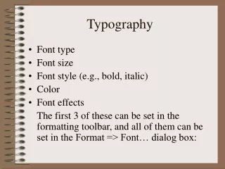
Principles of typography Thanks again to Robin Williams! Relationships Type is a building block for a page Used to create dynamic relationships 3 types of relationships Concordant Conflicting Contrasting Concordant Use one font Use variations on that font Size Italic , Bold Color

E N D
Principles of typography Thanks again to Robin Williams!
Relationships • Type is a building block for a page • Used to create dynamic relationships • 3 types of relationships Concordant Conflicting Contrasting
Concordant • Use one font • Use variations on that font • Size • Italic, • Bold • Color • Seen as calm, formal
For example . . . This concordant example uses Lucinda Bright. The first letter is larger and there is some italic, but the entire piece is rather subdued.
Or . . . The heavy typeface combines well with the heavy border. Even the line for writing on is a heavy.
Conflicting • Use two or more fonts that are similar (same family) • Creates a visual dissonance • Should be avoided
For example . . . This invitation uses two different scripts – they have many similarities with each other, but they are not the same and they are not different. The result is piece that looks a bit junky.
Or . . . This sample uses Franklin Gothic and Gill Sands. They are similar but not the same – look at the o. The light border is not the same visual weight as the type or the lines. There is too much conflict in this little piece.
Contrast • Strong contrast attracts our eyes • Simple way to create interest on a page • Creates energy on a page • May involve 1 or more fonts • Requires careful planning
For example . . . This invitation uses two different faces – different in dramatic ways. The contrast could be more dramatic with addition of a graphic