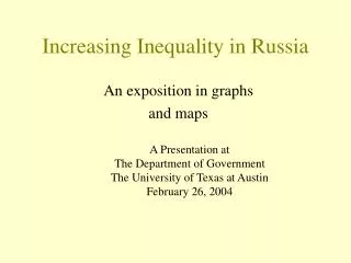
Increasing Inequality in Russia
150 likes | 590 Views
Increasing Inequality in Russia. An exposition in graphs and maps. A Presentation at The Department of Government The University of Texas at Austin February 26, 2004. by James K. Galbraith Ludmila Krytynskaia. The University of Texas Inequality Project. http://utip.gov.utexas.edu.

Increasing Inequality in Russia
E N D
Presentation Transcript
Increasing Inequality in Russia An exposition in graphs and maps A Presentation at The Department of Government The University of Texas at Austin February 26, 2004
by James K. Galbraith Ludmila Krytynskaia The University of Texas Inequality Project http://utip.gov.utexas.edu We gratefully acknowledge the support of the Ford Foundation
The U.T. Inequality Project • Measures Global Pay Inequality • Uses Simple Techniques that Permit Up-to-Date Measurement at Low Cost • Shows How Inequality Has Risen Under Globalization • Is Developing National and Regional Data Sets for Many Countries • Estimates Global Income Inequalities
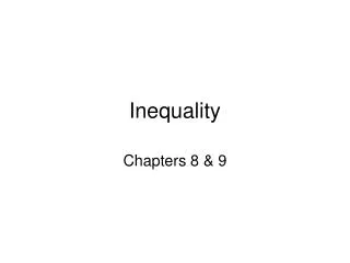
General Technique We use Theil’s T statistic, measured across sectorswithin each country, region or province, to show the evolution of economic inequality. The components of the statistic provide a measure of the contribution of each “province-sector cell” to inequality. This measure takes account both of the relative income of the cell and its size in relation to the whole employed population. The method permits us to map changes in the flow of incomes across regions and across sectors very accurately through time, using national data sources & without relying on sample surveys.
A brief review of the Theil Statistic: “The Theil Element” n ~ employment; mu ~ average income; j ~ subscript denoting group
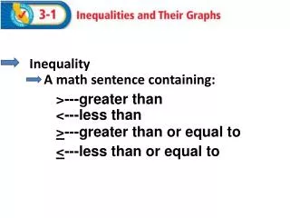
This figure shows the evolution of inequality in Russia measured across regions and across sectors. Note that the increases across regions are larger. Source data are from Goskomstat; Calculations by L. Krytynskaia.
A stacked bar chart of Theil elements can show the changing contribution of each sector to inequality over time; values above zero indicate above-average incomes, and conversely… Industry Transport Finance Agriculture Education
1990 Maps provide a useful way to visualize the increasing regional polarization of income. High values (yellow to red) indicate concentrations of relative wealth, low values (light \to dark blue) show concentrations of relative poverty.
2000 Important Note: These measures do not take account of relative changes in the regional cost of living.
These stacked line graphs show the contribution to inequality in Russia of each sector in each region. Two facts emerge clearly: the general decline of agriculture, education and health in all regions, and the rise of industrial production (energy), construction, transport and finance in a very few specific regions. 1990 Note that in 2000 the bottom of the income structure is marked by agriculture; finance meanwhile has moved up past management and science. 2000