Download
1 / 19
210 likes | 648 Views
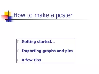
How to make a Poster Presentation in PowerPoint. By Gericke Sommerville March 21, 2003. Objectives. Understand the techniques and aesthetics behind an effective poster presentation. Learn how to create a poster using a PowerPoint slide. Critique some existing posters in NREL.

E N D
How to make a Poster Presentation in PowerPoint By Gericke Sommerville March 21, 2003
Objectives • Understand the techniques and aesthetics behind an effective poster presentation. • Learn how to create a poster using a PowerPoint slide. • Critique some existing posters in NREL.
Goals of a Poster Presentation • A visual presentation of your research. • Concise and focused (not a long presentation of your life’s work!) • Explains your research using schematics, graphs, and other visual strategies, with a minimum of supporting text. • Uses various strategies to attract viewers and stimulate conversation.
Key points of a poster layout • Background • Organization • Text • Pictures • Graphs/Tables • Balance
Backgrounds • Photographs as backgrounds lose resolution when blown up (pixelation). • Dark backgrounds are easier on the eye but use more dye. • Colored backgrounds can often break the monotony of a sea of white posters, thus attracting a viewer. • Use background/foreground contrasts. • Avoid fill patterns.
Organization • Introduction/Summary: Use a minimum of background information. This sections should be composed mostly of your research questions/hypotheses. • Methods: May shorten this section by using references for less critical techniques. Flow diagrams work well here. • Results: Biggest section of the poster, with lots of graphs, figures, etc. Arrange in a logical order so conclusions naturally follow.
Organization (cont’d) • Discussion: Usually more of a conclusion than a discussion. May use bulleted lists. Link the results to the hypotheses. • Acknowledgements: collaborators and grant support. • References: Keep to a minimum. Only cite critical references to your project.
Text • Should be able to read anything from 4’- 6’ away. • Establish a hierarchy of importance using the font size: • Title: 65-108 pts • Subheadings: 36-54 pts • Body text: 18-27 pts • AVOID USING ALL CAPS (has the effect of yelling) • Double-space all text, unless font size is large enough to read comfortably single-spaced. • Use shorter sentences than you might otherwise use.
Text (cont’d) • Use left justification (easier to read). • Use sans serif fonts • Times New Roman • Arial • Be consistent in font type and size • Use bold, italics, or underline to emphasize words. • Don’t changefonts to emphasize a word. • Don’t use all three. Overkill! • Check your spelling.
Pictures • JPEG, bitmap, or TIFF formats are easiest to use. • Stay within 150-300 dpi resolution. • Use light backgrounds with dark photos and vice versa. • Neutral/gray backgrounds enhance color photos while white backgrounds reduce their impact. • 4”x5” photos are a good minimum size. • Fluorescent lighting can change the color.
Graphs/Charts • Make sure that the text on axes and legends adhere to the minimum font size. • Few lines on a graph - label directly. • Multiple lines on a graph - use a legend. • Try to make all graphs and figures the same size for consistency. • Make lines in the graphs thick enough to see from 4’- 6’ away. • Use different colors for different groups, and maintain same color groups throughout poster.
Balance • Easiest layout involves boxes in 3-5 columns. • Is one side text- or graph-heavy? • Use of contrasting or complementary colors. • Even margins and spaces between boxes? • General rule of thumb: 20% text, 40% graphics, and 40% empty space. • Where does the eye go? Does the poster have flow? • Would this poster make you want to stop and read it?
Using PowerPoint • Before you start… • What are the maximum allowable poster dimensions for the symposium/conference? • Take a look around at other posters and get an idea of what grabs you. • Decide on your poster dimensions (max. 36” height is typical for plotters). • Type text into Word and create graphs in Excel. • Plan layout on paper before using PowerPoint.
Starting a new presentation • Open Powerpoint and click on “File, New…” • Choose a “blank” slide presentation. • Go to “File, Page setup…” • choose custom layout • choose orientation (usually landscape) • choose dimensions in inches (36” height maximum) • Scaling • May scale poster down by 33% or 50% (change dimensions accordingly). Then print by doubling or tripling scale in the print job. • Actual size (easiest). Everything at 100%. Fonts actual size on screen. See effect of pixelation on photos.
Poster Margins • The Easy Way: Set up margins by adding a box of known dimensions and center it on the slide. • Double-click on the box to get to properties. • Color tab: remove fill color. • Size tab: insert poster dimensions minus the margin space. • Position tab: insert margin space from top and side, and choose “top left corner” for alignment. • Use box to line up additions. • Remove when finished.
Layout of sections • Decide on the number of columns • Do the math to come up with the width of boxes, minus the margin spaces (around and between boxes). • After adding text or graphic boxes, use the properties to adjust the width. • Nest a text box within a graphic box, so text will be outlined as well. • Height of boxes may be variable, so try to leave same space between boxes vertically using properties. • In other words, the math has to be done for each box. • May remove graphic boxes after alignment, but boxes around text are a must.
Adding material • Draw a text box on the slide. • Cut/paste text from Word into text box. • Change the font size after transfer. • Always check spelling before pasting text! • May also cut/paste graphs from Excel in same manner. • If not using Excel, then try cut/pasting object as an image into Word. • If succeeds, then may transfer to PowerPoint. • Resolution problem as an image.
Wrap-up • Review poster by looking at issues of balance. • Review layout tips given earlier in this seminar. • Check for spelling and other errors. • Print slide to 8.5”x11” paper (scaled to fit) for final proofing. • May create a PDF version. • What you see is what you get. • May be easier to send to the printer/plotter. • May print several proofs to hand out at the symposium.
Poster Examples Let’s walk around NREL to get a feel for what to do (and what not to do) in a poster!