Download
1 / 24
240 likes | 263 Views
This report presents the findings and recommendations from a usability test conducted on the Austin Habitat for Humanity website. The test aimed to evaluate the website's usability for representative users. The report includes methodology, results, and usability findings.

E N D
Austin Habitat for Humanity Website Final Usability Report Hyeyoung Kim Jonghun Kim Li Cao INF 385P Introduction to Usability School of Information University of Texas at Austin
Outline • Introduction to Austin Habitat for Humanity website. • Introduction to Usability test. • Methodology • Results • Usability findings and Recommendations
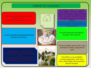
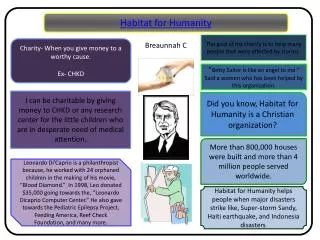
Introduction to Austin Habitat for Humanity Website • Habitat for Humanity International is a Christian organization. • Austin Habitat for Humanity • This website is a place for everyone.
Introduction to our usability test (1) • Study purpose: Test the usability of the website, using representative users.
Introduction to our usability test (2) • Study Summary • What data we collected? • This website is successful if users can find information about : 1. How to apply a home? 2. How to support the organization through volunteering/donating? 3. Other key services.
Methodology ( 1 ) • End-user test method • Participants • Half male, half female. • Various backgrounds. • Familiar with Internet. • None of them have use Austin Habitat for Humanity website before.
Methodology ( 2 ) • Procedure • Orientation script • Initial Survey • Critical Tasks • Final Survey
Methodology ( 3 ) • Task Scenarios • Apply a home • Donate Money • Being a volunteer • Find the calendar • Find photos • Find information about women builders
Methodology ( 4 ) • Evaluation Measures For the identified usability problems, we provided a criticality rating in regarding of the following table.
Data we collect • Quantitative data collected during testing • Time to complete each task • Number of test participants completing tasks with extra time • Number of problems encountered • Qualitative data collected during testing • facial expressions • verbal comments when test participants "thought out loud“ • spontaneous verbal expressions (comments)
Good Findings • Easy to navigate : left side navigation bar : clear labels : bread crumb • Contact Info http://www.austinhabitat.org/index.php
Moderate Findings • Unnecessary log in procedure just to see the calendar • Recommendation : Remove the log in process http://www.austinhabitat.org/volunteer/calendar.php
Moderate Findings (cont’d) • Hard to read font-style : excessive use of italic font style : the capitalized sentences • Recommendation: : Choose the most important phrase and make it bold or italic http://www.austinhabitat.org/volunteer/index.php
Moderate Findings (cont’d) • Users have difficulty knowing how to enlarge thumbnail pictures. • Recommendation: :Double clicking make the size bigger : Change the link text - “To enlarge images and view the image from the beginning” http://www.austinhabitat.org/photogallery/index.php
Moderate Findings (cont’d) • Undesirable location of pictures lists • Recommendation: : Display the title list through the dropdown boxes by each category (such as place or time) http://www.austinhabitat.org/volunteer/index.php
Minor Findings • Unnecessary icons on left-side navigation bar • Confusing underline • Indistinguishable linkable text color • Avoid “Click here.” http://www.austinhabitat.org/volunteer/index.php
Any Questions? Thank you for you time!