Data Visualization: Creating Compelling Charts and Graphs
Learn to create engaging charts and graphs with our data visualization tips. Enhance decision-making with compelling visualizations.

Data Visualization: Creating Compelling Charts and Graphs
E N D
Presentation Transcript
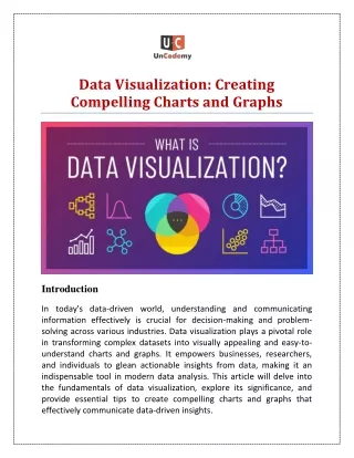
Data Visualization: Creating Compelling Charts and Graphs Introduction In today's data-driven world, understanding and communicating information effectively is crucial for decision-making and problem- solving across various industries. Data visualization plays a pivotal role in transforming complex datasets into visually appealing and easy-to- understand charts and graphs. It empowers businesses, researchers, and individuals to glean actionable insights from data, making it an indispensable tool in modern data analysis. This article will delve into the fundamentals of data visualization, explore its significance, and provide essential tips to create compelling charts and graphs that effectively communicate data-driven insights.
The Importance of Data Visualization Data visualization is the graphical representation of information and data. It allows us to perceive patterns, trends, and outliers that might be challenging to identify from raw numbers or text. Some key reasons why data visualization is crucial are: a. Enhances Understanding: Visuals enable the human brain to process and retain information more effectively than reading plain numbers or text. Visual representations bring clarity and coherence to data, facilitating better comprehension. b. Enables Better Decision Making: Compelling charts and graphs make it easier to identify trends, relationships, and correlations in data, leading to well-informed decision-making and strategic planning. c. Simplifies Complex Data: Data sets can be overwhelming, especially when they contain large volumes of information. Visualization simplifies complex data, allowing users to grasp the big picture effortlessly. d. Engages the Audience: Visuals are more engaging and memorable than raw data, making data-driven presentations more impactful and persuasive. Types of Data Visualization
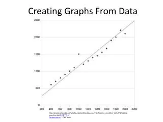
Before diving into the techniques of creating compelling charts and graphs, it's essential to understand the various types of visualizations available. The choice of visualization type depends on the nature of the data and the insights you want to convey. Some common types of data visualizations include: a. Line Charts: These charts are suitable for displaying trends and changes over time. They are created by connecting data points with straight lines. b. Bar Charts: Bar charts are effective for comparing discrete categories or showing the distribution of data. They use rectangular bars of varying lengths to represent values. c. Pie Charts: Pie charts are useful for displaying the proportion of different parts relative to the whole. Each segment represents a category, and the size of the segment corresponds to its proportion in the data. d. Scatter Plots: Scatter plots are ideal for visualizing relationships between two variables. They use points on a grid, with each point representing a data point with two numerical values. e. Histograms: Histograms are used to represent the distribution of continuous data and show the frequency of data points falling within specific intervals. f. Heatmaps: Heatmaps are used to represent data in a tabular format with colors, making it easier to identify patterns and trends.
Tips for Creating Compelling Charts and Graphs Now that we have explored the importance and types of data visualization, let's dive into some essential tips to create compelling and effective charts and graphs: a. Know Your Audience: Understanding the audience is the foundation of impactful data visualization. Consider their level of expertise, knowledge of the subject matter, and the insights they seek. Tailor your visualizations accordingly. b. Choose the Right Visualization: Select the visualization type that best represents your data and effectively conveys the insights you want to highlight. Avoid using complex visualizations when simpler ones will suffice. c. Keep it Simple: Simplicity is key in data visualization. Avoid cluttering the charts with unnecessary elements or excessive decorations. Focus on conveying the core message clearly and concisely. d. Use Appropriate Labels and Titles: Clear labels and titles are essential for understanding the context of the visualization. Ensure that axes, legends, and other relevant elements are appropriately labeled. e. Pay Attention to Colors: Colors play a crucial role in data visualization. Use colors purposefully to differentiate data points, highlight specific areas, and maintain consistency across multiple charts.
f. Ensure Data Accuracy: Double-check your data and calculations before creating visualizations. Inaccurate data can lead to misleading or incorrect insights. g. Emphasize Data Trends: If your visualization aims to showcase trends or patterns, use elements like trend lines or annotations to make these insights more apparent to the audience. h. Provide Context: Contextual information is vital for interpreting visualizations correctly. Add explanatory notes or descriptions to provide context and additional insights. i. Choose the Right Tools: Numerous data visualization tools are available, such as Tableau, Microsoft Power BI, and Python libraries like Matplotlib and Seaborn. Choose a tool that aligns with your data visualization needs and proficiency. j. Practice Data Storytelling: Weave a narrative around your data visualizations to make them more compelling. Tell a story that guides the audience through the insights and conclusions drawn from the data. Common Data Visualization Mistakes to Avoid Even with the best intentions, data visualization can sometimes go awry. Here are some common mistakes to avoid when creating charts and graphs:
a. Misleading Visualizations: Ensure that your visualizations accurately represent the data without distorting or misrepresenting the information. b. Overloading Visuals: Avoid overcrowding charts with excessive data points, making it difficult for the audience to decipher the insights. c. Using 3D Charts Inappropriately: 3D charts may look appealing, but they can distort data and make it challenging to interpret accurately. Use 3D only when it genuinely adds value to the visualization. d. Ignoring Accessibility: Consider accessibility requirements when creating visualizations, such as providing alt text for images or using high contrast colors for individuals with visual impairments. e. Lack of Focus: Ensure that your visualizations have a clear focus and that each chart conveys a distinct message. Conclusion Data visualization is an essential tool for transforming complex data into meaningful insights. By choosing the right visualization type, keeping designs simple yet effective, and providing context and clarity, you can create compelling charts and graphs that engage your audience and facilitate informed decision-making. As the world becomes increasingly data-centric, mastering the art of data visualization is becoming indispensable for professionals across industries. So, embrace the power of data visualization and unlock the potential of your data-driven insights. To know more about data visualization and
its fundamentals, one needs to do the data analytics course from reputed Data Analytics Training Institute in Kolkata, Kanpur, Mumbai, Delhi, Noida and many more cities in India, is a foolproof investment as it will surely pave the way for you to become a successful data analyst while offering a secure job in which you can stay motivated, and expect regular growth in your career as well. Source Link: https://expertseoinfo.com/data-visualization-tips/ ************************************************************************************* *************************************************************************************