Charts and Graphs
330 likes | 391 Views
Learn about different chart types like bar, column, line, and scatter to present data effectively. Understand their uses in visualizing and comparing data with examples. Explore the significance of charts in data representation.

Charts and Graphs
E N D
Presentation Transcript
Charts and Graphs Guilford County SciVis V105.01
Types of Charts and Their Uses • Why create charts? • Present data in a visual method • Prevent distorting data • Present many numbers in a single unit. • Make large data sets easy to understand • Encourage the eye to compare different pieces of data • Reveal the data at several levels of detail, from a broad overview to the fine structure Greensboro Age Distribution 2000
5 types of Graphs • Bar • Column • Line • Pie • Scatter • Histogram
Bar Chart • Used for comparing items that are not related to each other-also comparisons between unrelated variables. • Other names: bar chart, column graph, histogram, horizontal bar chart, stacked bar chart • Bar graphs are a family of charts that display quantitative information
Bar Chart 4 Bar Charts are frequently used to compare multiple variables or to show how one or more variables vary over time. 5. Each bar or column represents a data element, and a complete set of columns makes up a data set. 6. Bar graphs generally have one linear scale on the vertical axis, and a category or sequence scale (such as a time scale) along the horizontal axis. These charts are useful when trying to compare a number of discrete sets or categories against each other.
Bar Chart 7. A bar chart is a column chart on its side; this is usually employed when there are fewer categories and when the differences between categories are larger. 8. For a column chart, the x-axis lists the different categories, and the height of each category's column (with respect to the y-axis) shows the value.
Bar Chart Column Chart Bar Chart
Stacked Column Chart 9. A type of bar chart, the stacked column chart, showsseveral sets of related data adding up to a whole with their columns stacked on top of each other. a. The net result of this stacking should demonstrate some total value. Greensboro
Stacked Column Chart b. Stacking and grouping bars can also serve to show relationships between data sets, helping the user to: • Compare multiple items at various points in time; • Show how relationships between multiple items change with time; • Look for correlations or meaningful relationships between multiple data sets.
Line (X-Y) Graph • Used for related variables and relationships over time. • Line charts are good for showing trends of continuous data, usually involving time. • An area chart is a line chart with the area between the line and the x-axis is shaded.
Line (X-Y) Graph Line Graph Area Chart
PieChart Used for showing parts of a whole or percentages. • Pie graphs compare the components of a set to each other and to the whole. • Pie graphs are a member of an entire family of proportional graphs.
Pie Chart 3. The angle of the area of each slice (sometimes called a segment or wedge) is the same percent of the total circle as the data it represents. 4. Pie graph data may be contiguous or simultaneous in time and may be linked more by meaning than by physical proximity or sequence.
Scatter Plot Graph • Used to get a visual representation of the relationship or correlation between two variables using the x-y graph method of plotting. • Usually the lines connecting the data points are not connected.
Histograms • Histograms are bar charts that display frequencies or relative frequencies in the form of contiguous (touching) bars. • Histograms can be used to see the shape of the distribution and to determine whether the data are distributed symmetrically.
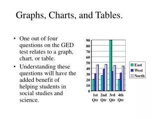
Histograms or Bar Charts • Histograms are "sorting boxes." There is one variable and data is sorted by this variable by placing them into "boxes.” • The number of pieces of data in each box is counted. The height of the rectangle drawn on top of each box is proportional to the number of pieces in that box. • A bar graph has severalmeasurements of differentitems that are compared. • The main question a histogram answers is: "How many measurements are there in each of the classes of measurements?" • The main question a bar graph answers is: "What is the measurement for each item?" Here are some examples:
Parts of a Chart • Axis -- The reference lines in a coordinate system. The X-axis is the horizontal reference, and the Y-axis is the vertical reference. • Title -- Describes the data the chart is symbolizing. • Legend -- An explanatory list of symbols on a chart (needed when you graph multiple data sets). • Labels -- Are needed for linking the chart to the information being displayed. If charted data has labels in the spreadsheet, the labels should be carried over to the chart.
Basic Rules for Creating a Chart • Use graph paper, a spreadsheet program, or graphing program such as Excel. • Decide on the correct type of chart or graph. • Determine the largest value number to be plotted on each axis and make sure the scale is large enough to use at least half of the paper in both directions.
Basic Rules for Creating a Chart 4. Plot the independent or control variable on the x-axis. The dependent variable is plotted on the y-axis. 5. Label the axes and give units to those labels. 6. All graphs should have a title. A good title that always works is "y" as a function of "x."
Basic Rules for Creating a Chart 7. Most graphs should start at the origin (x = 0, y = 0). There are exceptions like graphing temperature. If the lowest temperature is 37o C start at 35 o C. This is because 0 o C is not the lowest temperature. 8. Number the x- and y-axis with a regular numerical sequence or pattern starting with 0 to space out your data so it fills the entire graph. Use a ruler for straight lines. origin
Basic Rules for Creating a Chart 10. If 2 or more lines are plotted on a graph, a key or legend is necessary. A different hue or symbol should be used for each line. 11. The color of the background of the graph, and the lines on the graph should be clearly distinguishable from each other. 12. The color of lines on a multi-line graph should be distinguishable from each other. How many color rules are broken in the graph?
General Advice for Creating a Chart a. Keep graphs simple -- make the data do the talking. Don’t "liven" up you chart with extra colors, 3D, or pictures. Interesting data captures an audience’s attention more than any graphic or special printing effects could. b. Use meaningful titles and labels - let the audience think about what the data means, not what the data is or could be. c. Be truthful with the axes -- Do not exchange scales or perspectives to gain a falsely perceived advantage.
Basic Rules for 3D • 3D may not be a good idea because the data may appear distorted, can be misinterpreted, or may be misleading. • A demonstration of problematic 3D perspective: the chart on the left clearly shows that Clinton edged out Dole in Florida. • When Excel shows this data in 3D format, it is impossible to clearly tell if anyone won or if it was a tie.
Flow/Process Charts • Picture description of a procedure followed to solve a problem • shows relationships between people and processes rather than numbers • Common use -computer programs • To perform the process start at the top and move from box to box.
input output
How to Make a Flowchart • Determine the beginning and end of a process. • Brainstorm all major inputs, outputs, and processes • Use “post it” notes to sequence events and arrange them for all to see • Walk through. Check for smoothness. Make changes. Apply.
Flowchart symbols • Oval - Input / Output (Start, end) • Box - Activitya single step ("add two cups "), or and entire sub-process ("make bread") within a larger process. • Diamond - Yes / NO-Lines representing different decisions emerge from different points of the diamond. • Circle - BreakIndicates that the flow continues on another page, where a matching symbol (containing the same letter) has been placed. • Arrow - Flow-sequence of steps and the direction of flow
Enter a number Is it even? no yes Mult by 12 Add 42 Is it less than 300? yes Is = or > 300? Mult by 7 Divide by 6 Divide by 4 Mult by3 no no yes output
Flowchart Layout • Keep your type as large as possible, but don't crowd the edges of your boxes. • Abbreviate wherever possible. Use only first initials for names in organization charts. • Keep connecting lines short use the space for boxes and text. • Always supply printed handouts when using complex charts.
Organization Charts-the relationships between people in a business or other group - PERT Charts-a product is made, or a task completed Examples of flowcharts
Venn Diagrams • Made up of two or more overlapping circles. • Used to show relationships between sets. • Used to show similarities and differences in characters, stories, poems, etc.