Download
1 / 24
240 likes | 335 Views
Learn to measure and interpret relationships between variables using correlation and regression analysis, including scatterplots, regression lines, slope, and intercept calculations.

E N D
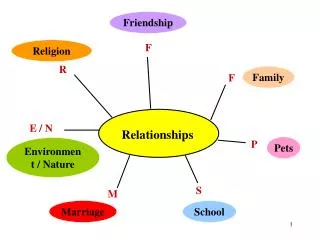
Relationships • We have examined how to measure relationships between • two categorical variables (chi-square) • one categorical variable and one measurement variable (t-test, F-test) • Now we look at relationships between two measurement variables
Interval variable relations • We want to describe the relationship in terms of • form • strength • We want to make inferences to the population
Our Tools • Correlation • to measure strength of relationship • Regression • to measure form of relationship
Regression • Begin with a scatterplot of two measurement variables, X and Y • Let X be the independent variable • Let Y be the dependent variable • Plot each case as we have done before at the beginning of the course.
Scatterplot Note:
Relationships • Each city is represented by an X score (percent poor) and a Y score (homicide rate) • We are asking about the relationship between poverty and homicide • Does homicide change as percent poor changes? If so, in what way and how much?
Looking at the scatterplot • We see that as percent poor (poverty) increases (from left to right on the graph), the homicide rate increases (from low to high on the graph
Representing relationships • We represent the relationship with a straight line that goes through the middle of the points on the graph • This line is the regression line • It shows the average homicide rate for every level of poverty.
30.00 20.00 10.00 0.00 0.00 5.00 10.00 15.00 Regression Line
Regression Line • Every line is represented by a formula • The regression line has the following general formula • ‘a’ represents the intercept of the line • ‘b’ represents the slope of the line • y-hat is the predicted value of y for a given x value
Regression of homicide on poverty a = -.815 b = .944 x is percent poory is homicide rate
Slope, the value of b • The slope of the regression line is positive, it goes from the lower left to the upper right. • The slope measures the amount of change in the dependent variable for every unit change in the independent variable • b = .944. There is an increase of .944 units in y for every increase of 1.0 in x
Regression Line, slope 20.00 5 units “run” RegressionLine 10.00 5 x .944 units “rise” 0.00 0.00 5.00 10.00 Percent families below poverty
Intercept, the value of a • The intercept is the point where the regression line crosses the Y axis • This point is the value of Y when X is zero • a = -.815. The predicted rate of homicide is -.815 when there is zero poverty
Calculate a • First calculate b, then
Calculate predicted y • After calculating a and b, one can use the regression line formula to calculate predicted values of y for every actual value of x
Prediction errors • Prediction errors are the difference between the predicted value of y and the actual value of y
Prediction errors RegressionLine Errors (actualminus predicted) Predicted Actual
Ordinary Least Squares: OLS • The regression line is the “best fitting” line through the data points in the graph • It is the line that minimizes the sum of the squared error terms -- hence “least squares” Minimize:
Sum of Squared Errors a -1.0 -0.9 -0.8 -0.7 -0.6 0.7 638.7 630.2 622.0 614.3 607.0 0.8 572.9 567.6 562.8 558.3 554.3 b 0.9 537.9 535.9 534.3 533.2 532.4 1.0 535.0 536.7 538.8 541.3 533.7 1.1 560.4 565.0 569.9 575.3 581.1 Minimum is 531.57 when a=-.815, b=.944