Download
1 / 24
250 likes | 402 Views
TOMSK POLYTECHNIC UNIVERSITY. COMMON MISTAKES IN PRESENTATION SLIDES DESIGN. Made by Matukhin D.L. Associate Prof. EEI TPU. Slide Design. Goals: Convey the necessary information Be readable/understandable Be interesting (enough) Avoid: Over stimulation Booooring. Logos.

E N D
TOMSK POLYTECHNIC UNIVERSITY COMMON MISTAKES IN PRESENTATION SLIDES DESIGN Made by Matukhin D.L. Associate Prof. EEI TPU
Slide Design • Goals: • Convey the necessary information • Be readable/understandable • Be interesting (enough) • Avoid: • Over stimulation • Booooring
Logos • We know you had support • Don’t need to list all of them every slide • If on first slide, don’t obscure title/authors • Maybe save it for last slide
Outline • Title Slide • Introduction • Outline • Results • Conclusions
Outline Slides • Previous slide didn’t “help” audience • If use outline slide, make it USEFUL • Everyone (hopefully) introduces their topic • Everyone explains their work, gives results • What is specific to YOUR talk? • Talk length correlates to outline need • Talk is 45 minutes, maybe! • Talk is 5 minutes… probably not.
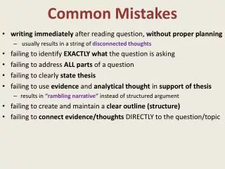
README.TXT • Do not attempt to put all the text, code, or explanation of what you are talking about directly onto the slide, especially if it consists of full, long sentences. Or paragraphs. There’s no place for paragraphs on slides. If you have complete sentences, you can probably take something out. • If you do that, you will have too much stuff to read on the slide, which isn’t always a good thing. • Like the previous slide, people do not really read all the stuff on the slides. • That’s why it’s called a “presentation” and not “a reading” of your work • Practice makes perfect, which is what gets you away from having to have all of you “notes” in textual form on the screen in front of you. • Utilize the Notes function of PowerPoint, have them printed out for your reference. • The audience doesn’t need to hear the exact same thing that you are reading to them. • The bullet points are simply talking points and should attempt to summarize the big ideas that you are trying to convey • If you’ve reached anything less than 18 point font, for God’s sake, please: • Remove some of the text • Split up the text and put it on separate slides • Perhaps you are trying to do much in this one slide? • Reading a slide is annoying. • You should not simply be a text-to-speech converter.
Font Size • You are close to your monitor • Your audience is far from the screen Tahoma 32 pt 28 pt 24 pt 20 pt 18 pt 16 pt 14 pt 12 pt 10 pt TNR 32 pt 28 pt 24 pt 20 pt 18 pt 16 pt 14 pt 12 pt 10 pt Courier 32 pt 28 pt 24 pt 20 pt 18 pt 16 pt 14 pt 12 pt 10 pt Lucida Sans 32 pt 28 pt 24 pt 20 pt 18 pt 16 pt 14 pt 12 pt 10 pt
Squint City • If you find yourself saying “you probably can’t read/see this, but…” • Then you probably have a BAD SLIDE! • There are exceptions, but very few • Test on real screen in conference room • Not just your computer screen 15” away.
This is a really long title for this single slide, I should have just summarized • Hard to read • Many people don’t read the title anyway • Should have been “Long Slide Titles”
Know Slide Boundaries • People can’t read text that runs off the side of the slide
Bullets Aren’t Everything • How many • Levels of • Hierarchy do • You think • You need * To express - Your point?
Speelchick • How samrt will poeple thikn yuo are? • Watch for: • there/their/they’re • too/to/two • its/it’s
There are exceptions, but in general Don’t have only text on most of your slides Try to draw diagrams wherever applicable (Well-drawn) pictures easier to understand System Architecture System Architecture • There’s a CPU, a RAM and an FPGA and they’re all connected - The FPGA connects to the CPU’s data cache - The bus is 32 bits wide - Blah blah blah blah • You have to visualize it yourself CPU data cache main memory 32 32 FPGA Picture This
Example Diagrams • Previous slide(s) used “animation”… • Use only where it is USEFUL • Know if presentation system will handle • Different versions of PowerPoint, Macs, etc. • Or use multiple slides to safely animate • Flip-book style Animation Use it sparingly Can Be Very (it can be annoying) Distracting
Line ‘Em Up • This is a bad drawing • Put in some effort FPGA CPU
I See A Ghost • More contrast on monitor than projector • Different projectors == different results • Colors to avoid with white are: • Light Green • Light Blue • Pale Yellow • Your slides should have good contrast • Side note: if printing slides, may want to choose white background to save ink! Usually can’t read this…
Equations • Ummm… okay…
g BB D N l h B A a FF HH EE q c V o F H n GG E DD VV YY R p II m h KK NN K JJ k Y OO L I CC t J O TT QQ C X f PP ZZ LL Q M MM P Z RR XX x r T y u SS d WW z G w UU S v W s b AA U e j Use Simple Examples • This isn’t one. It doesn’t help.
Results • You havelots of coolresults • No one canread this • No one canunderstand this • Graphs areyour friend…
Conclusion • If your talk is more than 5 minutes, nice to summarize work & results • Bring people back if they zoned out • Remind them why you’re great • Give “selling” points here • 30x performance increase with only 10% area penalty • Described novel method to create clean fuel from used cat litter
Bad Presentations • Audience won’t see your work is great • But will make fun of you from back row What does that slide say? Those are some NASTY colors… Dunno, I’m playing minesweeper Hey – it matches my tie. Please let it be OVER… zzz
Good Presentations • Interesting topic, explained at audience’s level • Slides are understandable and easy to see • Good presentations reflect well on speaker! I understood this one! I wonder if this technique would work for my problem You shouldwith a PhD… Let’s talk to them at the break But it’s outsidemy main area I never thought of that! Interesting