Download
1 / 26
260 likes | 449 Views
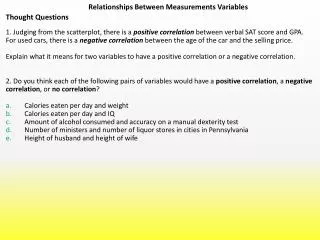
LECTURE UNIT 7 Understanding Relationships Among Variables. 7.1-7.2 Scatterplots and correlation 7.3 -7.4 Fitting a straight line to bivariate data. Objectives (Lecture Unit 7.1). Scatterplots Scatterplots Explanatory and response variables Interpreting scatterplots Outliers

E N D
LECTURE UNIT 7Understanding Relationships Among Variables 7.1-7.2 Scatterplots and correlation 7.3 -7.4 Fitting a straight line to bivariate data
Objectives (Lecture Unit 7.1) Scatterplots • Scatterplots • Explanatory and response variables • Interpreting scatterplots • Outliers • Categorical variables in scatterplots
7.1 Basic Terminology • Univariate data: 1 variable is measured on each sample unit or population unit (lecture unit 2) e.g. height of each student in a sample • Bivariate data: 2 variables are measured on each sample unit or population unit e.g. height and GPA of each student in a sample;(caution: data from 2 separate samples is not bivariate data)
Basic Terminology (cont.) • Multivariate data: several variables are measured on each unit in a sample or population. • For each student in a sample of NCSU students, measure height, GPA, and distance between NCSU and hometown; • Focus on bivariate data in lecture unit 7
Same goals with bivariate data that we had with univariate data • Graphical displays and numerical summaries • Seek overall patterns and deviations from those patterns • Descriptive measures of specific aspects of the data
Here, we have two quantitative variables for each of 16 students. • 1) How many beers they drank, and • 2) Their blood alcohol level (BAC) • We are interested in the relationship between the two variables: How is one affected by changes in the other one?
Scatterplots • Useful method to graphically describe the relationship between 2 quantitative variables
Scatterplot: Blood Alcohol Content vs Number of Beers In a scatterplot, one axis is used to represent each of the variables, and the data are plotted as points on the graph.
Focus on Three Features of a Scatterplot Look for an overall pattern regarding … • Shape - ? Approximately linear, curved, up-and-down? • Direction - ? Positive, negative, none? • Strength - ? Are the points tightly clustered in the particular shape, or are they spread out? … and deviations from the overall pattern: Outliers
Scatterplot: Fuel Consumption vs Car Weight. x=car weight, y=fuel cons. • (xi, yi): (3.4, 5.5) (3.8, 5.9) (4.1, 6.5) (2.2, 3.3) (2.6, 3.6) (2.9, 4.6) (2, 2.9) (2.7, 3.6) (1.9, 3.1) (3.4, 4.9)
Response (dependent) variable: blood alcohol content y x Explanatory (independent) variable: number of beers Explanatory and response variables A response variablemeasures or records an outcome of a study. An explanatory variableexplains changes in the response variable. Typically, the explanatory or independent variable is plotted on the x axis, and the response or dependent variable is plotted on the y axis.
SAT Score vs Proportion of Seniors Taking SAT 2005 IW IL NC 74% 1010
Some plots don’t have clear explanatory and response variables. Do calories explain sodium amounts? Does percent return on Treasury bills explain percent return on common stocks?
Making Scatterplots • Excel: • In text: see p. 179-180 • Statcrunch • On our course web page under Online Statistics Resources, in “Statcrunch Instructional Videos” see “Scatterplots and Regression” instructional video • TI calculator: • Our course web page: under Online Resources for Students, click on “Statistics on TI graphing Calculators”; see p. 7-9.
No relationship Nonlinear Form and direction of an association Linear
Positive association: High values of one variable tend to occur together with high values of the other variable. Negative association: High values of one variable tend to occur together with low values of the other variable.
No relationship:X and Y vary independently. Knowing X tells you nothing about Y. One way to think about this is to remember the following: The equation for this line is y = 5. x is not involved.
Strength of the association The strength of the relationship between the two variables can be seen by how much variation, or scatter, there is around the main form. With a strong relationship, you can get a pretty good estimate of y if you know x. With a weak relationship, for any x you might get a wide range of y values.
This is a very strong relationship. The daily amount of gas consumed can be predicted quite accurately for a given temperature value. This is a weak relationship. For a particular state median household income, you can’t predict the state per capita income very well.
How to scale a scatterplot Same data in all four plots • Using an inappropriate scale for a scatterplot can give an incorrect impression. • Both variables should be given a similar amount of space: • Plot roughly square • Points should occupy all the plot space (no blank space)
Outliers An outlier is a data value that has a very low probability of occurrence (i.e., it is unusual or unexpected). In a scatterplot, outliers are points that fall outside of the overall pattern of the relationship.
Outliers Not an outlier: The upper right-hand point here is not an outlier of the relationship—It is what you would expect for this many beers given the linear relationship between beers/weight and blood alcohol. This point is not in line with the others, so it is an outlier of the relationship.
IQ score and Grade point average Describe in words what this plot shows. Describe the direction, shape, and strength. Are there outliers? What is the deal with these people?
Categorical variables in scatterplots Often, things are not simple and one-dimensional. We need to group the data into categories to reveal trends. What may look like a positive linear relationship is in fact a series of negative linear associations. Plotting different habitats in different colors allows us to make that important distinction.
Comparison of men and women racing records over time. Each group shows a very strong negative linear relationship that would not be apparent without the gender categorization. Relationship between lean body mass and metabolic rate in men and women. Both men and women follow the same positive linear trend, but women show a stronger association. As a group, males typically have larger values for both variables.