Understanding Relationships Between Variables: The Importance of Graphs in Data Visualization
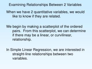
Graphs are an essential tool for organizing and presenting data, showcasing the relationships between variables more effectively than traditional data charts. This guide explores various types of graphs, including circle/pie graphs for illustrating percentages, bar graphs for comparing multiple answers, and scatter/line graphs to demonstrate changes in related variables through equations like y = mx + b. Understanding these relationships, including direct, quadratic, and inverse relationships, is crucial for accurate data interpretation and communication.


Understanding Relationships Between Variables: The Importance of Graphs in Data Visualization
E N D
Presentation Transcript
Relationships Between Variables Making Pictures Out of Numbers
Why Graphs? Good way of organizing data Better than data charts at showing the relationship between variables
Types of Graphs • Circle/Pie Graph • Good for showing percentages, or “parts of the whole” • Bar Graph • Good for showing comparisons between multiple answers to the same question • Scatter/Line Graph • Good for showing changes that occur in related variables
y = x or y = mx + b, where b=0 Direct Relationships
y = mx + b Direct RelationshipNon-Zero Intercept
y = ax2 + bx+ c Quadratic Relationship
y = ax-b Inverse Relationship