Download

1 / 11
110 likes | 181 Views
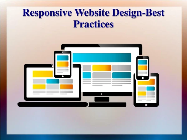
Learn essential strategies for creating responsive layouts that adapt to all screen sizes. Start small, use liquid layouts, limit navigation, design for grids, prioritize usability, optimize content weight, navigate hover limitations, and rethink canvas in web design. Avoid complex data tables for better mobile usability. 8 Relevant

E N D
10RESPONSIVE DESIGN BESTPRACTICESSEAN CUNNINGHAM VP CREATIVE DIRECTOR DIGITAL BUNGALOWDecember 11, 2012 209 ESSEX STREET 2ND FLOOR SALEM, MA 01970 WWW.DIGITALBUNGALOW.COM
STARTSMALL 1 • Start with the smallest size screen and work your way up, adding rules • in CSS to float elements into the larger windows of tablet and desktop browsers. Start with a narrow, single-column layout to handle mobile browsers and then scale up from there rather than the other • way around.
2 USE LIQUID LAYOUTS • Layouts that can accommodate any screen size. Don’t simply design one look for the iPhone/Android, one for tablets and one for the desktop. Keep it liquid, otherwise what happens when some new, intermediate screen size suddenly becomes popular?
3 LIMIT NAVIGATION • Limiting main navigation is always a great start to a responsive design and one that you won’t regret doing. Of course one of the great things about navigation on responsive is that as you expand (designing mobile first) you can add. However you don’t want to get caught in the trap of putting everything under the sun on the home page.
DESIGN FOR GRIDS 4 BUT DON’T LET THEM DESIGN YOU • Mobile is much more than just various small screens, and these emerging contexts unlock entirely new use cases, patterns and possibilities. We shouldn’t sell ourselves short by only creating responsive layouts. For example, we sometimes forget that mobile phones can get user location, initiate phone calls, and much more. Hopefully soon browsers on all these gadgets will have access to even more device APIs, further pushing the boundaries of what’s possible on the web.
5 BIG FINGERS • While most mobile responsive experiences these days use a drop down menu when the phone is in mobile, some opt to keep traditional navigation on all 3 devices. Consider the user on iPad and Mobile and that they may have larger than average fingers making it hard to click navigation items that are too small and too close together.
USE USABILITY 6 Usability research and testing are what make your services easier and more seamless to use (which are truly important qualities in a competitive landscape), but they are not the reason people choose to use a service in the first place — they do that to solve a problem or fulfill a need. So first come up with that ingenious new concept, and then draw heavily on user research when implementing the service. Usability tools are there to test and validate your designs, allowing you to continuously iterate your design based on user behavior and perceptions — an optimization process that should continue throughout the product’s life cycle.
LIGHTWEIGHT CONTENT 7 • OK, so you’re not gutting content for small screens and you’ve made an effort to deliver a full experience regardless of context. All’s well with the world, right? Well no, because now you have a bunch of stuff to load and that takes time. 74% of mobile users will leave after 5 seconds (PDF) of waiting for a page to load, and the unfortunate reality is that only 3% of small screen versions of responsive sites are significantly lighter than their large screen counterparts. That means users bear the burden of a potentially massive download.
8 HOVER CAN’T HOVER • Beware of active and passive states on navigation that are common paradigms on desktop. A hover state for example can not be achieved on tablet or mobile. Radial buttons don’t work as well in responsive (see big fingers). Don’t fret though there are a host of gesture based navigation goodies awaiting you that can be replicated on desktop without incident.
DESIGN CONTENT OUT 9 NOT CANVAS IN • Geometric systems create beautiful text for books. Text that belongs. Text that feels connected. It’s about comfort. Creating a comfortable, invisible reading experience. Binding content to the book is what all good book designers do. To do this, they use principles of design grid systems that, when populated by content, create that connection. But with all paper-based design, they start with paper. Paper that has edges, ratios that can be repeated. A canvas. And here’s the thing. Creating layouts on the web has to be different because there are no edges. There are no ‘pages’. We’ve made them up.
DATA TABLES 10 JUST SAY NO, AND DON’T TELL A FRIEND • Pages that include data tables pose a special challenge to the responsive web designer. Data tables are extremely wide by default, and when someone zooms out to see the whole table, it becomes too small to read. When one tries to zoom in to make it readable, he or she is supposed to scroll both horizontally and vertically to look through it. Well, there are several ways to avoid this problem. Reformatting the data table as a pie or mini-graph is an approved solution. The mini-graph fixes even in narrow screens.