Download
1 / 2
20 likes | 36 Views
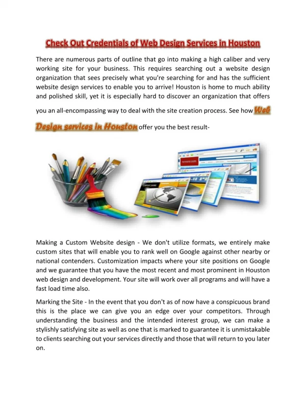
In the earlier days of website design in Houston, they were entirely designed based on being seen on huge, desktop screens rather than small, touch responsive screens <br>in the palm of peopleu2019s hands... https://www.wsixmedia.com/blog/best-practices-of-responsive-web-design-in-houston<br>

E N D
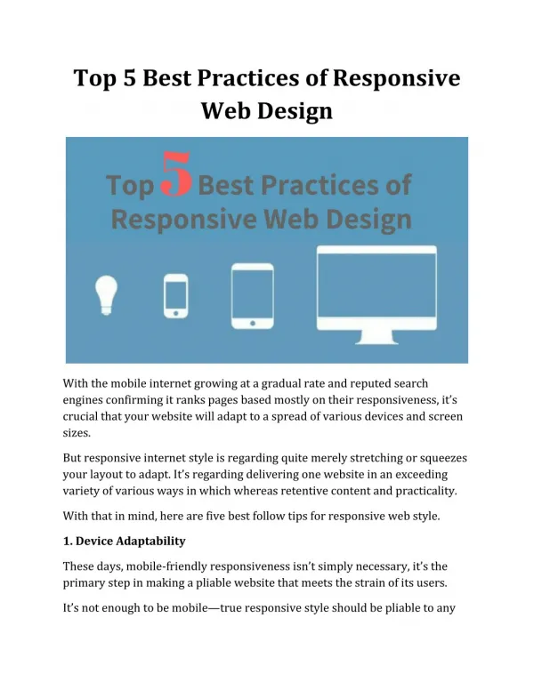
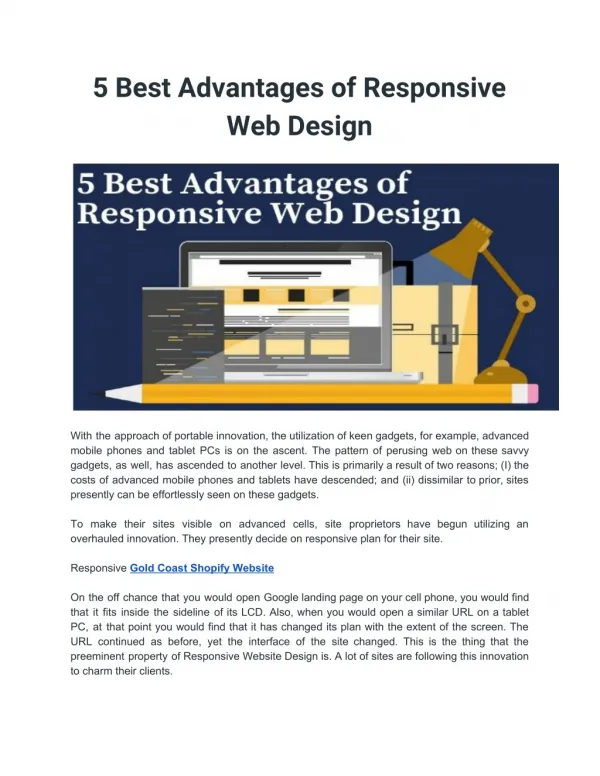
Best Practices of Responsive Web Design in Houston There used to be a time when people only used huge desktop computers to access the internet, but now the focus is mobility, and people crave the ability to browse websites freely on their mobile devices whenever they feel the need. Since the inception of smartphones, mobile web browsing has increased exponentially. In the earlier days of website design in Houston, they were entirely designed based on being seen on huge, desktop screens rather than small, touch responsive screens in the palm of people’s hands. In fact, today’s website designers have to create web page designs that are fully responsive for every type of browser and device. This is referred to as responsive website design. There are three key qualities involved in a responsive web page design: 1. A grid based, flexible layout This way, even if the proportions change, the content is built on percentages to ensure it maintains complete consistency. 2. Flexible media All of the media embedded into the web page needs to be sized with percentages rather than pixels, like a non-responsive design would be. 3. Media queries Media queries allow dynamic layout changes in websites when certain specifications are met. These specifications could be a screen resolution or something else similar. It could mean that columns are changed from double to single or that something that was side by side might be stacked on top of each other instead. The layout would completely change based on screen size which is ideal for responsiveness.
Responsive designs are a huge improvement to the previous mobile only designs that preceded them. Having a separate mobile site was an alternative that countless companies tried. While this band-aid approach was better than having no mobile option, it definitely isn’t as impressive as a completely responsive site. A specific mobile site has multiple issues, such as having to constantly update two distinct websites rather than updating the one responsive webpage, that accommodates all browsers, screen sizes and devices. At first, responsive web design was only embraced by some early adopters that were keen to try the new practice, but now the entire industry has embraced this as a best practice because, let’s face it, it only makes sense to move with user behavior and integrate our knowledge of their behavior into our Houston web design processes. Source : https://www.wsixmedia.com/