Download
1 / 48
500 likes | 715 Views
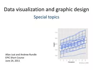
Data visualization and graphic design Special topics. Allan Just and Andrew Rundle EPIC Short Course June 24, 2011. Wickham 2008. Agenda. Quick hits Layer order in Deducer Bubble charts ggplot2 quasi- beanplot Being on your own with ggplot2 and R – getting unstuck

E N D
Data visualization and graphic design Special topics Allan Just and Andrew Rundle EPIC Short Course June 24, 2011 Wickham 2008
Agenda Quick hits • Layer order in Deducer • Bubble charts • ggplot2 quasi-beanplot Being on your own with ggplot2 and R – getting unstuck Small datasets revisited Large datasets Displaying uncertainty Automated generation of many plots Extending ggplot2 – direct labels and scatterplot matrices New geoms More practice exercises! Wrap up
Getting unstuck… • Check the str() of your data • Check the console for error messages • Look at the call for your plot – is that what you wanted? • Easier to start with something that works but is too simple • Simplify the plot until it works • Add back components one-by-one to isolate the problem
Reproducible examples and the ggplot2 listserve http://groups.google.com/group/ggplot2 Compose your question well and you might figure out the answer in the process!
Data + summary Loss of information
Better than bar charts… data(airquality) # open the plot builder and add geom_point # with x = Month and y = Ozone Data + summary – building this ourselves…
Pseudo beanplots g_violin_bean <- ggplot(sleep, aes(x = extra)) + geom_ribbon(aes(ymax = ..density.., ymin = -..density..), stat = "density", fill = "black") + geom_segment(aes(y = -.05, yend = .05, xend = extra), color = "grey90") + facet_grid(. ~ group, as.table = FALSE, scales = "free_y") + opts(panel.margin = unit(0 , "lines")) + xlab(NULL) + theme_bw(base_size = 20) + coord_flip() + opts(axis.text.x = theme_blank()) + expand_limits(x = c(-5, 9)) g_violin_bean
Playing with diamonds… data(diamonds) str(diamonds) With your neighbor: how do we show the data on the caret – price relationship…
Strategies for large datasets • Use smaller points - use circles • Use partial transparency • Jitter (small random noise) if data take discrete values • Overlay a smoother to show the trend • Display a random sample from your data
How do you show 54,000 diamonds? Partial transparency Alpha = 0.01 Contours for density Alpha = 0.1 Hexagonal bins with legend
Displaying uncertainty • Confidence intervals (uniformly shaded or bounded) • Pointwiseerrorbars • Bayesian simulations • Resampling based estimates
Model shouldn’t extend beyond the range of your data xkcd.com/605/
Graph your uncertainty Informal Bayesian Simulation • Run regression • Draw random numbers based on uncertainty of your regression • Plot some lines! • Uses the sim() function in package “arm” Gelman and Hill 2007
Informal bayesian simulation Figure 3. Association between DEP concentrations in personal air and the urinary metabolite MEP concentrations (adjusted for specific gravity) stratified by perfume use using linear regression of log transformed values. Lighter lines represent predictive uncertainty in regression parameters from informal Bayesian simulations (20 simulation draws with uniform priors). Boxplots show the distribution of MEP with means (“X”). Just et al 2010
Resampling - Spline after bootstrap CosmaShalizi 2010
How random is random - the qq-plot qqreference from package DAAG
a Q-Q envelope – show range from 19 draws of random normal Venables and Ripley
Generating many graphs Example: suppose we wanted to save a separate plot of mileage for each car manufacturer in "mpg" Start with data formatted so that it is long… manufacturer cty hwy 1 audi 18 29 2 audi 21 29 25 chevrolet 15 23 26 chevrolet 16 26 100 honda 28 33 101 honda 24 32 Use the magic of R and ggplot2…
Generating many graphs Example: suppose we wanted to save a separate plot of mileage for each car manufacturer in "mpg" Start with data formatted so that it is long… manufacturer cty hwy 1 audi 18 29 2 audi 21 29 25 chevrolet 15 23 26 chevrolet 16 26 100 honda 28 33 101 honda 24 32 • Use d_ply(from the plyr package – also by Hadley Wickham) to split up the dataframe by our subsetting variable • Define a function to run on subsets; we name these smaller dataframes "dat" • Call ggplot() and ggsave() within this function to generate and save our plot
Generating many graphs Example: suppose we wanted to save a separate plot of mileage for each car manufacturer in "mpg" # d_ply takes a dataframe, splits it apart, applies a function d_ply(mpg, .(manufacturer), function(dat) { # create a ggplot2 object named figure using 'dat' figure <- ggplot(dat, aes(cty, hwy)) + geom_smooth(method = "lm") + geom_point(alpha = 0.7, size = 2.5, position = position_jitter(height = 0.1, width = 0.1)) + annotate("text", x = -Inf, y = Inf, hjust = -.1, vjust = 1.2, label = paste("n =", nrow(dat))) + opts(title = dat$manufacturer[1]) # unique title can help # create a unique filename for each subset (e.g. "MPG_Audi.png") filename <- paste("MPG_", dat$manufacturer[1], ".png", sep = "") # by default this saves to your working directory; see ?getwd ggsave(filename, figure, height = 6.5, width = 10) })
Extending ggplot2 Let's get some more packages: install.packages() directlabels GGally
A fully polished plot probably took a lot of coding # original code adapted from http://learnr.wordpress.com library(ggplot2) # define the dataset df <- structure(list(City = structure(c(2L, 3L, 1L), .Label = c("Minneapolis", "Phoenix", "Raleigh"), class = "factor"), January = c(52.1, 40.5, 12.2), February = c(55.1, 42.2, 16.5), March = c(59.7, 49.2, 28.3), April = c(67.7, 59.5, 45.1), May = c(76.3, 67.4, 57.1), June = c(84.6, 74.4, 66.9), July = c(91.2, 77.5, 71.9), August = c(89.1, 76.5, 70.2), September = c(83.8, 70.6, 60), October = c(72.2, 60.2, 50), November = c(59.8, 50, 32.4), December = c(52.5, 41.2, 18.6)), .Names = c("City", "January", "February", "March", "April", "May", "June", "July", "August", "September", "October", "November", "December"), class = "data.frame", row.names = c(NA, -3L)) #and season labels seasons <- data.frame(month = c(1.5, 4.5, 7.5, 10.5), value = 97, season = c("Winter", "Spring", "Summer", "Autumn")) # melt the dataset to a long format dfm <- melt(df, variable_name = "month") levels(dfm$month) <- month.abb #build the basic plot p <- ggplot(dfm, aes(month, value, group = City, colour = City)) p1 <- p + geom_line(size = 1) dgr_fmt <- function(x, ...) { parse(text = paste(x, "*degree", sep = "")) } none <- theme_blank() p2 <- p1 + theme_bw() + scale_y_continuous(formatter = dgr_fmt, limits = c(0, 100), expand = c(0, 0)) + xlab(NULL) + ylab(NULL) + opts(title = expression("Average Monthly Temperatures (" * degree * "F)"), panel.grid.major = none, panel.grid.minor = none, legend.position = "none", panel.background = none, panel.border = none, axis.line = theme_segment(colour = "grey50")) (p3 <- p2 + geom_vline(xintercept = c(2.9, 5.9, 8.9, 11.9), colour = "grey85", alpha = 0.5) + geom_hline(yintercept = 32, colour = "grey80", alpha = 0.5) + annotate("text", x = 1.2, y = 35, label = "Freezing", colour = "grey80", size = 4) + geom_text(data = seasons, aes(label = season, group = NULL), colour = "grey70", size = 4)) (p4 <- p3 + geom_text(data = dfm[dfm$month == "Dec", ], aes(label = City), hjust = 0.7, vjust = 1)) data_table <- ggplot(dfm, aes(x = month, y = factor(City), label = format(value, nsmall = 1), colour = City)) + geom_text(size = 3.5) + theme_bw() + scale_y_discrete(formatter = abbreviate, limits = c("Minneapolis", "Raleigh", "Phoenix")) + xlab(NULL) + ylab(NULL) + opts(panel.grid.major = none, legend.position = "none", panel.border = none, axis.text.x = none, axis.ticks = none, plot.margin = unit(c(-0.5, 1, 0, 0.5), "lines")) Layout <- grid.layout(nrow = 2, ncol = 1, heights = unit(c(2, 0.25), c("null", "null"))) grid.show.layout(Layout) vplayout <- function(...) { grid.newpage() pushViewport(viewport(layout = Layout)) } subplot <- function(x, y) viewport(layout.pos.row = x, layout.pos.col = y) mmplot <- function(a, b) { vplayout() print(a, vp = subplot(1, 1)) print(b, vp = subplot(2, 1)) } mmplot(p4, data_table) # to save - run the following code - see ?png ##### # png("temperature_plot.png") # mmplot(p4, data_table) # dev.off() #note that when we were at the p3 stage we didn't yet have labels for the data p3 library(directlabels) # code to put labels into your ggplot2 objects p3.labelled <- direct.label(p3, list(last.points, hjust = 0.7, vjust = 1)) p3.labelled #############################
Extending ggplot2: GGallyScatterplot matrix: 36 plots showing ~9K measuresbivariate densities and correlations
Making a scatterplot matrix library(GGally) data(iris) head(iris[, 3:5]) #iris columns 3 to 5 # example 1 - defaults ggpairs(iris[, 3:5]) # example 2 – more customized by data type ggpairs(iris[,3:5], upper = list(continuous = "density", combo = "box"), lower = list(continuous = "points", combo = "dot"), diag = list(continuous = "bar", discrete = "bar")) # example 3 – some new stuff!!! dat <- data.frame(x = rnorm(100), y = rnorm(100), z = rnorm(100)) plotmatrix <- GGally::ggpairs(dat, lower = list(continuous = "density", aes_string = aes_string(fill = "..level..")), upper = "blank") plotmatrix #EOF
Showing density surfaces from stat_density2d Let's make a plot of x and y from data.framedat with stat_density2d What is the default geom? In the previous plot, which aesthetic was showing those colors? What geom would we need to make that plot?
geom_polygon after computing the convex outer hull, labels at the centroids, moved the legend to the top
Recap: Why we did this Visualization is important for communicating information and promoting your ideas Effective designs will be noticed We make many graphs quickly for discovery and choose the best ones to polish for communication With a theory of visualization we can create sophisticated graphics using basic components
Recap: Designing a good scientific figure Answer a question – usually a comparison Use an appropriate design (emphasize comparisons of position before length, angle, area or color) Make it self-sufficient (annotation & figure legend) Show your data – tell its story
Recap: ggplot2 and R R is a powerful language for statistics and data analysis ggplot2 implements a “grammar of graphics” ggplot2: Builds plots using data, and layers of geometric objects, mapping variables to aesthetic features, which have been transformed by scales, summarized with statistics, projected into a coordinate system, and subset into adjacent plots with facets
Recap: JGR and Deducer JGR: a graphic interface system for R programming Deducer: adds menu driven analysis and plotting
Deducer: Plot Builder Save or import .ggp file View call to see R code Send R code to Console ggsave("plot.png", height = 6.5, width = 10)
Deducer: Plot Builder Right-click to Get info Adjust position Right-click to edit, toggle, remove Geom Stat Data More options by component Switch to map to a var Mapped vars Set to a constant value Order of drawing layers
Questions? acj2109@columbia.edu