Download
1 / 12
120 likes | 153 Views
Read more about Why do we need a Movie Rating Chart? Movie Rating Chart u2013 behind the scenes, Comparison with regular score / rating.<br>https://efficiency365.com/2017/07/02/movie-rating-chart/<br>

E N D
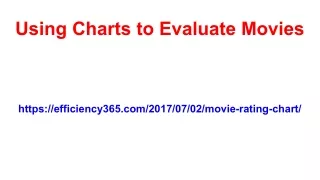
Using Charts to Evaluate Movies https://efficiency365.com/2017/07/02/movie-rating-chart/
Using Charts to Evaluate Movies I see lot of movies. I am the First-Day-First-Show guy. Usually, I post the Movie Rating on my personal FB page. See some examples below. But recently I posted a Movie Rating Chart. Here is how you do it. Contents ● ● ● ● ● ● Movie Rating Chart Regular rating Movie Rating Chart – behind the scenes! Comparison with regular score / rating Background Image What next
Why do we need a Movie Rating Chart I felt that rating the entire movie in just ONE number is unfair. There is so much effort put in by so many talented people that they deserve more detailed feedback. But how do you do that? That would become a review rather than a rating. I noticed that the overall appeal of a movie (or any other performance, presentation, lecture, etc.) is never at the same level. Some of it is great, then it becomes dragging, it picks up interest again and may become boring in the end. I have observed that even the most talented group of Actors, Screenwriters and Directors get carried away and stuff the movie with unwanted scenes – especially at the end. Creating a shorter and more impactful movie just does not seem to be humanly possible. Therefore, I decided to use a chart to rate the movie, Baby Driver, which I saw recently.
Movie Rating Chart – behind the scenes! It shows the logo superimposed with a simple line chart. This depicts the overall impact of the movie across time as a chart rather than a single number. The X axis is the entire duration of the movie – from left to right. The Y axis shows the score scale… from 0 to 5. You can interpret it as you want. For example, Zero means utterly boring and Five means extremely interesting and enjoyable. Actually, next time I am not even going to put numbers on the Y axis. It is just a quantification of whether you liked that part or not. The movie is 120 minutes long. I just scored it in 10 points. Each point does not correspond to the exact elapsed time. It is just a number I specified AFTER I had seen the whole movie. So it depends upon my recollection of which part was very nice and which parts were boring. Of course, it is not a perfect representation but just a gut feel.
Movie Rating Chart – behind the scenes! On second thoughts, I felt that the chart is too sharp. Next time I will use a smooth version of the chart to indicate that this is a flow rather than exact point measurement.
Movie Rating Chart – behind the scenes! This looks more realistic. In general, you should use a smooth line for such charts when you want to show the overall fluctuation while implying that there may be more data between the points that were captured and depicted. Comparison with regular score / rating If I had used my regular method of specifying a score – which is a gut-feel based number which comes to mind after watching the whole movie, I would have given it a score of 3.5 out of 5. This time I specified ten different numbers as the score across the movie duration. What is the average of these numbers? You will be surprised … I was too – 3.6 Of course, at this stage we have only one sample to compare. I will use this with more movies and try to correlate the output.
Background Image I put the Baby Driver movie poster itself as the chart background and adjusted its scale and offset. That makes it look much better and establishes the context. The line color must be chosen in a way that it stands out and does not blend with the poster itself.
What next Can we call it an Infographic? I already have ideas about how to enrich this Movie Rating Chart by adding more useful information to it. This can apply to any performing art event or production. It can apply to a class taught by a teacher or to a presentation or a meeting or a training program. What do you think? Do you like this way of rating? Do post your comments here. Read my articles about Charts and Data Visualization which cover lot of related topics and ideas for effective utilization.