Download
1 / 41
410 likes | 428 Views
Explore the fundamental aspects of typography including categories, elements, and special characters. Learn how to utilize type to convey specific moods or ideas effectively. Dive into typography best practices to enhance your design skills.

E N D
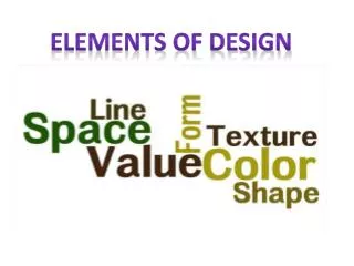
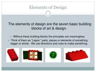
Elements of Design Type
Objectives • After this lesson, you will understand: • The 5 primary categories of type • Elements of typography • Special characters • Using type to convey a mood or idea • Type Do’s and Don’ts
Type Categories • The five primary categories of type are • Serif • Sans-serif • Script • Decorative • Pi
Serif Type • Serif type has a stroke at the top or base of letters, or an ear or spur on some letters. • They have a formal, traditional appearance. • They are used to convey a conservative, dignified image. • Usually easy to read and are used for long passages of text.
Examples of Serif Type • Times New Roman • Garamond • Georgia • Century
Sans-Serif Type • In French, sans means “without.” Therefore, sans-serif means “without the stroke.” • These are very legible and are often used for labeling illustrations. • Newspaper headlines are usually set in a sans-serif font • Associated with “the facts” • Also good when reversing type on a background (light type on dark background)
Examples of Sans-Serif Type • Arial • Century Gothic • Tahoma • Verdana
Script Type • Any typeface that has the appearance of being created with a pen or a brush, whether the letters are connected or unconnected, is a script typeface. • Often used for invitations or announcements and sometimes for logos. • Use with caution; they are not always well received.
Script Type Examples • Brush Script MT • Freestyle Script • Kunstler Script • Pristina
Decorative Type • These are meant to be used in headlines and to convey specific meaning. • These can be extremely elaborate. • It is never a good idea to introduce a complex type style into the body of a document. • These fonts often look like their name.
Decorative Type Examples • Chiller • Curlz MT • Jokerman • Ravie
Pi (Symbol) Type • Pi fonts, often called symbol, logo, or ornaments, are used to insert special symbols into text. • A pi font is a collection of related symbols. • These might include characters in a math font, map symbols, or blocks in a crossword puzzle. • If there is a need, the font is often created.
Pi (Symbol) Type Examples • Wingdings • Webdings • Symbol • Bookshelf Symbol
Good typography is what separates quality from amateur design. Some of the most important typography issues are: Weight Size Alignment Leading Kerning Tracking Baseline shift Horizontal scale Elements of Typography
Weight • Typefaces are usually sold as complete sets of fonts distinguished as different weights. • These include Regular (or Roman), Medium, Demi, Bold, Extra Bold, Heavy, and Black. • Specific options are determined by the company that created the font.
Weight Examples • Eras Light ITC • Eras Medium ITC • Eras Demi ITC • Eras Bold ITC
Ascender Height Typed X-height Baseline Descender Size • The size of a typeface is measured vertically from the bottom of the descender to the top of the ascender in units known as points. • There are 72 points per inch.
Size Examples • Six point • Eight point • Ten point • Twelve point • Fourteen point • Eighteen point • Twenty-four point • Thirty-six point
Alignment • The four alignments of text are: • Align left (or ragged right) • Align right (or ragged left) • Align center (or ragged center) • And justified.
Alignment Examples This is an example of text that is aligned to the left. Notice that the right side is jagged, but the left side is smooth along the left edge. This is an example of text that is aligned to the right. Notice that the left side is jagged, but the right side is smooth along the right edge.
Alignment Examples This is an example of text that is center aligned. Notice that the right and left sides are jagged. Everything extends out from the center. This is an example of text that has justified alignment. Notice that the left and right sides are smooth. This is achieved by adjusting the spacing within the line. Often the last line of justified text does not extend all the way to the right edge.
Leading Leading Leading Leading Baseline to baseline Leading • Leading is the spacing between lines of text. • Leading is measured from baseline to baseline, in points.
Kerning • Adjusting the kerning increases or decreases the space between pairs of letters. • Kerning units are based upon an em space – the amount of space occupied by an uppercase M, which is usually the widest character in a typeface.
WAT Kerning • Each letter has a width that butts up against other letters. • Kerning tightens the spacing between letters.
Tracking • This adjusts space between a selected range of letters, and is also known as range kerning. • Letter pair kerning requires that the cursor is between two letters to be kerned, with no letters selected.
Baseline Shift • This moves the selected type above or below the baseline in an amount specified in points. • The movement is measured from the baseline of the type, which is the line where the bottoms of the letters rest.
Horizontal Scale • This affects the horizontal width of the selected text. • This is a fast way of condensing type, but it’s not the preferred way. • Type that has been squashed or stretched destroys the type’s balance. • It is always better to use a condensed or expanded version of a typeface before resorting to horizontal scaling.
Special Characters • Most professional publishing applications feature special characters. • The use of these characters is the hallmark of a professional. • To use most special characters in Web design, you will need to know the ASCII code for the specific character you want.
Special Characters • End of line. This character is often used in both print and Web design to move text to the next line without creating a new paragraph. This is often called a “soft return.” • Non-Breaking Space. This is used to insert a space character between words that will not allow the words to break apart at the end of a line.
Special Characters • Em Space. An em space is a space that is the same width as a capital M of the selected typeface. • En Space. An en space is a space that is half as wide as an em space. • Thin Space. A thin space is typically one-third the width of an en space.
Special Characters • Em Dash. This is a dash that is the width of an em space. Em dashes are used to set off portions of text within a sentence – like this. • En Dash. This is a dash the width of an en space, used to denote negative numbers, the subtraction symbol, and a range. (ex. -265, 8-3=5, Monday-Friday)
Special Characters • Typographer’s Quotes. These are curved or angled quotes used as single and double quotation marks and apostrophes. • Also called smart quotes.
Special Characters • Ligatures. These are substitutes for certain pairs of letters, most commonly fi, fl, ff, ffi, ffl, and occasionally ct and st for use in historical typesetting.
Special Characters • Small Caps. These are typically created by artificially reducing the point size of a regular capital letter. • Example: This font is set as Small Caps.
Conveying Mood • Type can create an attitude, set a mood, or establish a theme. • A “spring” catalog might use decorative or display type with soft curvy lines, airy spacing, and wafting ascenders and descenders.
Type Do’s • Use serif type to convey an attitude of traditional, conventional values or stability. • Use sans-serif type to label illustrations. • Use sans-serif type for a modern look, or for a children’s book. • Use decorative type for a “novelty” treatment.
Type Do’s • Use decorative type sparingly. • Use decorative type in display sizes only (24 point or larger) • Use script type for announcements and invitations. • Use type appropriate to your message.
Type Don’ts • Use type in all upper case. It is harder to read than upper and lowercase letters. • Use several typefaces within a project. Stick to a couple of fonts. • Use unkerned type for display purposes. • Leave too much or too little space between lines of type.