Download
1 / 53
530 likes | 563 Views
Learn to analyze data distributions using graphs and numbers to understand variable characteristics. Discover histograms, stemplots, pie charts, and more. /

E N D
Chapter 1Looking at Data:Distributions Introduction 1.1 Displaying Distributions with Graphs 1.2 Describing Distributions with Numbers 1.3 Density Curves and Normal Distributions 1
1.1 Displaying Distributions with Graphs • Variables • Examining Distributions of Variables • Graphs for categorical variables • Bar graphs • Pie charts • Graphs for quantitative variables • Histograms • Stemplots • Time plots 2
Statistics Statistics is the science of learning from data. The first step in dealing with data is to organize your thinking about the data. An exploratory data analysis is the process of using statistical tools and ideas to examine data in order to describe their main features. Exploring Data • Begin by examining each variable by itself. Then move on to study the relationships among the variables. • Begin with a graph or graphs. Then add numerical summaries of specific aspects of the data. 3
Variables We construct a set of data by first deciding which cases or units we want to study. For each case, we record information about characteristics that we call variables. Individual An object described by data Categorical Variable Places individual into one of several groups or categories. Variable Characteristic of the individual Quantitative Variable Takes numerical values for which arithmetic operations make sense. 4
Distribution of a Variable To examine a single variable, we graphically display its distribution. • The distribution of a variable tells us what values it takes and how often it takes these values. • Distributions can be displayed using a variety of graphical tools. The proper choice of graph depends on the nature of the variable. Categorical Variable Pie chart Bar graph Quantitative Variable Histogram Stemplot 5
Categorical Variables The distribution of a categorical variable lists the categories and gives the count or percent of individuals who fall into that category. • Pie Charts show the distribution of a categorical variable as a “pie” whose slices are sized by the counts or percents for the categories. • Bar Graphs represent each category as a bar whose heights show the category counts or percents. 6
Quantitative Variables The distribution of a quantitative variable tells us what values the variable takes on and how often it takes those values. • Histograms show the distribution of a quantitative variable by using bars whose height represents the number of individuals who take on a value within a particular class. • Stemplots separate each observation into a stem and a leaf that are then plotted to display the distribution while maintaining the original values of the variable. • Time plots plot each observation against the time at which it was measured. 8
Histograms For quantitative variables that take many values and/or large datasets. • Divide the possible values into classes(equal widths). • Count how many observations fall into each interval (may change to percents). • Draw picture representing the distribution―bar heights are equivalent to the number (percent) of observations in each interval. 9
Histograms Example:Weight Data―Introductory Statistics Class 10
Examining Distributions In any graph of data, look for the overall patternand for striking deviationsfrom that pattern. • You can describe the overall pattern by its shape,center, and spread. • An important kind of deviation is an outlier, an individual that falls outside the overall pattern. 11
Examining Distributions • A distribution is symmetricif the right and left sides of the graph are approximately mirror images of each other. • A distribution is skewed to the right (right-skewed) if the right side of the graph (containing the half of the observations with larger values) is much longer than the left side. • It is skewed to the left (left-skewed) if the left side of the graph is much longer than the right side. Symmetric Skewed-right Skewed-left 12
Outliers An important kind of deviation is an outlier.Outliersare observations that lie outside the overall pattern of a distribution. Always look for outliers and try to explain them. The overall pattern is fairly symmetrical except for two states that clearly do not belong to the main trend. Alaska and Florida have unusual representation of the elderly in their population. A large gap in the distribution is typically a sign of an outlier. Alaska Florida
Time Plots A time plot shows behavior over time. • Time is always on the horizontal axis, and the variable being measured is on the vertical axis. • Look for an overall pattern (trend), and deviations from this trend. Connecting the data points by lines may emphasize this trend. • Look for patterns that repeat at known regular intervals (seasonal variations). 14
Time Plots 15
1.2 Describing Distributions with Numbers • Measures of center: mean, median • Mean versus median • Measures of spread: quartiles, standard deviation • Five-number summary and boxplot • Choosing among summary statistics • Changing the unit of measurement 16
Measuring Center: The Mean The most common measure of center is the arithmetic average, or mean. To find the mean (pronounced “x-bar”) of a set of observations, add their values and divide by the number of observations. If the n observations are x1, x2, x3, …, xn, their mean is: or in more compact notation 17 17
Measuring Center: The Median Because the mean cannot resist the influence of extreme observations, it is not a resistant measureof center. Another common measure of center is the median. The median Mis the midpoint of a distribution, the number such that half of the observations are smaller and the other half are larger. To find the median of a distribution: • Arrange all observations from smallest to largest. • If the number of observations n is odd, the median M is the center observation in the ordered list. • If the number of observations n is even, the median M is the average of the two center observations in the ordered list. 18
0 5 1 005555 2 0005 3 00 4 005 5 6 005 7 8 5 Key: 4|5 represents a New York worker who reported a 45-minute travel time to work. Measuring Center: Example Use the data below to calculate the mean and median of the commuting times (in minutes) of 20 randomly selected New York workers. 19
Comparing Mean and Median The mean and median measure center in different ways, and both are useful. The mean and median of a roughly symmetric distribution are close together. If the distribution is exactly symmetric, the mean and median are exactly the same. In a skewed distribution, the mean is usually farther out in the long tail than is the median. 20
Measuring Spread: The Quartiles • A measure of center alone can be misleading. • A useful numerical description of a distribution requires both a measure of center and a measure of spread. How to Calculate the Quartiles and the Interquartile Range To calculate the quartiles: • Arrange the observations in increasing order and locate the median M. • The first quartile Q1is the median of the observations located to the left of the median in the ordered list. • The third quartile Q3is the median of the observations located to the right of the median in the ordered list. The interquartile range (IQR)is defined as: IQR = Q3 – Q1. 21
The Five-Number Summary The minimum and maximum values alone tell us little about the distribution as a whole. Likewise, the median and quartiles tell us little about the tails of a distribution. To get a quick summary of both center and spread, combine all five numbers. The five-number summaryof a distribution consists of the smallest observation, the first quartile, the median, the third quartile, and the largest observation, written in order from smallest to largest. Minimum Q1 M Q3 Maximum 22
Boxplots The five-number summary divides the distribution roughly into quarters. This leads to a new way to display quantitative data, the boxplot. How to Make a Boxplot • Draw and label a number line that includes the range of the distribution. • Draw a central box from Q1to Q3. • Note the median M inside the box. • Extend lines (whiskers) from the box out to the minimum and maximum values that are not outliers. 23
0 5 1 005555 2 0005 3 00 4 005 5 6 005 7 8 5 Suspected Outliers: 1.5 IQR Rule In addition to serving as a measure of spread, the interquartile range (IQR) is used as part of a rule of thumb for identifying outliers. The 1.5 IQR Rule for Outliers Call an observation an outlier if it falls more than 1.5 IQR above the third quartile or below the first quartile. In the New York travel time data, we found Q1= 15 minutes, Q3= 42.5 minutes, and IQR = 27.5 minutes. For these data, 1.5 IQR = 1.5(27.5) = 41.25 Q1– 1.5 IQR = 15 – 41.25 = –26.25 Q3+ 1.5 IQR = 42.5 + 41.25 = 83.75 Any travel time shorter than 26.25 minutes or longer than 83.75 minutes is considered an outlier. 24
M = 22.5 Boxplots Consider our New York travel times data. Construct a boxplot. 25 Travel Time
Measuring Spread: The Standard Deviation The most common measure of spread looks at how far each observation is from the mean. This measure is called the standard deviation. The standard deviationsxmeasures the average distance of the observations from their mean. It is calculated by finding an average of the squared distances and then taking the square root. This average squared distance is called the variance. 26
deviation: 1 - 5 = -4 deviation: 8 - 5 = 3 = 5 Calculating The Standard Deviation Example: Consider the following data on the number of pets owned by a group of nine children. • Calculate the mean. • Calculate each deviation. deviation = observation – mean Number of Pets 27
Calculating The Standard Deviation Square each deviation. Find the “average” squared deviation. Calculate the sum of the squared deviations divided by (n – 1)…this is called the variance. Calculate the square root of the variance…this is the standard deviation. “Average” squared deviation = 52/(9 – 1) = 6.5 This is the variance. Standard deviation = square root of variance = 28
Properties of The Standard Deviation • s measures spread about the mean and should be used only when the mean is the measure of center. • s = 0 only when all observations have the same value and there is no spread. Otherwise, s > 0. • s is not resistant to outliers. • s has the same units of measurement as the original observations. 29
Choosing Measures of Center and Spread We now have a choice between two descriptions for center and spread • Mean and Standard Deviation • Median and Interquartile Range Choosing Measures of Center and Spread The median and IQR are usually better than the mean and standard deviation for describing a skewed distribution or a distribution with outliers. Use mean and standard deviation only for reasonably symmetric distributions that don’t have outliers. NOTE: Numerical summaries do not fully describe the shape of a distribution. ALWAYS PLOT YOUR DATA! 30
Changing the Unit of Measurement Variables can be recorded in different units of measurement. Most often, one measurement unit is a linear transformationof another measurement unit: xnew = a + bx. Linear transformations do not change the basic shape of a distribution (skew, symmetry, multimodal). But they do change the measures of center and spread: • Multiplying each observation by a positive number b multiplies both measures of center (mean, median) and spread (IQR, s) by b. • Adding the same number a (positive or negative) to each observation adds a to measures of center and to quartiles but it does not change measures of spread (IQR, s). 31
1.3 Density Curves and Normal Distributions • Density curves • Measuring center and spread for density curves • Normal distributions • The 68-95-99.7 rule • Standardizing observations • Using the standard Normal Table • Inverse Normal calculations • Normal quantile plots 32
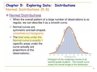
Exploring Quantitative Data 33 We now have a kit of graphical and numerical tools for describing distributions. We also have a strategy for exploring data on a single quantitative variable. Now, we’ll add one more step to the strategy. Exploring Quantitative Data Always plot your data: make a graph. Look for the overall pattern (shape, center, and spread) and for striking departures such as outliers. Calculate a numerical summary to briefly describe center and spread. Sometimes the overall pattern of a large number of observations is so regular that we can describe it by a smooth curve. 33
Density Curves Example: Here is a histogram of vocabulary scores of 947 seventh graders. The smooth curve drawn over the histogram is a mathematicalmodelfor the distribution. 34
Density Curves The areas of the shaded bars in this histogram represent the proportion of scores in the observed data that are less than or equal to 6.0. This proportion is equal to 0.303. Now the area under the smooth curve to the left of 6.0 is shaded. If the scale is adjusted so the total area under the curve is exactly 1, then this curve is called a density curve. The proportion of the area to the left of 6.0 is now equal to 0.293. 35
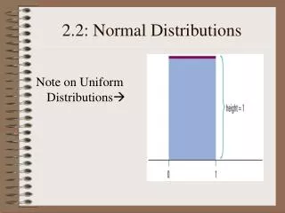
Density Curves A density curveis a curve that: • is always on or above the horizontal axis • has an area of exactly 1 underneath it A density curve describes the overall pattern of a distribution. The area under the curve and above any range of values on the horizontal axis is the proportion of all observations that fall in that range. 36
Density Curves Our measures of center and spread apply to density curves as well as to actual sets of observations. 37 Distinguishing the Median and Mean of a Density Curve • The medianof a density curve is the equal-areas point―the point that divides the area under the curve in half. • The meanof a density curve is the balance point, at which the curve would balance if made of solid material. • The median and the mean are the same for a symmetric density curve. They both lie at the center of the curve. The mean of a skewed curve is pulled away from the median in the direction of the long tail. 37
Density Curves • The mean and standard deviation computed from actual observations (data) are denoted by and s,respectively. • The mean and standard deviation of the actual distribution represented by the density curve are denoted by µ (“mu”) and (“sigma”),respectively. 38
Normal Distributions One particularly important class of density curves are the Normal curves, which describe Normal distributions. • All Normal curves are symmetric, single-peaked, and bell-shaped. • A Specific Normal curve is described by giving its mean µ and standard deviation σ. 39
Normal Distributions A Normal distributionis described by a Normal density curve. Any particular Normal distribution is completely specified by two numbers: its mean µ and standard deviation σ. • The mean of a Normal distribution is the center of the symmetric Normal curve. • The standard deviation is the distance from the center to the change-of-curvature points on either side. • We abbreviate the Normal distribution with mean µ and standard deviation σ as N(µ,σ). 40
The 68-95-99.7 Rule The 68-95-99.7 Rule In the Normal distribution with mean µ and standard deviation σ: • Approximately 68% of the observations fall within σ of µ. • Approximately 95% of the observations fall within 2σ of µ. • Approximately 99.7% of the observations fall within 3σ of µ. 41
The 68-95-99.7 Rule The distribution of Iowa Test of Basic Skills (ITBS) vocabulary scores for 7th-grade students in Gary, Indiana, is close to Normal. Suppose the distribution is N(6.84, 1.55). • Sketch the Normal density curve for this distribution. • What percent of ITBS vocabulary scores are less than 3.74? • What percent of the scores are between 5.29 and 9.94? 42
If a variable x has a distribution with mean µ and standard deviation σ, then the standardized value of x, or its z-score, is Standardizing Observations All Normal distributions are the same if we measure in units of size σ from the mean µ as center. The standard Normal distributionis the Normal distribution with mean 0 and standard deviation 1. That is, the standard Normal distribution is N(0,1). 43
The Standard Normal Table Because all Normal distributions are the same when we standardize, we can find areas under any Normal curve from a single table. The Standard Normal Table Table A is a table of areas under the standard Normal curve. The table entry for each value z is the area under the curve to the left of z. 44
The Standard Normal Table Suppose we want to find the proportion of observations from the standard Normal distribution that are less than 0.81. We can use Table A: P(z < 0.81) = .7910 45
Normal Calculations Find the proportion of observations from the standard Normal distribution that are between –1.25 and 0.81. Can you find the same proportion using a different approach? 1 – (0.1056+0.2090) = 1 – 0.3146 = 0.6854 46
Normal Calculations How to Solve Problems Involving Normal Distributions Express the problem in terms of the observed variable x. Draw a picture of the distribution and shade the area of interest under the curve. Perform calculations. • Standardizex to restate the problem in terms of a standard Normal variable z. • Use Table A and the fact that the total area under the curve is 1 to find the required area under the standard Normal curve. Write your conclusion in the context of the problem. 47
.10 ? 70 Normal Calculations According to the Health and Nutrition Examination Study of 1976–1980, the heights (in inches) of adult men aged 18–24 are N(70, 2.8). How tall must a man be in the lower 10% for men aged 18–24? N(70, 2.8) 48
N(70, 2.8) .10 ? 70 Normal Calculations How tall must a man be in the lower 10% for men aged 18–24? Look up the closest probability (closest to 0.10) in the table. Find the corresponding standardized score. The value you seek is that many standard deviations from the mean. Z = –1.28 49
N(70, 2.8) .10 ? 70 Normal Calculations How tall must a man be in the lower 10% for men aged 18–24? Z = –1.28 We need to “unstandardize” the z-score to find the observed value (x): x = 70 + z(2.8) = 70 + [(1.28 ) (2.8)] = 70 + (3.58) = 66.42 A man would have to be approximately 66.42 inches tall or less to place in the lower 10% of all men in the population. 50