Download
1 / 19
190 likes | 213 Views
Explore the principles of positive and negative space design, composition techniques, and applying the Golden Ratio and Rule of Thirds for balanced and visually appealing artworks. Dive into creating compelling compositions using realistic hands.

E N D
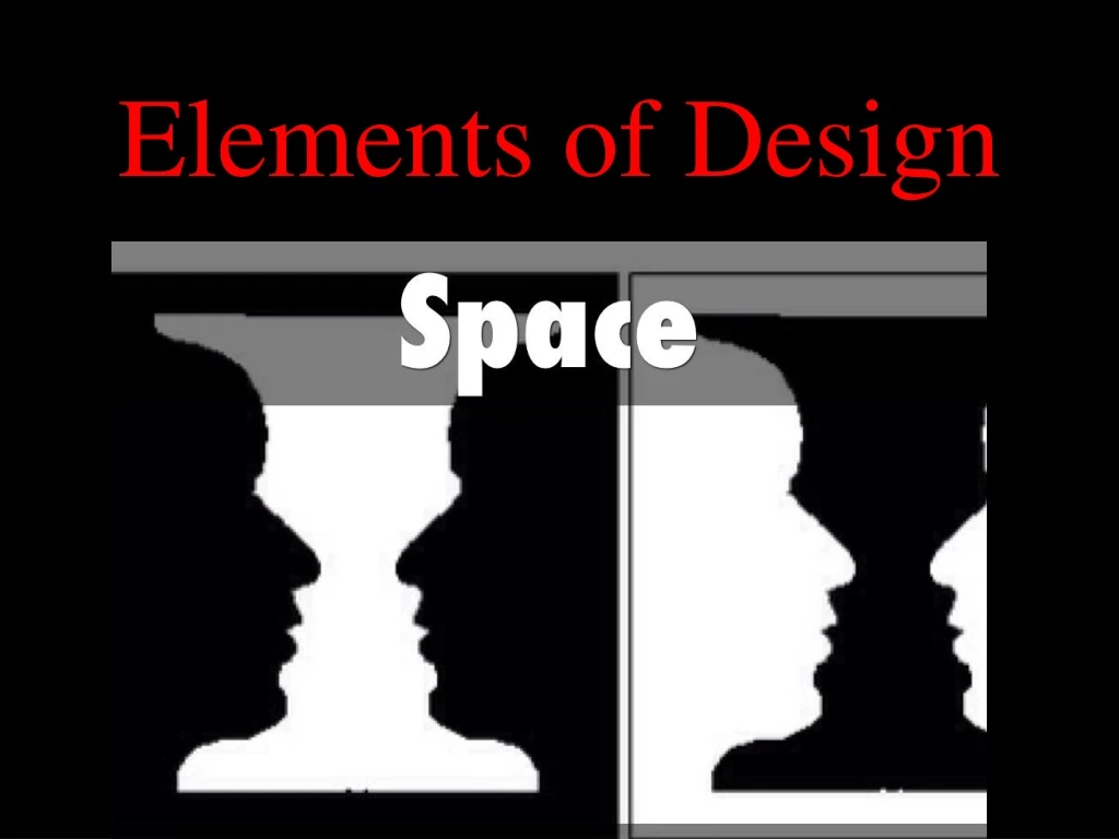
Positive/Negative SPACE • Positive Space is the primary shape, form, subject matter in the composition • Negative Space is the name given to the leftover space in your design, the part that is not taken up by subject matter. • This is also sometimes called the “ground”. • Negative space should always be designed. • If you look at your design as a silhouette, the space left over should be well balanced and interesting in shape.
positive/negative space • Negative space should always be considered in a composition. • If you look at your design as a silhouette, the space left over should be well balanced and interesting in shape.
Frank Miller (master of negative space) – Sin City comic book panel
Even if you remove the details to the point of not knowing what this is, the distribution of black (positive) and white (negative) is even, balanced and creates interesting shapes and forms.
Negative Space can also become part of the design. In the following examples, instead of simply being altered to create an interesting form, it has become an additional design element or shape.
COMPOSITION • In the visual arts—in particular drawing, painting, graphic design, photography, and sculpture—compositionis the placement or arrangement of visual elements or ingredients in a work of art, as distinct from the subject of a work.
Golden RatioThe idea was started by the ancient Greeks, who were strong believers in the Platonic concept of ideals. • They believed that all things, both tangible and intangible, have a perfect state of being that define them. • They also felt that one should always strive toward achieving this ideal state, be it in mathematics, one's physique, politics or aesthetics. • Like implied lines and contrasting values, color can be used to draw the viewer's eye to anywhere we want • Greek mathematicians, after repeatedly seeing similar proportions in nature and geometry, developed a mathematical formula for what they considered an ideal rectangle: a rectangle whose sides are at a 1:1.62 ratio. • They felt that all objects whose proportions exhibited this were more pleasing, whether a building, a face or a work of art.
Rule of Thirds • This states that if you divide any composition into thirds, vertically and horizontally, then place the key elements of your image either along these lines or at the junctions of them. You'll achieve a more pleasing arrangement. • The Rule of Thirds works because it demands that the artist makes one element more dominant than another. This dominance creates an imbalance, and an imbalance of any sort will always attract the viewer's eye. • Bisecting an image perfectly in half creates the least amount of interest, because everything is equally balanced. Asymmetrical is key.
Implied Lines • These are probably the most important aspect of a composition, because you notice them first. When painting realistically, there's no actual line around a subject. • The illusion of a contour is a result of different values and colors contrasting. But even the impression of a line is strong, and our eyes will go to it and follow its length until it ends, or until it meets another line, which we'll follow again. A great composition makes strong use of this natural attraction to lines.
REALISTIC HANDS COMPOSITION PROJECT • Use a ruler and draw a border for your paper 1” x 1” • Draw a thumbnail sketch 4” x 6” in your sketchbook to pre-plan your COMPOSITION • Estimate how many realistic life-size hands you can fit into your paper • Start drawing hands in contour outline on your paper • Add value showing a range in the negative space and one finished hand in the positive space 100pts.