Download
1 / 6
70 likes | 85 Views
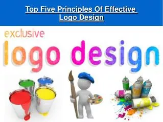
Logo design is a process that gets easier when people approach it with a solid plan, experience as well as knowledge. Here we discuss rules and principles of logo designing if you want to create an effective and successful logo.

E N D
What are the 6 Principles of Logo design? What is Logo design? Logo design is a process that gets easier when people approach it with a solid plan, experience as well as knowledge. To create something appealing and extraordinary, it’s important to know the principles of graphic design and basics. Firstly determine who your customer is and what you want to tell them through the logo. Logo design is the best way to communicate your message to your customer. Read the below-mentioned rules and principles of logo designing if you want to create an effective and successful logo. So without further ado, these are the 6 key principles of logo designing you should know about: 1.Simplicity
The simplicity of the logo is necessary what helps a logo stand up against the challenges of time and what makes it replicable and easy to work with. Your logo should be as clear and visible as possible which is able to convey your philosophy. For instance- the Google and Nike logo, it’s so simple. The thing that matters a lot is the colors, typeface, and graphics at this step. Is your logo is made up of different shades, fonts, letters, and images? You need to choose just a few active elements for your logo design. Because elements overcrowded on a logo does not make it look good. Simplicity also requires excellent use of spacing. Some elements need to breathe so that your logo stands out and clearly communicates to your audience. 2. Originality Your logo should look unique and original so that it can easily attract attention. Also, you should design it in such a way that it becomes memorable enough to remain in people’s minds. Your logo should be different to attract attention and be memorable enough to remain in people’s minds. First of all, think of all the amazing and unforgettable logos that come in your memory such as Starbucks, UPS, and Apple are at the top of the list. You may remember them because you have seen their logo many times. Also because they are original and attractive. If your logo is
unique and original, it will surely stand out from the crowd by being different and memorable. Your logo must attract people at first glance so that people remember it when they need to use that type of service your brand offers. With repeat interactions, people will be able to express trust and reliability towards your brand. A unique logo design with a unique concept is the need to grasp customer attention. While logo designing artistry usually meets with great and new ideas and a firm grasp of consumer design. A skilled graphic designer will be able to respond to the logo according to your goals and considerations in mind. 3. Versatility Logo plays important role in creating brand identity and your logo has a big job. It will adorn all of your products, shop signage, digital ads, and much more such as T-shirts and bumper stickers. Because it’s essential to make it versatile and adaptable to land. In addition, a simple logo that can be easily recognizable helps with versatility. Another way to make your logo versatile is by making it responsive. Because these are usually adaptive because they may have a great way to achieve versatility is with a responsive logo. Also, you will find that responsive logos have different variations of size, complexity, or even color to accommodate and adapt wherever they are placed.
The thumb rule is that your logo should go with any color and background. This simply means that logo needs to look good in both black and white colors with no effects. Is your logo still carry your company’s voice? 4. Scalability Your logo should be scalable which means it should be able to adopt any design. It should easily fit a giant billboard and a tiny pen too. According to the adaptability principle, your company logo should be scalable to represent your brand anywhere. A scalable logo needs to make sense which means it looks good and should be eligible for all sizes. Whether you need to print it for a huge poster, tiny business card, etc. If you add too much detail to your logo then it will become harder to scale down to the logo for a small size. Therefore, to scale it properly, you need to get created it in vector format. 5. Balance & proportion Most humans find balanced designs more beautiful. Therefore a well- proportioned design should have a balance between the various elements. In this way, you can make up your logo. Proportion simply refers to the weight of various elements that are used to make up your logo. From a practical perspective, the right proportions will be helpful to make your logo look amazing and help it to make sense. Some symmetrical logos are balanced through equally weighted elements that are aligned. On the other hand, you can also balance asymmetrical
designs by using opposite weights to create a composition that may not be even but still has equilibrium. 6. Timelessness A timeless logo looks good even after ten years same as it looks today. While designing the logo, you should look for a classic look. You may have noticed that 70s-inspired logos are in the rage, but they might be played out in a year. Epic logos stand out from other companies’ logo designs because when you start paying attention to logo principles and the rules that last then. With the company’s growth and changes, a logo will remain constant with various fundamentals and ideals. If your company’s logo will be quirky or timely then it will help your company’s brand to gain attention at the moment but it might lose that attention in the future. Something that speaks to you and speaks for you (i.e. your company logo) will stay by your side for a long duration. Let’s test out logo design principles by imagining the same scenario: Firstly think about the thought of your logo again and again. Now decide, would your explanation still feel valid 5 or 10 years from now? Apply these logo principles while designing a logo to get an outstanding result. Because your logo reflects your brand’s voice and face, therefore, it should look like an attention grabber. It has lots of responsibility and the graphic designer has to fulfill his all responsibility by creating it as thoughtfully as possible.
These 6 logo design principles will surely guide you and help you test your ideas. Use these principles for logo designing to see what works and to find flaws in your logo design. Reference: https://medium.com/@createdxb0/what-are-the-6- principles-of-logo-design-ff7a6119c0e4