Download
1 / 43
430 likes | 594 Views
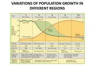
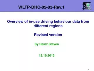
WLTP-DHC-05-03-Rev.1. Overview of in-use driving behaviour data from different regions Revised version. By Heinz Steven 12.10.2010. 1. Data Sources. Table 1. 2. Comparison of vehicle speed distributions.

E N D
WLTP-DHC-05-03-Rev.1 Overview of in-use driving behaviour data from different regions Revised version By Heinz Steven 12.10.2010 1
Data Sources Table 1 2
Comparison of vehicle speed distributions • Figure 1 shows the overall vehicle speed distributions for the different data sources. The speeds in Japan and Korea (and for some EU N1 vehicles) are significantly lower than the speeds for M1 vehicles in Europe. • It is the other way round for the stop percentages. • Figure 2 shows the speed distributions without the stops. 3
Overall speed distributions Figure 1 4
Overall speed distributions Figure 2 5
Urban streets • Figure 3 shows the vehicle speed distributions for urban areas. Only that data was used where the road category is indicated. This was not the case for the Swedish data. • For the JRC data the road category is only partly indicated. This might explain the low stop percentages. • Figure 4 shows the distributions without the stops. • The envelopes of the speed curves are formed by data from Germany (2007 the lower end, 1998 the higher end). The 2007 data is from an urban main street in Berlin, the 1998 data from Aachen and thoroughfares of villages in the Aachen region. 6
Urban streets • The differences can be explained by different traffic load conditions. • The data from Japan and Korea is from agglomerations with high traffic loads, while the European data also contains conditions with lower traffic loads (e.g. M1 in Switzerland and Belgium). • Interestingly enough, there seems to be no significant difference in the speed ranges for urban between the different regions. • The differences between N1 and M1 are higher in Europe than in Japan or Korea with the tendency of lower speeds for N1 compared to M1. But this needs to be further investigated. 7
Speed distributions for urban areas Figure 3 8
Speed distributions for urban areas Figure 4 9
Rural roads • Figures 5 and 6 show the speed distributions for rural roads. • The Japanese, Korean and Belgium data have stop percentages around 14%, the distributions for M1 are almost the same. Korean M2 and N1 data have lower percentages of high speeds. • The other European data have stop percentages below 5% and higher speeds up to 120 km/h compared to up to 100 km/h for Korea and up to 80 km/h for Japan. • The highest speeds were found for the old German data from the Aachen region. 10
Rural roads • The comparison between M1 and N1 has no uniform result. No difference for Japan, lower speeds for N1 for Korea and France, higher speeds for N1 for Switzerland. 11
Speed distributions for rural areas Figure 5 12
Speed distributions for rural areas Figure 6 13
Motorways • The biggest differences between the regions (Europe, Korea, Japan) were found for motorways (Figures 7 and 8). • The median values are 40 km/h for Japan, 60 km/h for Korea and between 100 km/h and 120 km/h for Europe. • The 95% percentiles are around 90 km/h for Korea, 100 km/h for Japan and between 125 km/h and 145 km/h for Europe. • Figure 9 shows the distributions for all road catego-ries for France, Korea and Japan. The motorway curve for Korea has a higher percentage of low speeds than the rural curve (figure 10). 14
Speed distributions for motorways Figure 7 15
Speed distributions for motorways Figure 8 16
Comparison of speed distributions Figure 9 17
Comparison of speed distributions Figure 10 18
Comparison of RPA • Basis of the RPA analysis are short trips with a minimum duration of 10 s. • Figure 11 shows an overview of nearly all data except the second dataset from France. The differences between the regions are minor for M1 vehicles. • Figure 12 shows the European data. The lowest dynamic is found for the Swedish M1 data, the highest for the Italian M1 and the old German data. • Figures 13 to 15 show comparisons between M1 and N1 vehicles in Korea, Japan and Sweden. The differences for Japan and Korea are as expected, but the differences for Sweden need further investigation. • Figure 16 shows the 2 French datasets. 19
Comparison of RPA Figure 11 20
Comparison of RPA Figure 12 21
Comparison of RPA Figure 13 22
Comparison of RPA Figure 14 23
Comparison of RPA Figure 15 24
Comparison of RPA Figure 16 25
Comparison of RPA • The next series of figures show the average RPA values versus average speed of the short trips for the different vehicles tested in each region/country. • The differences between individual drivers are higher than the differences between the regions/countries. 26
Average RPA, France, 1. dataset Figure 17 27
Average RPA, Belgium Figure 18 28
Average RPA, Switzerland Figure 19 29
Average RPA, Sweden Figure 20 30
Average RPA, Germany Figure 21 31
Average RPA, Italy Figure 22 32
Average RPA, Slovenia Figure 23 33
Average RPA, Japan, M1 Figure 24 34
Average RPA, Japan, N1 Figure 25 35
Average RPA, Korea Figure 26 36
Comparison of RPA • Figure 27 shows a comparison of the average values, figure 28 a comparison of the 95% percentiles for different regions/countries. • Figure 28 is limited to M1 vehicles only. The French data is from the 2nd dataset. • Figure 29 shows the comparison of M1 and N1 vehicles for Korea, Japan and Sweden. 37
Average RPA, different regions Figure 27 38
Average RPA, different regions Figure 28 39
Average RPA, M1 vs N1 Figure 29 40
Analysis of first short trips of the day • Since the WLTP cycle will be measured with a cold start, Sweden raised the question that the first short trip of the urban cycle part should be representative for the first short trip of the day of the in-use data. • Therefore that part of the data that contained daytime information was analysed with respect to the first short trips per day. Short trips below 10 s duration were disregarded. • The results are shown in Table 2. The first short trips show huge variances in all regions. The European data has the highest, the Korean data the lowest variance. The average and maximum speeds are lowest in Europe and highest in Korea. 41
Analysis of first short trips of the day Table 2 42
End of presentation • Thank you for your patience! 43