Download
1 / 6
60 likes | 200 Views
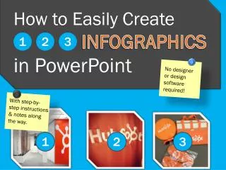
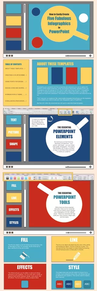
How to Easily Create Five Fabulous Infographics In PowerPoint. ABOUT THESE TEMPLATES. TABLE OF CONTENTS. ABOUT THESE TEMPLATES ... 1 CREATING A COLOR SCHEME… 2 USING FONTS FOR DESIGN…… 3 DESIGN ICONS AND SHAPES…. 4 WORKING WITH A THEME……... 5 CONCLUSION & RESOURCES… 6.

E N D
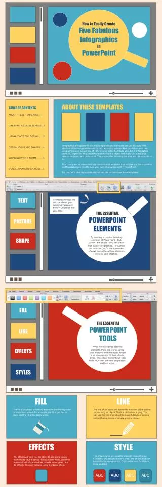
How to Easily Create Five Fabulous Infographics In PowerPoint ABOUT THESE TEMPLATES TABLE OF CONTENTS ABOUT THESE TEMPLATES ...1 CREATING A COLOR SCHEME…2 USING FONTS FOR DESIGN……3 DESIGN ICONS AND SHAPES….4 WORKING WITH A THEME……...5 CONCLUSION & RESOURCES…6 Infographics are a powerful tool that companies and marketers can use to capture the attention of their target audiences. In fact, according to AnsonAlex, publishers who use infographics grow an average of 12% more in traffic than those who don’t. Infographics allow you to present what would normally be hard-to-digest information, in a way that readers can enjoy and understand. The problem lies in finding the time and resources to do so. That’s why we’ve created six fully customizable templates that will give you the inspiration and foundation you need to build your own infographics right in PowerPoint. But first, let’s dive into some tools you can use to customize these templates. TEXT To insert an image like the one above, you can simply drag any PNG or JPEG file into your slide. THE ESSENTIAL POWERPOINT ELEMENTS PICTURE By learning to use the three key elements of PowerPoint – text, picture, and shape – you can create high-quality infographics. Throughout this template, you’ll learn a number of ways to use these three elements to create your graphics. SHAPE FILL THE ESSENTIAL POWERPOINT TOOLS LINE While there are three essential elements, there are four essential tools that you will be using to design your infographics: fill, line, effects, styles. These four elements will help build your color scheme, shape style, and font styles. EFFECTS STYLES FILL LINE The fill of an object or text will determine the primary color of that object or text. For example, the fill of this box is blue, and the fill of this text is white. The line of an object will determine the color of the outline surrounding an object. The line of this box is grey. You can use the line of an object to make it stand out among colored backgrounds or simply give it a border. EFFECTS STYLE The shape styles give you the option to choose from a number of pre-designed colors, lines, and effects that can be applied to your graphics. This can be used for objects, lines, and text. The effects will give you the ability to add some design elements to your graphics. You can work with a variety of features that include shadows, bezels, outer glows, and 3D effects. The icon below is using a shadow effect. ABC ABC ABC ABC
CREATING A FOUR COLOR INFOGRAPHIC When creating an infographic, you should start by determining what color scheme you would like to use. A four color setup gives you plenty of creative freedom to work with. More than that can look a bit chaotic. USE CLIP ART, CUSTOM SHAPES, AND FONTS OVER 400 OPTIONS Microsoft has a variety of clip art that you can download from their online database. ] Fonts like Wingdings can be used to add custom icons and images to your text. Combining custom shapes can give you a variety of useful images to convey your data. Change a shape’s look by altering the colors of the Fill and Line of that shape. Double click your shape to access those options in the tool bar at the top. 50% BREAK UP YOUR SECTIONS WITH A CHANGE IN STYLE A helpful tip about breaking up your infographic into distinguishable sections is to simply change up the style. You can use a different set of custom shapes or text, or inverse the color scheme. This can help indicate to viewers that they are now looking at a section of statistics or a section of explanatory information.
ALTERNATING FONT SIZES CONVEYING STATISTICS There are times when we have a staggering amount of information that we can’t present with an image-heavy infographic. These times call for styles of design that focus more on the fonts and how they can give your infographic a professional look without the clutter of too many images. INFORMATION USE YOUR COLORS 70 SQUIRRELS ALTERNATE THE COLOR OF YOUR TEXT TO EMPHASIZE CERTAIN DATA PREFER PEANUT BUTTER OVER JELLY PEOPLE MIX AND MATCH SHAPES 9 OUT OF 10 OVER MARKETERS 100 WILL SHARE THIS SHAPES TIME CAN BE USED TO CREATE GRAPHICS 68 YEARS UNTIL PUPPIES TIMELINES TAKE OVER THE WORLD VIDEOS OF CATS STATEMENTS 2014 2012 2013 2015 INBOUND MARKETERS ARE RESPONSIBLE FOR FINDING LIFE ON MARS GRAPHS 10 ATTENTION SPAN OF PEOPLE 9 RANDOM THOUGHTS 8 7 6 YOU CAN’T CATCH APPLES BY THROWING ORANGES 5 4 3 2 1 2010 2011 2012 2009 400 BILLION STARS IN THE MILKY WAY You’ll notice that this infographic was created entirely from basic shapes and alternating font sizes. By focusing your design on two simple aspects, you can accomplish an intricate outcome. For an infographic of this style, I would suggest using no more than three colors and stick to one font to make things simpler. DON’T LEAVE TOO MUCH WHITE SPACE An important thing to remember when designing an infographic is to keep your use of white space to a minimum. Although white space can be useful, too much will spread your data too far apart and break the flow of your infographic. When you’ve finished designing your graphic, take a few minutes to adjust and move your elements around to find that perfect level of spacing.
COMPARING TWO SIDES OF THE SAME COIN When creating an infographic for comparing data, one of the easiest design tips is to simply split your infographic in half. Use two distinct colors and give each set of data its own side on the page. You can do this by choosing one color for each side, and then use the basic shapes to create two parts to your infographic. As you can see, we’re using blue and red with white as the general font color. 1 1 2 50 50 DIFFERENT FONTS FOR HEADERS FOR TEXT GROUP YOUR SHAPES When creating custom graphics from an assortment of shapes, it can help to “group” those shapes when you need to resize or move them around your infographic. BAR GRAPHICS CAN BE EASILY MADE Learn to use a variety of shapes to create interesting graphs, charts, and other visualizations to show off your data points. You can do this by right clicking the object above, navigate to “Grouping,” and click “Ungroup” to break this object into its individual shapes. To regroup it, just highlight all the pieces, right click, and choose “Group” from the menu. Hold the Shift key to select more than one element at a time. SHAPES THAT LOOK LIKE GRAPHS Each of these icons was created from individual shapes and lines offered by PowerPoint. Using a combination of basic shapes, rectangles, and lines, we were able to create some commonly used icons for infographics. You should start by choosing a base color. We used white as the base color of our icons and blue or red to create the details. 31 Don’t forget to hold the Shift key when selecting multiple pieces of one icon. Once you’ve selected each element of the icon, you should “group” it so that you can more easily move and scale the object. The icons seen here are not limited to any particular color scheme, size, or shape. Experiment with your own company colors and style to find what works for you. As we mentioned before, try sticking to fewer than 4 main colors for your infographics. This will give your designs a professional feel that looks vibrant but not too busy. The goal of this infographic is to illustrate two distinctly different sides and compare them visually for the viewers. Breaking your data into two sides will do the job well.
Pinterest Inspired Infographic: Tiles! Get to the Point Tiles let you organize your information and graphics. Large tiles should be used to showcase a main point or some important data your infographic is based around. It doesn’t hurt to use lovable icons that your readers can connect to the data. Don’t forget to pay attention to consistent sizes and spacing. 1 in 3 marketers will… A lot of people use cell phones Use a variety of tile sizes to fill up your infographic. Use the person icon to illustrate statistics involving people. Simple icons can be great for representing simple statistics. Over 1,000 people get struck by lighting each year in the U.S. Explosions = Michael Bay Movies Most of the stars you view from Earth are binary stars. The moon is the only natural satellite of the Earth. Random Bar Graph Information Be sure to label your bar graph so your viewers are aware of what they are looking at. About 4.1 billion text messages are sent per day in the U.S. Half the time, I’m right all the time. Most people don’t know that panda bears can move in four different directions AT ONCE. The total amount of water on Earth is about 326 million cubic miles. Follow Me on Twitter @DetectiveDDubs 12 Million laptops go missing at U.S. airports per week! Webcams have been in existence for fewer than 20 years.
SAVING YOUR INFOGRAPHIC Once your infographic is ready, you’ll need to save the PowerPoint slide as an image. Simply go to File Save As and select PNG (Portable Network Graphics). Saving the slide in PNG is an important aspect of your final product. The PNG format is the only file type that will give your infographics the high quality they need for publishing. CONCLUSION HOW THIS WILL HELP YOUR INBOUND MARKETING STRATEGY The rise of visual content on the internet creates a demand for high quality, educational, and entertaining content. One issue with large amounts of educational information -- like statistics -- is that these types of information can be hard to digest if presented incorrectly. The infographic provides you with a highly visual and easily sharable platform to display your content. This will allow you to better communicate your information to the readers and offer them an easier way to share your wisdom with their world of friends, colleagues, and peers. Now that you’ve got a set of great templates and some inspiration, start creating! Remember to have fun and experiment with your infographics to find which colors, fonts, and styles work best for yourself and your company. WANT TO MEASURE THE SUCCESS OF YOUR INFOGRAPHICS? Collect Visual Content Insights with HubSpot’s Social Media Tools As mentioned earlier, publishers who use infographics grow in traffic an average of 12% more than those who don’t. But how do you actually measure the business impact of your infographics? By uploading and sharing your visual content through HubSpot’s social media tools, you can get actual marketing insight into how much traffic your infographics are sending to your website! By starting a free trial of our social media tools, you can start sharing your infographics right away, and start watching the metrics roll in! Click here to unveil such insights today: http://bitly.com/HS-Free-Social-Tool Sources - HubSpot http://bitly.com/InfographFreeTrial