Download
1 / 33
330 likes | 340 Views
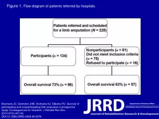
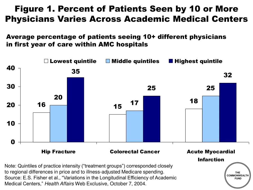
Figure 1. Percent of Patients Seen by 10 or More Physicians Varies Across Academic Medical Centers. Average percentage of patients seeing 10+ different physicians in first year of care within AMC hospitals.

E N D
Figure 1. Percent of Patients Seen by 10 or More Physicians Varies Across Academic Medical Centers Average percentage of patients seeing 10+ different physiciansin first year of care within AMC hospitals Note: Quintiles of practice intensity (“treatment groups”) corresponded closelyto regional differences in price and to illness-adjusted Medicare spending. Source: E.S. Fisher et al., “Variations in the Longitudinal Efficiency of AcademicMedical Centers,” Health Affairs Web Exclusive, October 7, 2004.
Figure 2. Private-Public Collaboration Needed to Improve Availability of Quality and Cost Information Source: P. Fronstin, S.R. Collins, Early Experience with High-Deductible andConsumer-Driven Health Plans: Findings From the EBRI/Commonwealth FundConsumerism in Health Care Survey, EBRI Issue Brief, December 2005.
Figure 3. Physicians’ Access to Quality-of-Careor Performance Data on Their Own Care Percent receiving data on the following aspects of patient care Source: The Commonwealth Fund National Survey of Physicians and Quality of Care.
Figure 4. Availability of Quality-of-Care Data When Making Referrals Percent indicating how often they have any data about a physician’s quality of care when making referrals Rarely 32% Sometimes 16% 64% Often 14% Never 32% Always 5% Source: The Commonwealth Fund National Survey of Physicians and Quality of Care.
Figure 5. Hospital Charges for AMI–Medical Management Vary Eight-Fold Across Large Pennsylvania Hospitals Dollars Lowest mortality hospital $21,846* *This hospital demonstrated significantly lower than expected in-hospital mortality rates. Note: Hospital charge equals patient total charge excluding professional fees; all hospitals shown provided advanced cardiac services (angioplasty/stent procedures), had >100 cases, and <5% of cases transferred to another acute care facility. Source: Pennsylvania Health Care Cost Containment Council, Hospital Performance Results, Hospital discharges between January 1, 2003 and December 31, 2003, www.phc4.org.
Figure 6. Top-Ranked and Bottom-Ranked Performances in Measures of Quality of Care for AMI, CHF, and Pneumonia Among the 40 Largest Hospital-Referral Regions* *AMI denotes acute myocardial infarction, and CHF congestive heart failure. Source: A K. Jha, Z. Li, E. J. Orav, and A. M. Epstein, “Care in U.S. Hospitals—The Hospital Quality Alliance Program,” New England Journal of Medicine 353 (July 21, 2005): 265–74.
Figure 7. Physicians’ Willingnessto Share Quality-of-Care Data Yes, Definitely/ Probably No, Definitely/ Probably Not Willingness to share data with:* Medical leadership 71% 27% Physicians’ own patients 55% 44% General public 69% 29% Other physicians 26% 72% *Answers to survey question: “To improve high quality of care in the U.S., which of the following do you think should have access to ‘Quality of Care’ data about individual physicians?” Source: The Commonwealth Fund National Survey of Physicians and Quality of Care.
Figure 8. Hospital CEO Opposition to Disclosure of Quality Information to the Public Source: The Commonwealth Fund 2003 International Health Policy Survey of Hospital Executives.
Figure 9. Most Costs Are Concentrated in the Very Sick Distribution of Health Expenditures for the U.S. Population, By Magnitude of Expenditure, 1997 Expenditure Threshold (1997 Dollars) 1% 5% 10% $27,914 27% 50% $7,995 55% $4,115 69% $351 97% Source: A.C. Monheit, “Persistence in Health Expenditures in the Short Run: Prevalence and Consequences,” Medical Care 41, supplement 7 (2003): III53–III64.
Figure 10. Most Trusted Sources for Information on Health Care Providers, by Insurance Source Percent of adults 21-64 Note: Comprehensive = plan w/ no deductible or <$1000 (ind), <$2000 (fam); HDHP = plan w/ deductible $1000+ (ind), $2000+ (fam), no account; CDHP = plan w/ deductible $1000+ (ind), $2000+ (fam), w/ account. Source: EBRI/Commonwealth Fund Consumerism in Health Care Survey, 2005.
Figure 11. “Perception that Health Care Is Free”*Is Not the Problem National Health Expenditures per Capita, US$ United States Canada Germany Australia Netherlands France OECD Median Japana New Zealand a Out-of-Pocket Health Care Spending per Capita, US$ a 2002 *Allan Hubbard, Director of the National Economic Council, February 14, 2006. Note: Adjusted for Differences in the Cost of Living, 2003. Source: Bianca K. Frogner and Gerard F. Anderson, “Multinational Comparisons of Health Systems Data, 2005,” The Commonwealth Fund, Forthcoming.
Figure 12. Consumers Spending More Out-of-Pocket for Health Care Dollars spent per capita (in 2004 dollars) $788 $774 $667 $583 $577 Source: C. Smith et al., “National Health Spending in 2004: Recent Slowdown Led by Prescription Drug Spending,” Health Affairs 25, no. 1 (January/February 2006); Centers for Medicare and Medicaid Services, National Health Expenditures Data; http://www.cms.hhs.gov/NationalHealthExpendData/downloads/tables.pdf
Spent >10% of income, or >5% of income if low-income* Spent >10% of income Figure 13. Nearly One of Six FamiliesSpent 10% or More of Income (or 5% or More if Low-Income) on Out-of-Pocket Medical Costs, 2001–02 Percent of families with high out-of-pocket medical costs relative to income, not including premiums *Low-income includes families with incomes <200% of the federal poverty level. Source: M. Merlis, D. Gould and B. Mahato, Rising Out-of-Pocket Spending for Medical Care: A Growing Strain on Family Budgets (New York: The Commonwealth Fund) February 2006.
Figure 14. Cost-Sharing Reduces Use of Both Essential and Less Essential Drugs and Increases Risk of Adverse Events Percent reduction in drugs per day Percent increase in incidence per 10,000 Source: R. Tamblyn et al., “Adverse Events Associated With Prescription Drug Cost-Sharing Among Poor and Elderly Person,” JAMA 285, no. 4 (2001): 421–429.
Figure 15. Distribution of Individuals Covered by Private Health Insurance, by Type of Health Plan Note: Comprehensive = plan w/ no deductible or <$1000 (ind), <$2000 (fam); HDHP = plan w/ deductible $1000+ (ind), $2000+ (fam), no account; CDHP = plan w/ deductible $1000+ (ind), $2000+ (fam), w/ account. Source: EBRI/Commonwealth Fund Consumerism in Health Care Survey, 2005.
Figure 16. FEHBP HDHP/HSAs Plans Enroll 7,500 out of 9 Million Covered Lives Percent Note: As of March 2005. Source: Government Accountability Office, Federal Employees Health Benefits Program First-Year Experience with High-Deductible Health Plans and Health Savings Accounts, Washington, DC: GAO, January 2006; OPM, http://www.opm.gov/insure/handbook/FEHBhandbook.pdf
Figure 17. Enrollees Who Chose HDHPs from the Federal Employees Health Benefits Program Are More Likely to Earn Higher Incomes Percent of FEHBP enrollees with incomes ≥ $75,000 Source: Government Accountability Office, Federal Employees Health Benefits Program First-Year Experience with High-Deductible Health Plans and Health Savings Accounts, Washington, DC: GAO, January 2006.
Figure 18. Age Distribution of HDHP and Other FEHBP Enrollees Percent FEHBP enrollees Source: Government Accountability Office, Federal Employees Health Benefits Program First-Year Experience with High-Deductible Health Plans and Health Savings Accounts, Washington, DC: GAO, January 2006.
Figure 19. Percentage of Individuals Covered by Employment-Based Health Benefits With No Choice of Health Plan, by Type of Health Plan Note: Comprehensive = plan w/ no deductible or <$1000 (ind), <$2000 (fam); HDHP = plan w/ deductible $1000+ (ind), $2000+ (fam), no account; CDHP = plan w/ deductible $1000+ (ind), $2000+ (fam), w/ account. Source: EBRI/Commonwealth Fund Consumerism in Health Care Survey, 2005.
Figure 20. Satisfaction with Quality of Health Care Received, by Type of Health Plan Note: Comprehensive = plan w/ no deductible or <$1000 (ind), <$2000 (fam); HDHP = plan w/ deductible $1000+ (ind), $2000+ (fam), no account; CDHP = plan w/ deductible $1000+ (ind), $2000+ (fam), w/ account. Source: EBRI/Commonwealth Fund Consumerism in Health Care Survey, 2005.
Figure 21. Satisfaction with Out-of-Pocket Costs for Health Care, by Type of Health Plan Note: Comprehensive = plan w/ no deductible or <$1000 (ind), <$2000 (fam); HDHP = plan w/ deductible $1000+ (ind), $2000+ (fam), no account; CDHP = plan w/ deductible $1000+ (ind), $2000+ (fam), w/ account. Source: EBRI/Commonwealth Fund Consumerism in Health Care Survey, 2005.
Figure 22. Satisfaction with Choice of Doctors, by Type of Health Plan Note: Comprehensive = plan w/ no deductible or <$1000 (ind), <$2000 (fam); HDHP = plan w/ deductible $1000+ (ind), $2000+ (fam), no account; CDHP = plan w/ deductible $1000+ (ind), $2000+ (fam), w/ account. Source: EBRI/Commonwealth Fund Consumerism in Health Care Survey, 2005.
Figure 23. Overall Satisfaction with Health Plan, by Type of Health Plan Note: Comprehensive = plan w/ no deductible or <$1000 (ind), <$2000 (fam); HDHP = plan w/ deductible $1000+ (ind), $2000+ (fam), no account; CDHP = plan w/ deductible $1000+ (ind), $2000+ (fam), w/ account. Source: EBRI/Commonwealth Fund Consumerism in Health Care Survey, 2005.
Figure 24. Likelihood of Staying With Current Health Plan If Had the Opportunity to Change, by Type of Health Plan Note: Comprehensive = plan w/ no deductible or <$1000 (ind), <$2000 (fam); HDHP = plan w/ deductible $1000+ (ind), $2000+ (fam), no account; CDHP = plan w/ deductible $1000+ (ind), $2000+ (fam), w/ account. Source: EBRI/Commonwealth Fund Consumerism in Health Care Survey, 2005.
Figure 25. Likelihood of Recommending Health Plan to Friend or Co-Worker, by Type of Health Plan Note: Comprehensive = plan w/ no deductible or <$1000 (ind), <$2000 (fam); HDHP = plan w/ deductible $1000+ (ind), $2000+ (fam), no account; CDHP = plan w/ deductible $1000+ (ind), $2000+ (fam), w/ account. Source: EBRI/Commonwealth Fund Consumerism in Health Care Survey, 2005.
Figure 26. Percent of Income Spent Annually on Out-of-Pocket Medical Expenses, Including Premiums Percent of adults 21-64 spending ≥ 5% of income 92 66 (n = 61) 53 38 42 (n = 90) 34 31 17 12 33 21 18 3 4 13 12 10 9 <$50,000 Annual Income Total Health Problem** Note: Comprehensive = plan w/ no deductible or <$1000 (ind), <$2000 (fam); HDHP = plan w/ deductible $1000+ (ind), $2000+ (fam), no account; CDHP = plan w/ deductible $1000+ (ind), $2000+ (fam), w/ account. **Health problem defined as fair or poor health or one of eight chronic health conditions. Source: EBRI/Commonwealth Fund Consumerism in Health Care Survey, 2005.
Figure 27. Percent of Adults Who Have Delayedor Avoided Getting Health Care Due to Cost Percent of adults 21–64 (n = 61) (n = 90) Note: Comprehensive = plan w/ no deductible or <$1000 (ind), <$2000 (fam); HDHP = plan w/ deductible $1000+ (ind), $2000+ (fam), no account; CDHP = plan w/ deductible $1000+ (ind), $2000+ (fam), w/ account. ** Health problem defined as fair or poor health or one of eight chronic health conditions. Source: EBRI/Commonwealth Fund Consumerism in Health Care Survey, 2005.
Figure 28. Percent of Adults Who HaveSkipped Doses to Make a Medication Last Longer Percent of adults 21-64 with prescriptions in last 12 months (n = 85) (n = 50) Note: Comprehensive = plan w/ no deductible or <$1000 (ind), <$2000 (fam); HDHP = plan w/ deductible $1000+ (ind), $2000+ (fam), no account; CDHP = plan w/ deductible $1000+ (ind), $2000+ (fam), w/ account. ** Health problem defined as fair or poor health or one of eight chronic health conditions. Source: EBRI/Commonwealth Fund Consumerism in Health Care Survey, 2005.
Figure 29. Percent of Adults Who Have Not Filleda Prescription Due to Cost Percent of adults 21–64 (n = 90) (n = 61) Note: Comprehensive = plan w/ no deductible or <$1000 (ind), <$2000 (fam); HDHP = plan w/ deductible $1000+ (ind), $2000+ (fam), no account; CDHP = plan w/ deductible $1000+ (ind), $2000+ (fam), w/ account. **Health problem defined as fair or poor health or one of eight chronic health conditions. Source: EBRI/Commonwealth Fund Consumerism in Health Care Survey, 2005.
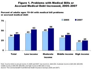
Figure 30. Medical Bill or Debt Problemsin Past Year, by Size of Deductible Percent of adults ages 19–64 with anymedical bill problem or outstanding debt* ^ ^ ^ Size of deductible Note: Adjusted percentages based on logistic regression models; controlling for health status and income. *Problems paying/not able to pay medical bills, contacted by a collection agency for medical bills,had to change way of life to pay bills, or has medical debt being paid off over time. ^Significant difference at p < .05 or better; referent category = no deductible. Source: The Commonwealth Fund Biennial Health Insurance Survey (2003).
Figure 31. HSAs Won’t Solve the Uninsured Problem: Income Tax Distribution of Uninsured 5% (27% tax bracket) 1% (30%-39% tax bracket) 23% (15% tax bracket) 55% (0% tax bracket) 16% (10% tax bracket) Source: S.A. Glied, The Effect of Health Savings Accounts on Health Insurance Coverage, The Commonwealth Fund, April 2005.
Figure 32. Medicare Physician Group Practice Demonstration • 10 physician group practices • 3-year project, began April 2005 • Bonus pool based on savings relative to local area • Practices expected to save 2%, keep up to 80% of additional savings • Actual bonuses depend on savings and quality targets • The Everett Clinic (WA) • Deaconess Billings Clinic • Park Nicollet Health Services (MN) • Marshfield Clinic (WI) • St. John’s Health System (MO) • Univ. of Michigan Faculty Group Practice • Geisinger Health System (PA) • Forsyth Medical (NC) • Middlesex Health (CN) • Dartmouth-Hitchcock Clinic Source: “Medicare Physician Group Practice Demonstration,” www.cms.gov, January 31, 2005.
Figure 33. Building Quality Into RIte CareHigher Quality and Improved Cost Trends Percent Cumulative Health Insurance RateTrend Comparison • Quality targets and$ incentives • Improved access, medical home • One third reductionin hospital and ER • Tripled primarycare doctors • Doubled clinic visits • Significant improvements in prenatal care, birth spacing, lead paint, infant mortality, preventive care RI Commercial Trend RIte Care Trend Source: Silow-Carroll, Building Quality into RIte Care, Commonwealth Fund, 2003.Tricia Leddy, Outcome Update, Presentation at Princeton Conference, May 20, 2005.