Download
1 / 2
20 likes | 132 Views
This article explores the critical relationship between Peak Oil, rising gas prices, and the implications for food storage, particularly within the context of LDS (Latter-day Saints) preparedness principles. It examines how the decline in U.S. oil production since 1974 creates a widening gap between supply and demand, leading to socioeconomic challenges. The text highlights potential future scenarios, including increased oil prices, societal changes, and a shift toward barter systems in response to energy scarcity. Understanding these dynamics is essential for planning for a sustainable future.

E N D
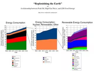
“Replenishing the Earth”orA relationship between Peak Oil, High Gas Prices, and LDS Food Storagehttp://www.walden3d.com/aspo/po/
A Graphical Definition of Peak OilM. King Hubbert published this geostatistical summary of oil production in 1969. Peak Oil is simple. When an oil field is discovered it soon is producing as fast as it will. As the oil is produced the pressure drops, and the amount of oil produced drops. This drop in production defines a decline curve. If time is the horizontal axis and production is the vertical axis, the curve looks like a lower case "n" with a long tail. When all of the oil fields in the US are added up in this same manner, it forms a normal distribution, starting at "0" in the late 1800's when the first oil well was drilled in Pennsylvania, climbing to a peak in 1974, and dropping off since then. 1974 was peak oil production in the United States. The United States will never produce as much oil again as it did in 1974. However, demand has continued to climb, and the gap between demand and supply from U.S. production is the red area of the bottom image. This red area represents US dependence on foreign oil, funding of terrorists, over use of cars and trucks for cheap transportation, the spread of suburbs, and a litany of other problems. For the past year and the next few years the world oil supply curve is flattening out and will go slightly up and down. Then it will start to fall off, just like production in the U.S fell off after 1974. There is no place else on earth to go find more oil. The gap between supply and demand will create even bigger problems. Gasoline lines. Trucker strikes. Riots. Fighting and killing in the U.S. There will be life on the other side of the panic. However, it will be very different from the life we have known. Oil prices will climb from $100/barrels to at least $200/barrel. This will happen within the next 10 years, and possibly this year. The next generation will consider this generation the most wasteful generation that ever lived, and they will read about our trips around the world with disdain. The entire world society will change because of a lack of cheap energy. It will become a barter society. Isn't that simple?