Logo Design
540 likes | 744 Views
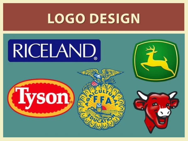
Logo Design. Introduction. John Deere. Mercedes Benz. PBS. Apple. Target. McDonald’s. Adidas. Carhart. AT&T. Batman. Atari. Netscape. Penn State. Nike. Obama Campaign ‘08. Michael Jackson Productions. Dr. Seuss. Evolution of the Pepsi Logo. Why redesign a logo?. New leadership

Logo Design
E N D
Presentation Transcript
Logo Design Introduction
Why redesign a logo? • New leadership • Financial reasons • Prospective analysis of the market • Mergers • What do you get when FedEx and UPS merge? • FedUP!
How to create a logo • Line • Shape • Figure ground • Pattern • Letterform • Contrast • Image field • Perception
Line • The way in which a line is drawn can evoke different moods or meanings. • Right angles produce a very sharp and potentially dangerous situation, whereas a soft, sensuous line implies a gentle, nonaggressive attitude.
Shape • A square is the most visually stable. Next are the circle and the triangle. • Rectangles, both horizontal and vertical, and ellipses are the most visually unstable.
Figure Ground • When positive and negative shapes interact to provide a mental puzzle.
Pattern • When creating a pattern using geometric shapes, it is tempting to create a pattern using elements of the trademark. This leads to a less unique logo.
Letterform • Using common letterforms to create unique configurations can create simple, but effective logos.
Contrast • Variations of the letterform weight and size also help create a subtle meaning in the wordmark that could not be obtained otherwise.
Image Field • The area around the object can define it as well as a literal drawing of it.
Perception • Simple linear and geometric forms can convey completely different meanings with the slightest modifications.
Criteria for Development • Visibility • Will it stand out in its surroundings to provide quick and memorable identification. • Application • How well can the symbol be used in a variety of applications?
Criteria for Development • Distinctiveness • Will the application distinguish itself from its competition? • Simplicity/Universality • Is the symbol’s concept easy to identify? • Retention • If a symbol is too easy to read, the viewer will feel no sense of discovery and thus no personal equity with the mark.
Criteria for Development • Color • A good symbol must work in a number of technologies. • Descriptiveness • Does the symbol reveal to some extent the nature of the company or product? • Timelessness
Criteria for Development • Modularity • Will the potential mark be adaptable to numerous applications? • Equity • The age, use, and recognition of a mark is also a primary consideration in its development.


