Willie Wonkie Logo Design - Playful & Modern Mini Cookies Branding
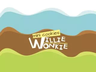
This logo design for Willie Wonkie features a playful and modern logotype in white and yellow colors. The logo includes "Willie Wonkie" text along with "mini cookies" to enhance the branding. The packaging color scheme matches the flavors. Inspired by a beverage cup, the layout displays a wavy background resembling the cup's contour. The design focus remains simple, clean, and modern, connecting characters and colors to the flavors. The unique feature is the 'cracked' cookies inside the box cover to engage customers with interactive packaging. Thank you for considering this design! - Erlinda

Willie Wonkie Logo Design - Playful & Modern Mini Cookies Branding
E N D
Presentation Transcript
Logo Design For the logo I choose white, because it have to always look great on every color or texture. The logotype that I used have playful, fun, and cheerful feel, plus its look modern. The main color for the logo are white and yellow. There is one color that will follow the selected color of the flavors.
Willie Wonkie main logo is only consist of the text “Willie Wonkie” For this particular product, we add “mini cookies” on top of the logo. The text color for “mini cookies” follow the color of the packaging / flavors.
Layout and Character The whole box are actually inspired by the shape and contain of a beverage cup, that’s explain it has wavy background that show as contain of the cup.
Layout and Character I keep the Illustration style of the whole project simple, clean, and modern. All the characters and colors are strongly connected to the flavors , some of them are quite obvious while the others might seems less connected, but they are connected in a different point of view.
Layout and Character The other key point of this design is the ‘cracked’ cookies that you would find after you open up the top cover of the box. It indirectly create a little interactivity with the customers.
THANK YOU Erlinda