Successful Website Layout
Many clients struggle to articulate their webpage requirements, which often leads to a mismatch between their requests and what is truly needed for their target audience. To create an effective website layout, it’s crucial to understand the audience demographics, including age, education, occupation, income, marital status, culture, and gender. Additionally, knowledge of audience technology preferences, such as browser type and connection speed, plays a vital role. A visual sitemap aids in aligning client expectations and streamlining budget discussions, ensuring a successful design process.

Successful Website Layout
E N D
Presentation Transcript
Successful Website Layout EWD Chapter 2
Defining Client’s Needs • Many clients don’t know exactly what they want • What they ask for may not be what’s needed • What they want may not work well with their audience
Who is the Audience? • You need demographics • Age • Level of education • Occupation • Income • Marital status • Culture • Gender
What Technology Do They Use? • Browser • Computer (Processing speed) • Monitor • Screen Resolution • Connection (dialup vs. broadband/dsl)
What is Standard Screen Size? Source: OneStat.com, June 2005
Starting to Design • Build a Visual Site Map • This helps make sure you and your client are on the same page • Provides an architectural framework for your site • Helps to define and narrow scope and set a budget
Main Page 1.1 s 1 2 4 3
The Idea Behind Web Layout A website is for promoting, selling and marketing for the goal of making money!
Classic Inverted L Shape Appeals to a large demographic.
Top Header Used with drop-down navigation.
Side Navigation Can be used with slide-out navigation.
Box Shape Centers your content on the screen.
Classic Header, Content, Footer Allow for graphic and text based navs.
Left Justified Popular with “stretching” web pages.
No Interface, Just White Space A vignette style. Lots of unused real estate.
Full Design, No White Space No real estate left untouched!
Middle Interface Like a wide screen movie.
Horizontal Scrolling Use with caution.
Other, Unconventional Styles Freeform…left to your imagination.
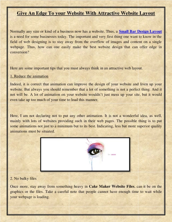
Principles of Web Design Emphasis: The most important element on the page should be the most prominent. • What is the message you are trying to convey? • What elements communicate that message best? • Am I trying to convey more than one message? • What visual element is the most appealing? • Remove elements that don’t support your message.
Bold, Italic, Underline Colors Special effects (shadows, glows, textures) Bigger Use of shapes Use of Borders Use of white space Methods of Emphasis We will use just about all of these in our first project!!
Methods of Contrast • Reverse Text • Size • Color • Special effects (shadows, glows, etc) • Shapes • Borders • White space
Arrangement, Repetition, Visual Direction • Align your page elements! • Repeat: stick with the same navigation, colors, logo on every page, retain the same layout throughout the site, etc • Visual direction: lead the user’s eye across the page, fluidly, and through the most important elements

![OIT 2013 Website Layout [English]](https://cdn2.slideserve.com/3871609/oit-2013-website-layout-english-dt.jpg)