Download

1 / 139
1.4k likes | 1.72k Views
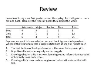
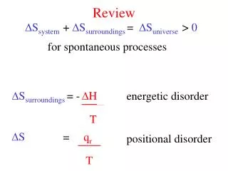
Review. A quick review of each chapter. Chapter 1. One-Variable Statistics. How old is our teacher?. N=82. Describe the distribution. CUSS: C enter(mean and median), U nusual features(are there outliers?), S hape(skewed left,symmetric , skewed right), S pread(max to min).

E N D
Review A quick review of each chapter
Chapter 1 One-Variable Statistics
How old is our teacher? N=82 Describe the distribution. CUSS: Center(mean and median), Unusual features(are there outliers?), Shape(skewed left,symmetric, skewed right), Spread(max to min)
How old is our teacher? The distribution of age guesses are slightly skewed to the left, with a mean age guess of 36.4 which slightly larger than the median guess of 36. Guesses of Mr. Pines’ age ranged from 19 to 48 years old.
5# Summary Definition: The five-number summary of a distribution consists of the smallest observation, the first quartile, the median, the third quartile, and the largest observation, written in order from smallest to largest. Minimum Q1 M Q3 Maximum
Box Plots 25% 25% 25% 25% Min Q1 Q2 Q3 MAX
Outliers in a boxplot 1,4,7,12,13,13,21,36 Possible outlier Checking for outliers we use the formulas: Q1 – 1.5(IQR)…..any number LOWER is an outlier Q3 + 1.5(IQR)…..any number LARGER is an outlier IQR = Q3-Q1
5# Summary of Histogram 10 8 6 4 3 1 1 n=33
Half of 33 is 16.5 so the median falls in the “6” column Half of 16.5 is 8.25 which makes Q1 in the “4” column On the other half Q3 falls in the “7” column 10 8 6 4 3 1 1 n=33
Chapter 2 Normal Distribution
The Empirical Rule 68,95,99.7 68% of the data is within 1 StDev of the mean 95% of the data is within 2 StDev of the mean 99.7% of the data is within 3 StDev of the mean
Standard Normal Curve N(0,1)
Outliers on a Normal Curve You need to remember the outlier formulas: Q1 – 1.5(IQR) Q3 +1.5(IQR)
Outliers on a Normal Curve Q1 is the 25th percentile Q3 is the 75th percentile Why?
Outliers on a Normal Curve invNorm(.25) = -.67 invNorm(.75) = .67 IQR = Q3 – Q1 IQR = .67 – (-.67) = 1.34 Q1 – 1.5(IQR) Q3 +1.5(IQR) -.67 – 1.5(1.34) =-2.68 .67 + 1.5(1.34) = 2.68
Outliers on a Normal Curve z= 2.68 z= -2.68
Outliers on a Normal Curve z= -.67 z= 2.68 z= -2.68 z= .67 Q1 Q3
Outliers on a Normal Curve IQR = 1.34 Q1 Q3
Chapter 3 Scatterplots and Linear Regression
Study Time and GPA Residual Plot A randomly scattered residual plot shows that a linear model is appropriate.
Study Time and GPA Write the linear equation: GPA = 1.8069326 + .4247748(Study Time)
Study Time and GPA Interpret the Slope(b): For every hour of study our model predicts an avg increase of .4247748319 in GPA.
Study Time and GPA Interpret the y-intercept(a): At 0 hours of study our model predicts a GPA of 1.8069326.
Study Time and GPA Interpret the correlation(r): There is a strong positive linear association between hours of study and GPA.
Study Time and GPA Interpret the Coefficient of Determination(r2): 66.6% of the variation in GPA can be explained by the approximate linear relationship with hours of study.
Tootsie Pop Grab If this point was removed, the slope of the line would increase and the correlation would become stronger. Are there any outliers or influential points?
Scatterplot vs Residual Plot The residual plot uses the same x-axis but the y-axis is the residuals. The residual plot shows the actual points. It shows whether they were above or below the prediction line.
Scatterplot vs Residual Plot Prediction line
Tootsie Pop Grab What was the predicted # of pops for a handspanof 24? Predicted # of Pops = -12.9362 + 1.57199(Handspan)
Tootsie Pop Grab What was the predicted # of pops for a handspan of 24? Predicted # of Pops = -12.9362 + 1.57199(24) 24.79
Tootsie Pop Grab Check the residual plot for this. What was the ACTUAL # of pops for a handspan of 24? It’s predicted +/- residual. 24.79 + 4 = 28.79
Correlation r = ± .70 to ± .99 Strong Correlation r = ± .40 to ±.69 Moderate Correlation r = ± .01 to ± .39 Weak Correlation
Scatterplot & Residual Plot Sometimes you can spot a curved residual plot in the scatterplot
Chapter 12.2 Transformations
Transformations If your Linear Model x,y is not Appropriate….. There are a few options to try….. Exponential Model x ,Log(y) Power Model Log(x), Log(y) Try the above options in that order, check r2 and the residual plot,……if r2 is high and the residual plot looks good then you have found a suitable model CAUTION…Real data may not have a perfect model….sometimes you have to settle on “good enough”
Baseball Salaries Ballplayers have been signing very large contracts. The highest salaries (in millions of dollars per season) for some notable players are given in the following table.
Year VS SALARY R2 is high, however the scatterplot appears to have a curved pattern. A linear model may not be appropriate.
Year vs Log(salary) This is an exponential model. R2 is very high and the scatterplot shows no curvature. This appears to be a good fit for this data. Make sure to check the residual plot to make sure.
Residual Plot This residual plot shows no curved pattern and the residuals are randomly scattered above and below the axis…this shows that your model is a good fit.
Exponential model Use the data from your new model to write the equation. Make a prediction for the salary in the year 2006 Make a prediction for the salary in the year 2015
Exponential model Log(salary) = -109.133 + 0.05516YEAR Make a prediction using your model for a salary in 2006. About 33 million a year