Download
1 / 22
230 likes | 417 Views
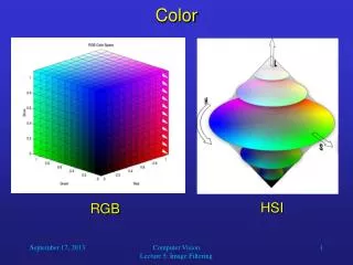
Color. It’s Magic!. Color Experiment. Work with a partner Complete the handout. COLOR. A ray of light is the source of all color Color is light broken into rays of varying wavelengths, which causes the viewer to see different colors.

E N D
Color It’s Magic!
Color Experiment • Work with a partner • Complete the handout
COLOR • A ray of light is the source of all color • Color is light broken into rays of varying wavelengths, which causes the viewer to see different colors. • A prism, soap bubble, oil spill, or a rainbow demonstrates this division of color • Red is the longest and Violet is the shortest wavelength
HUE • Hue: • the specific name for a color. • The feature, individual nature that makes each color different. • Each color on the color wheel is a hue • Black, white, and grey do not have a hue.
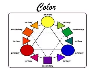
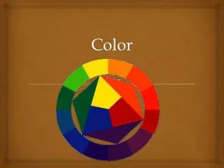
THE COLOR WHEEL • Is the most commonly used tool to understand the basis of all color relationships. • It consists of three types of colors: primary, secondary, and intermediate (tertiary) Color each type
PRIMARY COLORS • Yellow, Red, & Blue. • By mixing, lightening, or darkening the primary colors, all other colors can be made. • No other colors can be combined to create the primary colors. They occur naturally. red yellow blue
SECONDARY COLORS • Orange, Green, and Violet. • Are produced by mixing EQUAL amounts of two primary colors. • Red + Yellow = Orange • Blue + Yellow = Green • Red + Blue = Violet orange green violet
INTERMEDIATE (TERTIARY) COLORS Yellow-Orange • Yellow-Green, Blue-Green, Blue-Violet, Red-Violet, Red-Orange, and Yellow-Orange • Made by mixing a primary color with a secondary color. • Note: The primary color is always listed first. Red-Orange Yellow-Green Blue-green Red-violet Blue-Violet
YELLOW YELLOW-ORANGE YELLOW-GREEN green ORANGE Blue-green e Red-Orange Red blue Blue-violet Red-violet violet
INTENSITY • Refers to the Brightness or Dullness of a color created by adding its compliment. • Color’s are brightest in their natural form. (i.e. pure yellow, pure red, pure blue) • Objects with Bright high intensity colors seem larger. Rooms feel larger. • Bold and intense colors are best used sparingly or as accents • Objects with Dull low intensity colors seem smaller. Rooms feel smaller.
5. VALUE • Refers to the lightness or darkness of a hue. • The value of a hue can be made lighter by adding white, creating a TINTof that hue. • Appearance of greater room size or height. • Pink is a tint of red, Peach is a tint of orange • The value of a hue can be made darker by adding black, creating a SHADE of that hue. • Maroon is shade of red. Rust is shade of orange • Appearance of smaller room size or height • The intensity (bright/dull) of a hue may be lowered by adding some of its complement, or gray – creating a TONE.
6. WARM COLORS • Are considered “warm” because of their association with warm objects of the same color, such as the sun and fire. • Also called advancing colors because they make objects appear larger or closer than they really are. • Makes a room appear smaller • They can make a room feel active, exciting, warmer and cozy.
WARM COLORS Separate these colored pencils
COOL COLORS • Associate with water, grass, and trees. • Are called receding colors because they make objects seem smaller and farther away. • Makes a room appear larger • Make a room feel restful, peaceful, and cooler.
COOL COLORS Separate these colored pencils
NEUTRAL COLORS Separate these colored pencils • White, Black, and Gray. • Not considered colors because they do not have a hue. • Brown, tan, and beige are considered neutral colors, but based on the hues red, orange, and yellow.
Color Can….. • BE SYMBOLIC • CHANGE OUR MOODS • AFFECT OUR PERFORMANCE AND ABILITIES • ALTER THE APPEARANCE OF FORM AND SPACE
7. Choosing the Right Color • Mood • What mood do you want to create • People • Think about the people who will be in the area • Style • The style may influence the color choice(s).Spanish style = rust colored walls • Items in the room • Choose an item in the room, and one of it’s colors as the main color for your room. Then choose accent colors based on your knowledge of color schemes. • Time • The amount of time that will be spent in the room • Existing Colors • Some room components can’t be changed so incorporate them. • Adjacent Rooms • Create a unified look with rooms that you can see. • Lighting • Natural light shows objects in true colors. Artificial lights make color appear blue or yellow
Using Color Correctly a. Colors seem more intense when applied to large areas. Choose a color several tints lighter than the color actually desired. b. Using contrasting colors draws attention. Remember, too many strong contrast values in a room can be confusing and tiring. c. Choosing colors that have similar values will create a restful mood in the room. d. Color schemes/harmonies look better when one color, the base color, dominates. When you use equal amounts of two or more colors, your eyes become confused and your color selection seems cluttered
e. The value of a hue changes the apparent size of a room. • Dark ceiling (dull) appears lower and closer and light (bright) colored walls appear further away. f. If a room is small, choose colors that will make the room appear larger. (tints, low-intensity colors, and cool hues) • Lighter walls makes it appear larger g. If a room is very large, choose colors that will make it look smaller. (Shades, high-intensity colors, and warm hues) • Darker walls make a room appear smaller h. Bright colors convey an informal environment i. Use High-intensity colors in small amounts such as accent colors in accessories or small pieces of furniture. j. Black unifies when a number of colors are used.
Color Assignments • Creating Effects with Color • Create a solution for the room design challenge. • Homes and Interiors Textbook page 410-411 • Many Looks of Color • Color each square based on its label • Paint • Color Wheel • Value: Tint, Tone, Shade • Intensity