Download
1 / 55
550 likes | 574 Views
Understand the foundational elements of design like Line, Shape, Direction, and Space, essential for creating engaging artworks. Dive deep into how elements like size and space influence art balance and depth, and discover the various types and characteristics of lines. Explore the dynamic world of art composition and movement through literal and compositional movements. Uncover the relationship between positive and negative shapes, static and dynamic shapes, and how they contribute to artistic expression. Learn how space in art is determined by positive and negative spaces and the techniques to create depth in two-dimensional artworks.

E N D
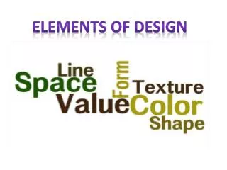
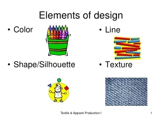
Elements Of Design
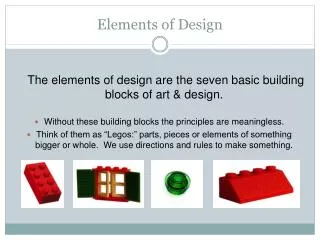
What are Elements of Design? The elements of design are the building blocks used to create a work of art. They can be thought of as the things that make up a painting, drawing, print, photograph, etc. Good or bad, all art work will contain most of, if not all of, the seven elements of design.
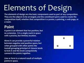
Line A line represents a "path" between two points. Lines can have many different characteristics. They imply motion and suggest direction or orientation. They are an effective element of design because they can lead the viewer's eye. Lines can also be implied, that is filled in by the mind when several points are positioned geometrically within a frame. They can also imply certain feelings.
Characteristic of Line are: Width- thick, thin, tapering, uneven Length - long, short, continuous, broken Direction- horizontal, vertical, diagonal, curving, perpendicular, oblique, parallel, radial, zigzag Focus- sharp, blurry, fuzzy, choppy Feeling- happy, sad, rage, graceful, silly
Types of Line: Outlines- Lines made by the edge of an object or its silhouette. Contour Lines- Lines that describe the shape of an object and the interior detail. Gesture Lines- Lines that are energetic and catch the movement and gestures of an active figure. Sketch Lines- Lines that capture the appearance of an object or impression of a place. Implied Line- Lines that are not actually drawn but created by a group of objects seen from a distance. The direction an object is pointing to, or the direction a person is looking.
“Four Seasons” 1982 Woodcuts Gennie Deweese
“The Oarsman” 1931 Woodcut Rockwell Kent
“Untitled” 1961 Lithograph Pabblo Picasso
“Interpretation of the Legend of White Buffalo Woman” 1988 Linocut JR Rummel Detail of linoleum block
Shape Shapes are the result of closed lines. However shapes can be visible without lines when an artist establishes a color area or an arrangement of objects within the artwork.
Categories of Shapes: Geometric Shapes-Circles, squares, rectangles and triangles. We see them in architecture and manufactured items. Organic Shapes-Leaf, seashells, and flowers. We see them in nature and with characteristics that are free flowing, informal and irregular. Positive Shapes-In artwork positive shapes are the solid forms in a design. Negative Shapes-In artwork it is the space around the positive shape. Static Shape-Shapes that appear stable and resting. Dynamic Shape-Shapes that appear to be moving and active.
“Fiet van Stolk” 1918 Linoleum MC Escher
“Piero’s Problem Continued” 1988 Lithograph George Gogas
“Bell Jar” 2005 Monotype Carolyn Pomponio
“January 1973” 1973 Serigraph Patrick Heron
Direction And Movement Direction refers to an object/s in an artwork being positioned in a certain direction (up, down, sideways, vertical, etc.). The placement of these objects may cause the viewers eye to move in the same direction as the object/s.
Movement can be defined as motion of objects in space over time, and is often described in one of two ways: Literal: Literal movement is physical movement. Examples of literal movement include: Products such as the automobile, motion pictures and dance. Compositional: Compositional movement is the movement of the viewer’s eye through a given composition. Compositional movement can be either static or dynamic. Static movement jumps between isolated parts of a composition. Dynamic movement flows smoothly from one part of the composition to another.
“After Last March Snow Storm” 2000 Serigraph Nuong Van-Dinh Tran
“Brain Storm” 2003 Monotype Barbara Bickley Stephens
“Reflections” 1989 Linocut Lela Autio
Size and Space Size relationships in artwork can have two meanings. One refers to the size of the objects in an artwork making use of the space. The size of the objects will contribute to the balance of the artwork. The other refers to the size of the objects in an artwork creating the illusion of depth. Objects decrease in size the farther back they appear in an artwork.
“Self Portrait in a Chair” 1920 Woodcut MC Escher
Space is defined and determined by shapes and forms. Positive space is where shapes and forms exist; negative space is the empty space around shapes and forms. For images to have a sense of balance, positive and negative space can be used to counter balance each other.
“From Siem Riep” 2005 Lithograph Jenny Freestone
Space in a two-dimensional artwork refers to the arrangement of objects on the picture plane. The picture plane is the surface of your drawing paper or canvas. You can have a picture plane that is a crowded space with lots of objects or an empty space with very few objects in the picture plane. A two-dimensional piece of art has heights and width but no depth. The illusion of depth can be achieved by using overlapping, diminishing scale, atmospheric perspective, vertical placement, warm and cool colors, diagonals and linear perspective. This is the technique used to have your picture look like it is moving to the distance like a landscape or cityscape.
“The Financial City of The West” 1988 Linocut R. Bruce Muerarity
Vocabulary for Space Positive space-Like in positive shape it is the actual sculpture or objects in artwork. Negative space-Also like negative shape it is the space around the sculpture or objects in artwork. Picture Plane - The flat surface of your drawing paper or canvas.
Linear Perspective is the method of using lines to show the illusion of depth in a picture. The following are types of linear perspective. • One-point perspective-When lines created by the sides of tables or building look like that are pointing to the distance, and they all meet at one point on the horizon, this is one-point perspective. • Two-point perspective-Here the lines look like they are meeting at two points on the horizon line.
Nonlinear Perspective is the method of showing depth that incorporates the following techniques: • Position-Placing an object higher on the page makes it appear farther back then objects placed lower on the page. • Overlapping-When an object overlaps another object it appears closer to the viewer, and the object behind the object appears farther away. • Size Variation-Smaller objects look farther away in the distance. Larger objects look closer. • Color-Bright colors look like they are closer to you and neutral colors look like they are farther away. • Value-Lighter values look like they are farther back and darker value look like they are closer. For example in a landscape the mountains often look bluish and lighter then the trees or houses that are closer to you.
Texture Texture refers to the surface quality or "feel" of an object - smooth, rough, soft, etc. Textures may be real (felt with touch - tactile) or implied (suggested by the way an artist has created the work of art -visual).
Categories of Texture Real Texture is the actual texture of an object. Artist may create real texture in art to give it visual interest or evoke a feeling. A piece of pottery may have a rough texture so that it will look like it came from nature or a smooth texture to make it look like it is machine made. Implied Texture is the when a two-dimensional piece of art is made to look like a certain texture but in fact is just a smooth piece of paper. Like a drawing of a tree trunk may look rough but in fact it is just a smooth piece of paper.
“3 Footed 20th Century Tomb Vessel” 1998 mixed media print Neena Birch
“Central Park from the Met” 2002 Watermedia Monotype Yolanda Frederikse
“La Nina de la Patineta” 1962 Intaglio Aquatint Guillermo Silva
“Black Field” 1972 Serigraph Adolph Gottlieb
Value Value is the range of lightness and darkness within a picture. Value is created by a light source that shines on an object creating highlights and shadows. It also illuminates the local or actual color of the subject. Value creates depth within a picture making an object look three dimensional with highlights and cast shadows, or in a landscape where it gets lighter in value as it recedes to the background giving the illusion of depth.
Categories of Values Tint is adding white to a color to create lighter values such as light blue or pink. Shade is adding black to a color to create dark values such as dark blue or dark red. High-Key is when the picture is all light values. Low-Key is when the picture is all dark values. Value Contrast is where light values are placed next to dark values to create contrast or strong differences. Value Scale is a scale that shows the gradual change in value from its lightest value, white, to its darkest value, black.
“Drummer” 2002 Drypoint Deron DeCesare
“Quiet Harbor” 2002 Lithograph Yolanda Frederikse
“Stormy Day, Gulf Coast” 2004 Woodcut Max-Karl Winkler
“Fancy Feline” 1990 Woodcut Walter Hook
Color Color comes from light; if it weren’t for light we would have no color. Light rays move in a straight path from a light source. Within this light, the rays are all of the colors in the spectrum or rainbow. Shining a light into a prism will create a rainbow of colors because it separates the colors of the spectrum. When the light rays hit an object, our eyes responds to the light that is bounced back, and we see that color. For example, a red ball reflects all the red light rays. As artist we use pigments in the form of powder or liquid paints to create color.
Did You Know……. There has been a tremendous amount of research on how color affects human beings and some of this research suggests that men and women may respond to colors differently. Color affects us emotionally, with different colors evoking different emotions. In short, color has the capacity to affect the human nervous system.
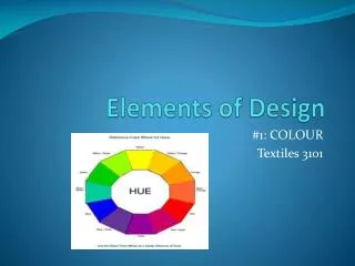
The Vocabulary of Color: Hue: refers to a particular color. Value: the lightness or darkness of a color: the amount of white or black added. Intensity: the purity or saturation of a color. Primary Colors: Red, Yellow, and Blue. These color cannot be made by mixing colors. Secondary Colors: Orange, Violet, and Green. These colors are created by mixing two primary colors.
Color Harmonies: when an artist uses certain combinations of colors to create different looks or feelings. Analogous Colors: colors that are next to each other on the color wheel. For example red, red orange, and orange are analogous colors. Triadic Harmony: when three equally spaced colors on the color wheel are used. For example, yellow, red, and blue is a triadic harmony color scheme. Monochromatic: when one color is used, but, in different values and intensity. Complimentary: two colors that are directly across from each other on the color wheel. For example, blue and orange.
In the photograph above - green and yellow are analogous colors that harmonize where as the violet color of the shooting stars appears more intense against the complementary colored background.
Warm colors: colors on one side of the color wheel that give the feeling of warmth. For example red, orange and yellow are the color of fire and feel warm. This sunrise behind a popular tree has a warm fire like feel to it.
Cool colors: colors on the other side of the color wheel that give the feeling of coolness. For example blue, violet, and green. Banff Springs Hotel in the coldness of winter (Monochromatic color)
Using Warm and Cool Colors A warm glow of the sunrise advances where the cool blue shadows recede.