Abstract
Your poster title here – usually formatted in lower case. Author Number One, MD, PhD 1 ; Author Number Two, MD 2 ; Author Number Three, MD 2 ; Author Number Four, MD 2.

Abstract
E N D
Presentation Transcript
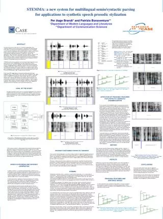
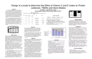
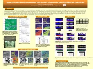
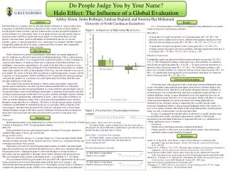
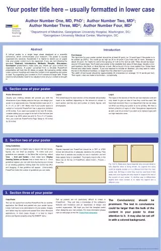
Your poster title here – usually formatted in lower case Author Number One, MD, PhD1; Author Number Two, MD2; Author Number Three, MD2; Author Number Four, MD2 1Department of Medicine, Georgetown University Hospital, Washington, DC; 2Georgetown University Medical Center, Washington, DC Georgetown University Abstract A ‘roll-up’ poster is a single large sheet displayed at a scientific conference, which communicates your research. The poster is usually organized into sections. Sometimes it is helpful to sketch out on paper how your poster content is to be organized. If you are not following the standard 'Abstract, Introduction, Methods, Results, Discussion, Conclusion' presentation, make sure you “chunk up" your content into organized sections. A poster converted from a 20-slide PowerPoint presentation will look like 20 slides on paper. But grouping similar slides under common headings will make the content more appealing and easier to read. Try organizing your content in 3 to 5 columns to begin with. These columns will probably need to be adjusted once all your content is brought in. Introduction Font Issues The type size for your poster content should be at least 24 point, (or 12 point type if the poster is to be scaled up 200%). You could go as high as 36 to 44 point if you have lots of room. Average is about 30 point. It’s helpful to add a line spacing of 1.25 to the text as well. Titles should be large–around 100 point type. You’ll want your poster to be readable from about 6 feet away. Usually a non-serif typeface, like Arial, or Arial Narrow, is best. We’ve found it to be more legible than Times New Roman and often looks ‘cleaner’. If you are required to include an Abstract, you may wish to make the text in the Abstract boldface, or larger than the other text in your poster. The width of text boxes should be approximately 40 characters (on average 10-14 words per line). Then again, rules are made to be broken…occasionally. 1. Section one of your poster Poster Dimensions Usually your meeting website will provide you with the dimensions of your display area so that you can design your poster to an appropriate size. Standard poster sizes are 4' x 6‘, 3' x 5', or 36" x 56". Make note if your poster space is vertical or horizontal! PowerPoint has a page-size limitation of 56 inches. If you want your poster to be over 56 inches, consider setting up your page to be half of the final size (we will scale it up 200% when we print it). For a 3' x 5' poster, then, you could set PowerPoint's Page Setup to 18 inches by 30 inches. Layout The overall layout for each section of this template will probably need to be modified, depending on the amount of content in each section and the size and number of charts, figures, and photographs. Logos The logos in the banner of this file are low-resolution and are only meant to give an idea of how they could be used. We have high-resolution files in our department that we can swap out when you bring your poster to us for printing. We have a limited collection of logos of other Georgetown departments as well. Just let us know if you want us to replace logos with our high-resolution ones. 2. Section two of your poster Using Guidelines Using guidelines is a helpful way to assure that text boxes, figures, etc. are lined up properly. To make sure your guidelines are viewable, in the Menu Bar at the top, select View > Grid and Guides > then make sure ‘Display Drawing Guides on Screen’ has a check next to it. Once guidelines appear, you can add more by placing your mouse on an existing guideline, holding down the Control key (PC) and dragging. A new guideline will appear. Unfortunately PowerPoint limits the number of guidelines you can make. Figures Figures imported into PowerPoint should be in TIFF or JPEG format and should be of adequate resolution for printing. Files taken from a website are usually too low in resolution and will likely appear fuzzy or ‘pixellated’. To properly import a file, in the Menu bar at the top of PowerPoint, select Insert > Picture > From File. B C Fig. 1(A-C). Make sure figure legends have enough detail to fully describe what is being shown. A) Legend font sizes could be slightly smaller or in a different font than the main poster text. B) Keep in mind they must be read from 6 feet away and your figures are very import to support the rest of the content of your poster. C) Another way to differentiate legend from main content is to make the legend text a different color. A 3. Section three of your poster Copy/Paste Text can be copied from another PowerPoint file (or another application like Word) and pasted into your poster layout. Likely it will have to be reformatted to fit your poster. Images and tables may be copied and pasted from other Microsoft applications. In most cases though, it is best to import photos and figures properly using the INSERT menu. Roll up posters are not particularly difficult to create in PowerPoint. They just take a knowledge of the software’s features and limitations and an awareness of design and content organization. We hope you find this template useful when designing your own posters. For more information please visit our web page at this link: PowerPoint templates. The Conclusion(s) should be prominent. The text in conclusions could be larger than the bulk of the content in your poster to draw attention to it. It may also be set off in with a colored background.