Discover Bridge at The Bridge Center of Buffalo - Join Our Community of Players!
150 likes | 297 Views
Welcome to The Bridge Center of Buffalo, where we promote the game of Bridge through competitive play and educational programs. Our center conducts duplicate contract bridge games sanctioned by the ACBL, fostering a vibrant community for both novice and seasoned players. Join us to hone your skills, participate in tournaments, and connect with fellow enthusiasts. We also prioritize ethical standards and member conduct to ensure a welcoming environment. Visit us online to learn more about upcoming classes, events, and how to get involved!

Discover Bridge at The Bridge Center of Buffalo - Join Our Community of Players!
E N D
Presentation Transcript
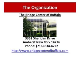
The Organization The Bridge Center of Buffalo 3362 Sheridan DriveAmherst New York 14226Phone: (716) 834-4222 http://www.bridgecenterofbuffalo.com
What is Bridge? • a partnership card game using a standard deck of 52 cards, dealt equally among four players • players bid in a coded language to describe their hands to their partners and then play to make their contract of tricks A card holder A “bidding box,” used by players to make called a “board.” bids at the table. • Generally, one suit is determined as “trump,” which led to the expression, “Play your trump card.” • Duplicate Contract Bridge, in which each competitor or team plays identical hands under similar conditions, is the main form of competitive bridge. A “traveler,” used for scoring
The Bridge Center of Buffalo, Inc. • Purpose/Mission: • To conduct duplicate contract bridge games sanctioned by the American Contract Bridge League (ACBL). http://www.acbl.org • To promote and stimulate interest in the game of bridge mainly by conducting educational programs. • To encourage the highest standards of conduct and ethics by its members, and to enforce such standards.
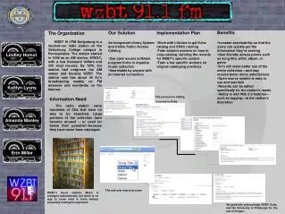
How We Became Involved • Board of Directors inquired about updating website through a member email survey • Solicited feedback from bridge players who access website • Bridge Center has very limited resources, so Eug. proposed LIS student help • B.o.D. and students prioritized areas of need and recommended: • Larger text size for menu (navigation bar), especially to meet the needs of elderly users • Required to keep yellow & blue font color (“vivid”) and white background • Add a more personable, inviting feel to webpages, such as by adding pictures • Create and post biographies for Mentors and Teachers • Create a Bridge Class Registration page & form so bridge students can sign-up directly on the site
Final Project Group • John Meczynski, Jr. • The “techie” of the group • Created homepage template & page styles, class regis. form • The “glue”: merged all pages to temporary host site • http://www.acsu.buffalo.edu/~jem44/LIS506/finalproject/ • Blodine Francois • The “task organizer/time manager” of the group • Created Mentors biographies/pages • Photos, tables, links • Initiated and Outlined Usability Test Scenarios & Questions • Eugene Harvey • “liason” btw. group and Board of Directors • Digitized & resized photos of teachers & mentors • Created teachers biographies/pages • Photos, tables, links • Implemented Usability Test • All of us • Brainstormed & outlined final project work goals • Identified & corrected minor errors on all pages (Proof reading) • Usability scenarios & statistical results • Power Point Presentation
Revision of Site Features • Font Size & Color • Size enlarged; color bolded • Ems vs. pts. • Pts.: “used for designing type for print, but are often unpredictable for displaying text on a computer screen.” • Ems: “measurement based on the height of the capital letter ‘M’…and the default font size.” • Benefits of Using Ems: • Respects users’ font size choices • E.g., if a user has “set the browser font size to a higher setting…then your font measurements will be reflective of those choices.” This is especially useful if you are designing a site for users who are more likely to have vision problems.
Revisions (cont’d) • Page margins • Table size based on pixels, not percentage • Limits width of table • Links • Larger font size relative to default font size • Rollover changed • Made more clear that user is rolling over a link • Mentor/Teacher Main Pages • Thumbnails (links to indiv. pages)
Revisions (cont’d) • Class Registration Form • Available for users who want to sign up for lessons • Validation • Certain fields must be filled out to send form – error given if the form is improperly filled out • Certain fields have format restrictions – e.g., email • User sent to “success page” upon successful submission • Removed unnecessary Javascript
Biography Pages • Inform • Contact Information • Expertise of Teachers & Mentors • Days and Times of Sessions • Recommended resources and links • Organization of Information • Tables • Divide information into headings and subheadings • Create clear format/layout
Biography Pages (cont’d) • Create Community • Pictures of people • Learn about Teachers and Mentors • Share Bridge experiences
Usability Testing • Developed 9 Multi-part questions & scenarios in 3 areas: • Identification and Comparison of Site Features • To gauge familiarity with current site, especially the homepage • To gather feedback about new homepage • Compare and contrast the two pages • Clarity & efficiency of site navigation • User Expectation of New Sections • Navigation buttons are self-evident/self-explanatory • Content of new webpages is self-evident/self-explanatory • Compare and contrast expectations with “reality” (the actual webpages) • Information Retrieval Tasks • Clarity of page design • Efficiency of information layout/format • Clarity and ease of navigation within site • Clarity and ease of navigation to/from external sites via internal links
Positive Findings • Site Features • Overwhelmingly preferred new homepage • Larger font size, more centered, less empty/“stark” • Major site features unchanged (photo, border, contact info.) • User expectations • Biography sections exceeded their expectations • Loved photos, personal backgrounds, interviews • “There is a sense of connection…” “…softens the website, makes it feel more personal.” “…makes the page feel warmer.” “good pictures too” • Major work goal: to make site “feel” more personal • Information Retrieval Tasks • Very little difficulty with most tasks (with one exception) • Liked the easy-to-scan table format and the delineation of sections (subheadings, tables, border) • Impressed with the easy-to-click links for resources • “That’s a nice feature…” “That’s cool…it takes me right there to see it.”
Problems • Minor Misspellings/“Typos” • Resources not clear on Teachers pages • Most users were slowed due to lack of clarity of resources - not sure of type of resource (i.e. a book, a website, etc.) • “Is that a book? (pause) Yep, I guess that’s a book.” “I wasn’t sure. I’m a very linear thinker.” • named a book, but then said, “…but I don’t know if it’s a book.” “I’m not sure if resources means books or not…” • “I’m not sure if these are books or not. I think they are…” “Yep, they are…” • Class Registration form • Canadian users not able to enter alphanumeric zip code due to validation rule • Difficulty entering phone number due to limited text field
Finally… HAVE FUN AND PLAY SOME CARDS! Thank you…and have a nice break!