Making Persuasive Presentations
Making Persuasive Presentations Dr. Helen Grady Dept. of Technical Communication Mercer University ASQ Meeting, Feb. 9, 2004 What We Will Discuss Tonight Presenting yourself Structuring the content Designing the visuals Presenting: Project Personal Energy Professional Dress


Making Persuasive Presentations
E N D
Presentation Transcript
Making Persuasive Presentations Dr. Helen Grady Dept. of Technical Communication Mercer University ASQ Meeting, Feb. 9, 2004
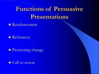
What We Will Discuss Tonight • Presenting yourself • Structuring the content • Designing the visuals
Presenting: Project Personal Energy • Professional Dress • Confident Posture • Eye contact • Smile! • Volume, voice • Hands, gestures • No paper-shuffling
Structure the Content to answer the main question • If the “head honcho” is absent and asks someone for a summary, what do you want them to say in a few sentences? • State in a sentence • No more than 3 critical points • Gauge audience’s knowledge levels • Build your credibility (establishing criteria, alternatives; etc.)
Good Beginnings & Endings • Beginning: • Connect • Urgency • Roadmap (main point, overview) • Ending: • Recommend • Restate • Action request
Good Middles • Clear main points • Transitions • Pictures (word and visuals)
What to know about designing the visuals • Each visual should add value • Make the message the heading • Follow simple rules for text visuals and charts
Make the message the heading • People read top down • Heading should convey significance of visual • What it means NOT what it is • If can’t come up with message, visual not needed • Do not punctuate • See examples
Sales 1990-2000 A topical heading says “what it is.”
Sales have tripled in 10 years A message heading says “what it means.”
Agenda • Overview • Current market • Competitors • Opportunity • Next steps This visual only tells audience that presentation has 5 parts. Provides no meaningful roadmap.
Our goals today are • Define critical issues • New technology • New market demands • Determine change in focus • Agree on implementation steps This visual sets stage for presentation by letting audience know what speaker hopes to achieve and order of topics.
Here are some guidelines for text visuals • Use action or message phrases • Keep lists parallel and in the order you intend to follow • Use upper/lowercase type and simple typeface • Highlight the most important message on the visual
Organizational structure has allowed these weakness to develop • Key tasks are not being performed: market research, long-range planning, proposal writing • The organization is overly dependent on key people: two individuals manage all aspect of program • Work unevenly divided: several departments are overloaded, other are underutilized. • Communication among departments is poor. • The staff’s involvement in the organization is artificially limited. Text is too dense, visually unappealing, and too long.
We can gain a competitive advantage if we • Provide major pricing advantage with new plants • Reach the market ahead of the competition • Service the entire region from central distribution Phrases let speaker tell story. Verbs give sense of action.
We will build on the basics • Provide superior financial products • Unequaled client service • Strength and value A list that is not parallel in form is hard to read.
To build on the basics, we will • Provide superior financial products • Offer unequaled service to clients • Preserve strength and value Strong verbs make good lists.
What to know about designing the visuals • Each visual should add value • Make the message the heading • Follow simple rules for text visuals and charts
Guidelines for any visual • Message determines form • Convey one message per chart • Make the chart easy to read • Convey data honestly • Eliminate all unnecessary design details
Message determines form • Bar and column chart – compares or groups items • Column and line chart – change in variables over time • Pie chart – relation of part to other parts or whole • Scatter diagram – relation of two or more variables
Guidelines for any visual • Message determines form • Convey one message per chart • Make the chart easy to read • Convey data honestly • Eliminate all unnecessary design details
Gross Revenues per Product Important information not highlighted; too many visual distractions.
As a % of sales, manufacturing and G&A costs have remained steady Chart clearly illustrates message in heading. Labels are clear.
Guidelines for any visual • Message determines form • Convey one message per chart • Make the chart easy to read • Convey data honestly • Eliminate all unnecessary design details
Tips to convey data • Order variables for easy comparison • Keep differences between quantities equal • Start numerical axis at zero • Use 3D charts sparingly - give deceptive weight to the items in the ‘front”
Conveying data Ordering variables by size makes comparison easier.
Put the least varying bar of stacked bars on bottom This chart is a more honest representation of the data..
Sales by Division Start numerical axis at zero and eliminate unnecessary grid lines.
Sales have increased in all divisions except the West Message is in heading, no gridlines, and trends are easy to follow. .
Problems with 3D charts Pie sections in front of screen have distorted emphasis.
Guidelines specific to column and bar charts • Keep bar and columns wider than spaces between them to focus attention on message • Label bars and columns when possible, instead of using legends and grids • Group items for comparison
Peach sales are the lowest of software products Effective for comparing one or several variables. .
Peach sales continue to be the lowest of graphics packages Effective for comparing one or several variables over time. .
Hedge prices exceeded spot prices for most purchases Spot price Column and bar charts work well for +/- numbers. .
Guidelines specific to line charts • Reserve the heaviest line for the most important variable or component • Use a variety of broken lines for other variables • Anchor data lines to the left axis • Label the line on any combination line and bar chart
Line charts show changes in time of 1 or more variables More effective than column charts when have more than 4-5 data points. .
Guidelines specific to pie charts • Limit the number of components to five or fewer • Highlight your message by exploding the most important segment • Place the most important component at the 12 o’clock position and use darker shade to show emphasis
Bagels are our best sellers Too much detail obscures main message. .
Bagels are our best sellers Based on the message, this visual is to the point. .
Precautions to take when presenting data • Use visual effects sparingly • Use color purposefully • Use color consistently • Be aware of color associations
Avoid background images • They can distract from your message • They can interfere visually with on-screen text • They can be irritating when seen for a whole presentation
Use design elements with care • Too many colors may distract from your message • Shadows behind text may make it harder to read • Design elements may crowd text • A line below a header signals the reader to “stop here”
Is this an effective on-screen slide template? • Background is simple • Text shows up clearly • Bullets are basic; do not distract Logo
This is not an effective slide • Large areas of color are less likely to print evenly if you print transparencies • Light colored backgrounds wash out when projected • Colored text may be harder to read than black
Visual support helps people remember your message • Design visual that add to presentation • Keep visual simple • One point per visual • Use the most appropriate form • Text visuals preview and summarize and provide transitions • Charts show relationships among data • Keep the audience focused on your message, not on the design features
Sources • Holcombe & Stein, Presentations for Decision Makers (3rd ed., 1996, Wiley) • Markel, Technical Communication (2004, Bedford/St. Martins) • Morgan, Reichert, & Harrison, From Numbers to Words (2002, Allyn & Bacon) • White, Using Charts and Graphs (1984, Bowker)