Download
1 / 38
380 likes | 400 Views
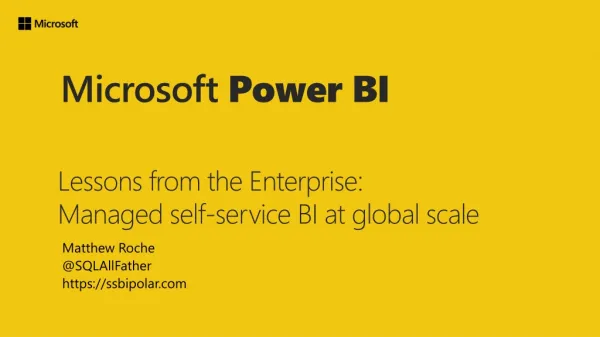
Here comes the Full list of March updates for Power BI.<br><br>Anantara represents the most progressive thinking on:<br><br>1.Partnering with clients.<br>2.High value consulting-driven Business Solutions.<br>3.Exploiting emerging and established Information Technologies to create business value.<br><br>Think of us as a next generation outsourcing company. Or as a next generation consulting company.<br><br>https://www.anantsol.com/power-bi-implementation/<br>

E N D
Source : https://powerbi.microsoft.com/en-us/blog/power-bi-march-2021-feature-summary/ 1
Full list of March updates: Reporting Analytics Modeling Data connectivity Service Visualizations Template Apps Embedded
Reporting DirectQuery for Power BI datasets and Azure Analysis Services (preview) Advanced Data Selection in Azure Maps Visual Word-wrap in Small Multiples titles (preview) Updates to background settings on Small Multiples (preview) Analytics X axis constant line for line charts 3
Modeling Model View UI (preview) IF.EAGER CALCULATE filters are easier to use Data connectivity Kerberos-based SSO for Denodo Certified Connectors 4
Service Featured content on Home Updates View dataset details from workspace list view Filter apps gallery to view only endorsed apps Visualizations SMART KPI List by Nova Silva Editor’s picks 5
Template Apps Download PBIX files for installed template apps Analyze Popular Stocks with Power BI Facebook Ads Overview Report – by Windsor.ai Embedded The new Power BI embedded analytics playground Power BI Embedded Generation 2 (preview) Power BI embedded analytics new Contoso demo 6
Reporting DirectQuery for Power BI datasets and Azure Analysis Services Microsoft added some more capabilities that will be synced between a remote source and the local model that you’ve created in Power BI Desktop. Now, display folders and sort by column properties are set in a remote source will be synced with your local model. 7
Reporting Advanced Data Selection in Azure Maps Visual The Azure Maps Visual in Power BI provides multiple visualization types (bubbles, 3D bar chart, real-time traffic etc.,) that make it easy to visualize your business data on a Map and observe how different parameters change across locations. Selection control A new selection control option is available in the tool bar located on top right of the Azure Map Visual. 8
Reporting Range selection Use the range selection method to select all data that is within a specified driving distance or driving time from a specified location. This method is especially useful to visualize the catchment area of a retail store. 10
Reporting Radial selection Click on the ‘Circle’ icon in the selection control bar to activate the radial selection mode. Next click at a desired point on the Map canvas and drag mouse to desired radius. A circular region centered at the selection point highlights all locations within the radial. Click again to complete the selection. Only selected points remain active on the Map canvas. 11
Reporting Polygon selection For a fine grain control of what data to select, use the polygon selection. With down, freeform shape to select data lying within the shape. the mouse-key drag and pressed draw any To close the shape, just double click on the Map. Without keeping the mouse-key pressed down, you can click anywhere on the Map to specify vertices of a polygon boundary and select data within the boundary. 12
Reporting Radial and Box selection The radial and box selection method provide ability to select on the Map using a circle or rectangle drawn on the Map canvas. The new selection control is enabled by default. To turn on/ off the selection control, edit the Azure Map Visual, go to “Format” tab in the control panel. Locate the section titled “Map Settings”, expand it and make sure the “Selection Control” toggle option is set to true (slide the control to right). 13
Reporting Radial and Box selection 14
Reporting Word-wrap in Small Multiples titles (preview) Now added word wrap to small multiple titles! Now, you can ensure your longer titles aren’t truncated if they run beyond the width of the small multiple column. 15
Reporting Updates to background settings on Small Multiples (preview) This change will allow you to see immediate changes in your small multiples background colors without your having to change the transparency setting. However, this change in defaults will also affect existing reports: If you have previously adjusted transparency without changing the small multiples background color, the previous (default) color will have become “no fill” — meaning you will no longer see a background color on your small multiples grid. If you have previously changed the small multiples background color without changing transparency, the previous transparency (100%) will now become 0% — meaning you will now see your background color applied to the small multiples grid. 16
Analytics X axis constant line for line charts Now support adding a X axis constant line in line charts for continuous type data. 17
Analytics Create this line by selecting ‘Add’ on the ‘X axis constant line’ from Analytics icon from the Visualizations section. The value can be date time or numeric value depending your data. You can configure all sorts of options for your line from its Color, Transparency percentage, Line style, Position, Data Label just like the existing Y axis constant line. 18
Modeling Model View UI (preview) The cardinalities are now shown at the end points of a relationship and the direction of the relationship is shown at the center. These icons have also been increased in size to be more readable. 19
Modeling Limited relationships UI This icon indicates a limited relationship and easily allows you to identify them in your model. Limited relationships are relationships between different source groups. 20
Data connectivity Kerberos-based SSO for Denodo This update provides users an easier way to publish Power BI reports to the service that connect to Denodo using DirectQuery leveraging Kerberos-based single sign-on via the on-premises data gateway. Certified Connectors New certified connector: Kognitwin We are releasing one new certified connector, Kognitwin, allowing users to connect to Kognitwin Energy by Kongsberg for advanced digitalization and analytics. 21
Data connectivity Updated certified connectors New Updates to the following nine certified connectors: Exasol Automation Anywhere Zoho Creator e-Way CRM IntelligentPlant Data Virtuality Vena FactSet MariaDB 22
Service Featured content on Home Updates Featured content on your Home page now includes metadata as to who featured the artifact. Additionally, endorsed content can also be Featured in the same workflow. Head over to the docs page to learn more about these updates. View dataset details from workspace list view You can now open the dataset details page from the workspace content list view. 23
Service View dataset details from workspace list view When clicking on a dataset in the workspace content list view, the dataset details page is opened to provide meaningful information and quick actions: Information about the dataset including last refresh time List of reports that are built on top of the dataset (just reports that you have access to will be shown here) Usage metrics for the last 30 days, including how many users and report opens were there for the last 30 days, not including today. Quick actions: View lineage, create a report and Analyze in Excel Create from template – if there is a template report defined for this dataset, you can quickly create a report from this template. 24
Service 25
Service Filter apps gallery to view only endorsed apps When getting a new app from the apps gallery you can choose to filter the gallery to view only certified and promoted apps. These apps were set by their owner as trusted. 26
Visualizations SMART KPI List by Nova Silva This visual allows everyone to create an overview of their KPI’s that is: Specific: the red-dot highlights the KPI’s that need immediate attention; Measurable: A value alone is a weak indicator of performance. A sparkline shows the trend to determine if you are moving towards your goal; Achievable: By comparing each result with a target you can determine if your KPI has met expectations; Relevant: Within the sparkline you can add a bandwidth of acceptable results which helps the user to identify “normal” and “abnormal” results in the past; Time-bound: The sparkline adds the required historic context to each indicator to enrich the indicators signals; 27
Visualizations Editor’s picks The new Editor’s picks visuals of the month are: Ratings by MAQ Software Comicgen SMART KPI List The Editor’s picks can be found in the in-product AppSource in Power BI Desktop and service under Editor’s picks category. 29
Template Apps Download PBIX files for installed template apps Now allows Power BI Pro users to download a PBIX file directly from your template app once they’ve installed it! All you have to do is turn on the download PBIX feature on the Control tab when you’re creating your template app. 30
Template Apps Analyze Popular Stocks with Power BI The Analyze Popular Stocks with Power BI app shows you multiple KPIs to start your analytics journey in Power BI. Use it to track end-of-day quotes as well as weekly, monthly, or yearly trends for popular stocks and ETFs. 32
Embedded The new Power BI embedded analytics playground It allows developers to get hands-on coding experience in our developer sandbox using samples or their own reports. Developers can discover and interact with client APIs and see instant results. 33
Embedded Power BI embedded analytics new Contoso demo The new Power BI embedded analytics Contoso sales demo was recently introduced to customers and partners, allowing you to explore a data-driven application with customized dashboard views built on Power BI embedded analytics To get started, follow these steps: Open the Contoso Sales Demo application. Select Salesperson. Select Enter in demo mode. 35
Choose Anantara Solutions Anantara represents the most progressive thinking on: Partnering with clients High value consulting-driven Business Solutions Exploiting emerging and established Information Technologies to create business Value Think of us as a next generation outsourcing company. Or as a next generation consulting company. https://www.anantsol.com/ 37
Reach Us https://www.anantsol.com/contact-us/ https://www.linkedin.com/company/anantara-solutions/ https://www.facebook.com/Anantara-Solutions-Private-limited-111522423821609/ 38