Different Types of Data Visualization - NareshIT
190 likes | 213 Views
<br>Data visualization is the graphical representation of data to facilitate understanding and analysis. There are various types of data visualization techniques.<br>Visit Here: https://nareshit.com/data-science-online-training/

Different Types of Data Visualization - NareshIT
E N D
Presentation Transcript
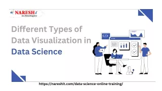
Different Types of Data Visualization in Data Science https://nareshit.com/data-science-online-training/
Today's Agenda Introduction to the Data Visualization Types of Data Visualization https://nareshit.com/data-science-online-training/
Introduction Data visualization is the graphical representation of data to facilitate understanding and analysis. There are various types of data visualization techniques, each suited for different types of data and insights. Here are some common types of data visualization: https://nareshit.com/data-science-online-training/
Types of Data Visualization Area Chart 08 Line Chart 01 Bar Chart Histogram 09 02 10 Pie Chart Treemap 03 Scatter Plot Box Plot 11 04 Bubble Chart Heatmap 05 12 Network Graph 06 13 Choropleth Map Sankey Diagram 07 14 Word Cloud
40 Line Chart 01 A line chart displays data points connected by a line, often used to show trends over time or continuous data. 30 20 10 0 Item 1 Item 2 Item 3 Item 4 Item 5 https://nareshit.com/data-science-online-training/
Bar Chart 02 25 A bar chart represents data using rectangular bars of varying lengths, commonly used to compare categorical data. 20 15 10 5 0 Item 1 Item 2 Item 3 Item 4 Item 5 https://nareshit.com/data-science-online-training/
Pie Chart 03 Item 5 20% Item 1 20% A pie chart divides a whole into slices to represent the proportion of different categories within the data. Item 4 20% Item 2 20% Item 3 20%
Scatter Plot 04 250 A scatter plot shows the relationship between two numerical variables, plotting points on a Cartesian coordinate system 200 150 100 50 0 0 1 0 2 0 3 0 https://nareshit.com/data-science-online-training/
Heatmap 05 A heatmap uses color-coded cells to represent values within a matrix, providing a visual summary of data patterns and relationships https://nareshit.com/data-science-online-training/
Area Chart 06 An area chart is similar to a line chart but with the area beneath the line filled, emphasizing the cumulative total or distribution over time https://nareshit.com/data-science-online-training/
Histogram 07 3 A histogram presents the distribution of a continuous variable by dividing it into bins and displaying the frequency or proportion of observations within each bin 2 1 0 1 0 12 1 4 16
Treemap 08 Group 1 A treemap represents hierarchical data using nested rectangles, where the size of each rectangle corresponds to a specific attribute or value. Subgroup 1 Subgroup 2 Subgroup 3 Group 4 Group 2 Group 3 Subgroup 4 Subgroup… Subgroup 8 Subgroup 9 Subgroup 5 Subgroup 7
Box Plot 09 A box plot displays the distribution of a numerical variable through quartiles, outliers, and other summary statistics, providing insights into the data's spread and skewness
Bubble Chart 10 A bubble chart displays three variables by using circles of different sizes and colors to represent the relationships between them
Network Graph 11 A network graph, or a node- link diagram, illustrates relationships between entities as nodes (points) and their connections as links (lines or arcs) https://nareshit.com/data-science-online-training/
Choropleth Map 12 A choropleth map uses color or patterns to represent data values across geographic regions, providing insights into spatial patterns
Sankey Diagram 13 A Sankey diagram visualizes the flow of data or resources through interconnected pathways, often used to show energy flows, migration patterns, or customer journeys.
Word Cloud 14 A word cloud displays words from a text dataset, where the size or color of each word corresponds to its frequency or importance. https://nareshit.com/data-science-online-training/
Thank you for Visiting https://nareshit.com/data-science-online-training/ support@nareshit.com +91-8179191999