Download
1 / 4
40 likes | 64 Views
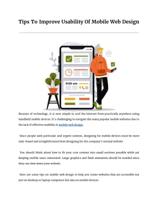
Because of technology, it is now simple to surf the internet from practically anywhere using handheld mobile devices. Itu2019s challenging to navigate the many popular mobile websites due to the lack of effective usability in mobile web design.

E N D
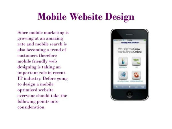
Tips To Improve Usability Of Mobile Web Design Prologic Technologies they can slow down your website. Because of technology, it is now simple to surf the internet from practically anywhere using handheld mobile devices. It’s challenging to navigate the many popular mobile websites due to the lack of e?ective usability in mobile web design. Since people seek particular and urgent content, designing for mobile devices must be more task-based and straightforward than designing for the company’s normal website. You should think about how to fit your core content into small sections possible while yet keeping mobile users interested. Large graphics and flash animation should be avoided since Here are some tips on mobile web design to help you create websites that are accessible not just on desktop or laptop computers but also on mobile devices.
Decide Screen Resolution The design concerns for mobile devices are quite diverse, ranging from various screen sizes and resolutions to various forms. Strive to balance the size of screens in accordance with the target audience. Use your best idea after researching the specifications of contemporary mobile Prologic Technologies Long passages of text might be challenging to read, so spreading them across many pages restricts scrolling in one direction. Get rid of the less important stu?. Keep your text in a single, wraparound column to prevent horizontal scrolling. All you need to do is simply display the most important content in manageable chunks. devices. For mobile developers, the trick is to figure out how to make a page appear correctly across a range of screen sizes without having to construct pages from scratch for each device. Divide Web Screen Into Small Sections
Try To Keep Design Simple The usability of a website is defined by its simplicity. Allow your users to easily navigate the site through a clean design. Do not include frames, tables, or other formatting. If you want to make use of padding, limit it to a bare minimum—far less than you would for a typical web Prologic Technologies website to navigate. If you want the content on your targeted mobile users’ screens to change fast, place your navigation menu underneath the content. page. On mobile websites, loading times increase when you click more links than they do on desktop websites, making you wait longer. As a result, your website has to be pared down and made simpler while maintaining a balance between the content and navigation. Navigation Placement Learn about your audience and what they are seeking. Find out how they plan to use your To avoid obstructing the ability to read the page’s content, the content and title must be shown first. Place the navigation at the top of the page for people who want to quickly browse a specific category.
Add a Search Option For the vast majority of users, search is the most crucial component. When creating a website, take into account the search bar as a component that promotes accessibility and website navigation. Prologic Technologies The basic idea of simple navigation is to guide customers around your website, not just anticipate and address any queries they could have. Contact Us: Website: https://www.prologic-technologies.com/ Facebook: https://www.facebook.com/ProLogicTechnologies Instagram: https://www.instagram.com/prologictechnologies/ Twitter: https://twitter.com/ProLogicTechno Linkedin: https://www.linkedin.com/company/prologictech