0 likes | 5 Views
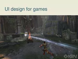
Explore the fundamentals of UI design through expert insights. Perfect for beginners, this guide offers essential tips to elevate your design skills.
E N D
UI (User Interface) and UX (User Experience) design are interconnected disciplines that focus on creating digital and physical products that are functional, user-friendly, and visually appealing. PART - 1 www.elightwalk.com
UI design focuses on the visual elements and interaction layer of a product, ensuring that users can easily interact with it. Key Aspects of UI Design: Visual Design Choosing colors, typography, icons, and layouts. Ensuring visual harmony and brand consistency.
Visual Design ICONS Colors LAYOUT typography
1. Choosing colors: Apple uses a monochromatic color scheme with a lot of white space and subtle gradients to allow the product images to stand out. Ideal for: Modern apps, portfolio websites, or tech brands. Apple uses a monochromatic color scheme with a lot of white space and subtle gradients to allow the product images to stand out. UI UX Development
Choosing colors: The use of white backgrounds makes the products appear more prominent, and the subtle use of gray allows for contrast without overwhelming the user.
Choosing colors: UI UX Development
2. Typography Apple uses a custom font called San Francisco for both headings and body text. It's a clean and modern sans-serif font, which is highly legible on both small and large screens. The Large, bold typefaces used in Apple’s product names create a strong visual hierarchy, while the smaller, more neutral body text ensures that details are easy to read. fonts are just one factor, focusing on efficient font usage can significantly enhance your site's overall performance and user experience. Expert Tips: Always Us Google recommendation fonts and light weight fonts easily browser in every screen such as Mobile, Desktop and tablet.
Learn the Principles of Typography Typography Principles 4. Contrast 1. Legibility and Readability: Choose fonts that are easy to read. Use appropriate sizes (e.g., 16px for body text on the web). Combine fonts with varying weights, styles, or sizes for contrast. Use color sparingly and purposefully. 2. Hierarchy: 5. Consistency Use different sizes, weights, and styles to create visual distinction. Headings should be bold and larger than body text. Combine fonts with varying weights, styles, or sizes for contrast. Use color sparingly and purposefully. 3. Alignment: Use consistent alignment (left, center, or right). Avoid overusing justified alignment unless well-spaced. UI UX Development
Study Typefaces and Font Pairing Serif: Classic and formal (e.g., Times New Roman, Georgia). Sans Serif: Clean and modern (e.g., Helvetica, Arial). Script: Elegant and flowing (e.g., Pacifico, Great Vibes). Display: Decorative and bold (e.g., Lobster, Bebas Neue). Monospaced: Fixed-width fonts (e.g., Courier, Consolas) Establish a Typographic Hierarchy Headings: Bold and larger to capture attention. Subheadings: Slightly smaller and lighter than headings. Body Text: Regular weight and size for paragraphs. Captions or Labels: Smaller and lighter for secondary information.
UI UX Development Recommended Fonts for UI Design Sans-Serif Fonts: Roboto, Open Sans, Inter, Lato, Arial. Serif Fonts: Georgia, Times New Roman (use sparingly in UIs). Monospace Fonts (for code-based UIs): Consolas, Courier. Combine serif and sans-serif fonts for contrast (e.g., Georgia + Arial). Avoid pairing fonts that are too similar. Use tools like Google Fonts or FontPair.co for inspiration.
Practice Practical Typography Typography Redesign Challenge 1. 2. 3. Select a poorly designed website, poster, or flyer. Identify typography issues (poor hierarchy, bad font choices, spacing problems). Redesign it using proper font pairings, spacing, and alignment. Focus Areas: Hierarchy, Legibility Visual balance Type-Only Poster Responsive Typography More Practice Ideas: Hierarchy Exercise Recreate Famous Designs Font Pairing Practice Grids and Typography Text Alignment Drill Motion Typography
Examples of Lightweight Fonts: Open Sans Light File size: ~28 KB Use Google Font Tool Inter File size: ~21 KB The smaller the font file, the less data needs to be downloaded by the browser when the page is loaded, leading to faster loading times.
3. icons Support Contact us
UI UX Development Making Sure visual harmony and brand consistency How design elements (like colors, typography, images, and layout) work together to create a cohesive and unified look that reflects the brand’s identity across all touchpoints. Consistent Color Palette Tone and Voice Consistency Consistent UI Components (Buttons, Forms, Navigation) Typography Consistency Imagery and Iconography Consistency Mobile Responsiveness Layout and Spacing Consistency
Interactive Elements Designing buttons, sliders, menus, and forms. Providing visual feedback (e.g., hover effects, error states).
THANK YOU Contact us now! And Get Quote today! www.elightwalk.com