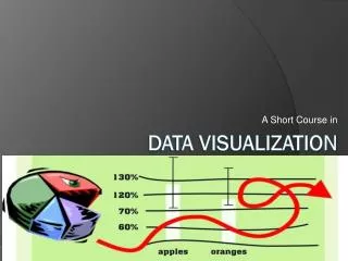
Data Visualization Understanding and Communicating Complex Data
Thereu2019s a famous saying, u201cA picture is worth a thousand words,u201d and that is what data visualization is all about. In this fast-paced world, weu2019re consuming data in several formats and platforms every single minute. Therefore, it is of utmost importance that businesses around the world have their way with data, that is, put it out in a simplified and understandable format. This is precisely where data visualization steps in.

Data Visualization Understanding and Communicating Complex Data
E N D
Presentation Transcript
Data Visualization: Understanding and Communicating Complex Data
There’s a famous saying, “A picture is worth a thousand words,” and that is what data visualization is all about. In this fast-paced world, we’re consuming data in several formats and platforms every single minute. Therefore, it is of utmost importance that businesses around the world have their way with data, that is, put it out in a simplified and understandable format. This is precisely where data visualization steps in. What is Data Visualization? Data visualization is the process of converting numerical and categorical data into graphical forms such as charts, graphs, and maps. It is a powerful tool that helps individuals and organizations make sense of complex data sets, identify patterns, trends, and communicate insights and findings clearly and concisely. Data visualization has become increasingly important in today’s data-driven world, where large amounts of data are generated and collected daily. This data can come from various sources, including business transactions, social media interactions, and scientific experiments.
Features of Data Visualization 1.Clear Headings and Keys: A clear and consistent use of headings and keys is essential for data visualization. This helps the viewer to quickly understand the information being presented and to identify the different data series represented in the visualization. For example, in a bar chart comparing sales of different products, using clear headings and keys to label the products and the sales figures makes it easy for the viewer to understand the information. 2.Simple Analysis: The simpler the visualization, the easier it is to understand and extract insights from the data. Data visualization should be designed to be simple and easy to understand while still providing the necessary information. For example, A simple line graph showing the trend of stock prices over time is easy to understand and provides a clear picture of the trend. 3.Relevant Comparisons: Relevant comparisons are important in data visualization as they help the viewer to understand the data and draw insights from it. For example, if a company wants to compare the sales of different products over time, a line graph showing the sales trend of each product would be a relevant comparison, as it shows the performance of each product over time.
4.Add Design Elements: Adding design elements like colors, shapes, and text can enhance the visual appeal of data visualization and make it more engaging. For example, a heat map showing population density by state can be enhanced by adding color to indicate higher or lower population densities. 5.Consolidated Structure: A consolidated structure makes it easy to understand and compare data. By consolidating data into a single visualization, the viewer can quickly see the overall picture and identify patterns and trends. For example, a stacked bar chart showing the breakdown of expenses by category in a budget makes it easy to see where most of the money is being spent. Types of Data Visualization There are different types of data visualization, each with its own strengths and weaknesses. However, some of the most common types include: Bar charts: They are used to compare the size of different categories of data. They are often used to represent categorical data, such as the number of sales by product category. They are easy to understand and are widely used in business and finance.
•Line graphs: Line graphs are used to track changes over time. They are often used to represent data that is continuous, such as stock prices or temperature changes. In addition, line graphs can be used to display multiple data sets on the same graph for comparison. •Scatter Plots: They are used to show the relationship between two sets of data. They are often used to represent data that is continuous, such as the relationship between height and weight. Scatter plots can be used to display multiple data sets on the same graph to compare. •Pie Charts: Pie charts show the proportion of different categories of data. They are often used to represent categorical data, such as the proportion of different types of sales. They are easy to understand and are widely used in business and finance. •Heat Maps: Heat maps are used to show the density of data in a particular area. They are often used to represent data that is continuous, such as population density or temperature changes. Heat maps can be used to display multiple data sets on the same map for comparison. •Treemaps: Treemaps are used to show hierarchical data. They are used to represent hierarchical data, such as a computer’s file system. They are easy to understand and are widely used in computer science and business.