Download
1 / 14
140 likes | 265 Views
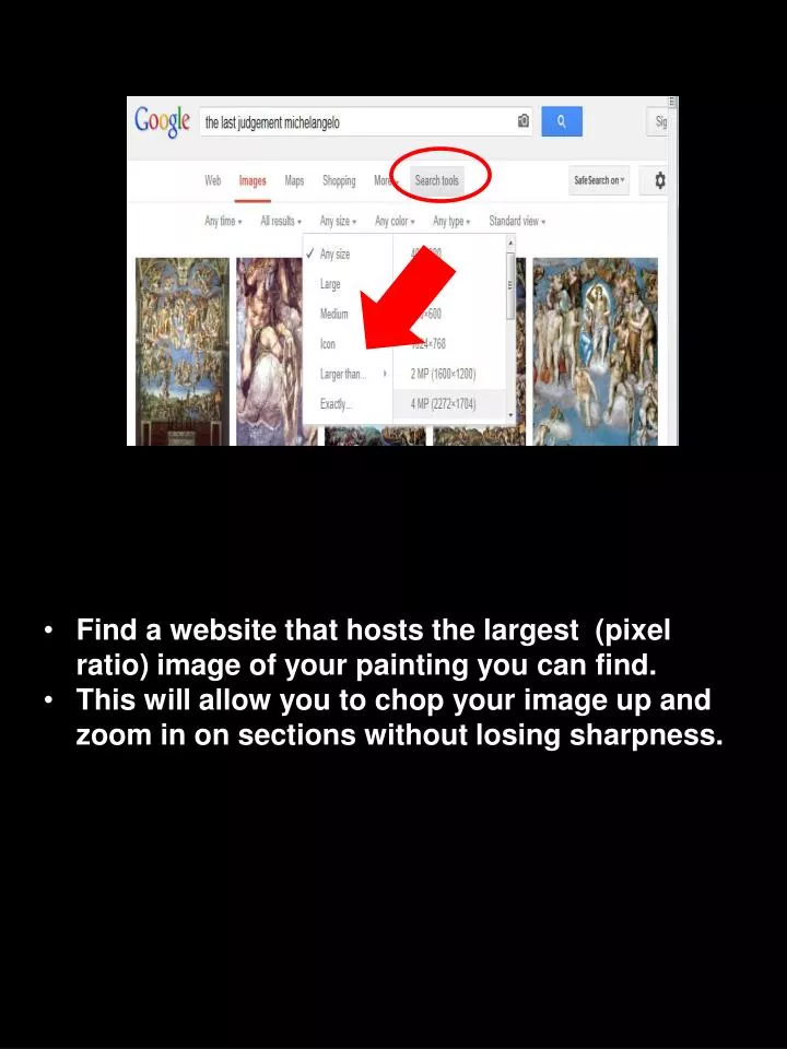
Find a website that hosts the largest (pixel ratio) image of your painting you can find. This will allow you to chop your image up and zoom in on sections without losing sharpness.

E N D
Find a website that hosts the largest (pixel ratio) image of your painting you can find. • This will allow you to chop your image up and zoom in on sections without losing sharpness.
Sometimes, if you are lucky or have a particularly popular painting, you might find that websites have already posted “blow ups” of key portions of your image. • Open these up and save them to your folder because they will help you when it comes time to point out details in your work.
You will also find some sites are better than others at hosting high quality, high resolution images. One such site is the Web Gallery of Art. Most of the images in the presentation that follows are from that site.
In rare cases, you may have to scan your art work from a book. If you do this, make sure you scan at 600 ppi (or 200 percent). This will give you a high number of pixels to work with so you can zoom to the finest detail.
The sample presentation that follows is of “The Last Judgment” by Michelangelo. It received an “A” • But it is not perfect • I will point out good things in bright yellow • Areas for improvement will be highlighted in red • If you are doing this image (no one in 2013 FAME is) you wouldn’t be able to copy much because this student used no text. All of her information was presented orally. • Do not OVERUSE text. PowerPoint is meant for presenting audio-visual support over oral presentations, not for reading (as you are doing here)
She changed the aspect on the ppt. slide to fit the shape of the painting • The white lines come in on each mouse click so they don’t ruin the first view of the work. • She began with an overall view.
Her blow ups are sharp and not pixellated • She continues to use lines, shapes and arrows to draw our eye to detail and to points of reference.
Be careful not to stretch or distort your scanned images. This is very easy to do if you click and drag on the white anchor points when formatting your presentation.
You can see that this presentation emphasized composition and movement within the painting. This was the single greatest aspect of the presentation.
What was missing was context about the artist and his time. • Though we don’t want you to talk too much about the painter, a little in