Download
1 / 11
110 likes | 161 Views
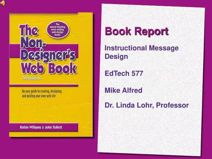
Book Report Instructional Message Design EdTech 577 Mike Alfred Dr. Linda Lohr, Professor. Summary:

E N D
Book Report Instructional Message Design EdTech 577 Mike Alfred Dr. Linda Lohr, Professor
Summary: This book is an easy-to-read manual written to assist anyone interested in creating a web page. It is extremely well written and should be required reading for anyone interested in web development. Williams and Tollett have broken the book up into five main sections that deal with everything from “What is the Web?” to “How and Why to Register Your Site” and everything in between.
Part One: Using the World Wide Web Inthis section of the book they clear up the mysteries and myths of the internet. The terminology we hear so often in reference to the internet is clarified as well. Bits: Digital pieces of information. Bits Per Second: Amount of information sent per second. URL:Uniform Resource Locator. This is a lot like your home address.
Part Two: Making Web Pages Here the discussion turns to the actual creation of web pages. The versatility of hypertext language allows users to create web sites that can be viewed on any computer platform. They also discuss web site planning, focusing on: • Who is your audience? What do you want to accomplish? • Make an outline as a road map to build site. • Collecting and storing materials. • Saving your source files or originals for further editing.
Part Three: Design Issues on the Web In this section the book looks at the advantages of web design versus print. They consider navigation elements of web pages and how to recognize good and bad web development by examining the basic design principles of web page making: contrast, alignment, repetition, and proximity. Alignment Williams states that “Lack of alignment is the most prevalent problem on web pages” (p.114). Contrast is what draws your eye into a page, it pulls you in. (Williams p.126) Repetition is what brings the site together to create the overall effect or message. Proximity is the relationship between items on the web page in terms of location or arrangement.
Part Four: Color, Graphics, and Type This section is the heart of the book. It is in this section that many important topics are discussed such as: color, graphic formats, image design, compression, typography, and flash animation. Light bouncing off object. CMYK Light going through object. RGB
Part Five: Your Done – Now What? The last section of this book discusses the final steps to complete your web site. It covers topics such as how to properly test your site in multiple web browsers, loading your site on a server, and the best way to register your site on the web. One of the most interesting topics covered in this section was Meta Tags, which are little pieces of code that allow search engines to classify your website. There are two main types of meta tags that you can use on your site: Description and Keywords. Both of these tags help most search engines classify your site, allowing people to find your site by your description or keyword.
Conclusion: This book is an easy read and is geared to all audiences from the beginning to the advanced web developer. It is chalk full of great tips to creating aesthetically pleasing and functional web sites. Williams and Tollett do an excellent job of breaking the vast amount of information into easy to digest segments, allowing the reader to get the most out of this book. This is a must read for anyone interested in creating a web page.
Most Important Thing I Learned: I felt that the single most important thing that I learned reading this book was about image compression. Having made a variety of web pages over the years, I always compressed images for the web based on the software’s recommendation. Williams and Tollet in their chapter “Color on the Web” discussed resolution in terms that made sense to me. The idea that you can compress an image down to 72 ppi (pixels per inch) was totally new to me. This has a profound effect on how fast a web page will load and does not effect the quality of the image. As they point out that there is no difference in quality between 144 ppi and 72 ppi on the web.
Justification: Within thispresentation I used all four principles of CARP: contrast, alignment, repetition, and proximity. Contrast was used extensively on each slide. Every slide has a striking difference in elements highlighting the book and presentation information on each slide. Also I employed “at least one really “fat” font and one really skinny font” (Lohr, p.201). Alignment is left aligned throughout the presentation for easier reading, and images are based off of this alignment to form perceptual chunks of information (Lohr, p.201).
Justification: Repetition was accomplished by the use of the same design, layout, and fonts on each slide of the presentation. By repeating the format on each slide, it allowed me to keep the same theme throughout the presentation. This aids in keeping the reader engaged in the content and not searching for information or feeling lost. Proximity was exemplified through alignment, contrast and repetition. I was able to chunk information into segments on the page. This allowed information to be organized by related topics on each slide. I placed headers close to the subordinate content to attempt to improve the learners understanding of the information (Lohr, p.207).