Download
1 / 14
140 likes | 145 Views
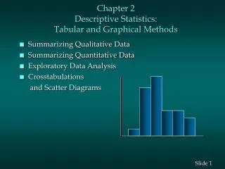
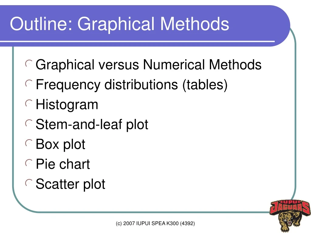
Outline: Graphical Methods. Graphical versus Numerical Methods Frequency distributions (tables) Histogram Stem-and-leaf plot Box plot Pie chart Scatter plot. Graphical vs. Numerical Methods. Graphical methods: Intuitive, easy to understand Difficult to construct manually

E N D
Outline: Graphical Methods • Graphical versus Numerical Methods • Frequency distributions (tables) • Histogram • Stem-and-leaf plot • Box plot • Pie chart • Scatter plot (c) 2007 IUPUI SPEA K300 (4392)
Graphical vs. Numerical Methods • Graphical methods: • Intuitive, easy to understand • Difficult to construct manually • Useful to find overall patterns • Numerical methods: • Require some knowledge • Provide more objective ways of describing data (c) 2007 IUPUI SPEA K300 (4392)
Frequency Table • Class and frequency • Mutually exclusive and exhaustive • Class limits should not overlap • Class should not be omitted • Class limits (boundaries) • Class width • Should be uniform (equal width) • Class midpoint (c) 2007 IUPUI SPEA K300 (4392)
Steps • Determine the number of classes • Find minimum and maximum values • Select the number of classes • Find the limits and boundaries • Tally the data to get frequencies • Relative frequency = freq/N • Cumulative frequency (c) 2007 IUPUI SPEA K300 (4392)
Example • Cereal Calories, question 15 on page 59 • Range: 190 (= 270 - 80) • 5 classes; 50 class width • Class midpoint: 125, 175… class | Freq. Percent Cum. ------------------------+----------------------------------- <=100 | 8 17.39 17.39 100-150 | 14 30.43 47.82 150-200 | 13 28.26 76.08 200-250 | 9 19.57 95.65 250-300 | 2 4.35 100.00 ------------------------+----------------------------------- Total | 46 100.00 (c) 2007 IUPUI SPEA K300 (4392)
Bar Chart (c) 2007 IUPUI SPEA K300 (4392)
Histogram • Continuous vertical bars for density (c) 2007 IUPUI SPEA K300 (4392)
Histogram Polygon, Oglive • Frequency polygon connects midpoints of classes • Ogive is the cumulative frequency graph • Histogram shapes, Figure 2-8 on page 56 (c) 2007 IUPUI SPEA K300 (4392)
Stem-and-leaf plot • Provide much useful information • Sort data in the ascending order • Determine leading digits • Record data by putting their trailing digit • Question 15 on page 79 Stem-and-leaf plot for tax 1* | 2788 2* | 001489 3* | 1367 4* | 148 5* | 0 6* | 0 7* | 6 (c) 2007 IUPUI SPEA K300 (4392)
Box plot • Minimum, maximum • 25th and 75th percentile (1th and 3th quartile) • Mean, medium (c) 2007 IUPUI SPEA K300 (4392)
Pie chart • Degree=(frequency/N)*360 (c) 2007 IUPUI SPEA K300 (4392)
Scatter Plot (Q14 on page 89) • To examine the relationship between two variables • Positive, negative, linear, exponential, … (c) 2007 IUPUI SPEA K300 (4392)
Misleading Graphs • Page 70-73 • Irrelevant scales • Not report units and labels. • Irrelevant type of graphs • Irrelevant perspective (c) 2007 IUPUI SPEA K300 (4392)
Perspectives (c) 2007 IUPUI SPEA K300 (4392)