Download
1 / 25
250 likes | 389 Views
Statistics: Using Scatter Plots. Vocabulary. Bivariate Scatter Plot Positive Correlation Negative Correlation No Correlation. Scatter Plot. A set of bivariate (data with two variables) graphed as ordered pairs in a coordinate plane is called a scatter plot.

E N D
Vocabulary • Bivariate • Scatter Plot • Positive Correlation • Negative Correlation • No Correlation
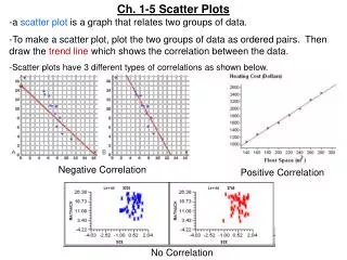
Scatter Plot • A set of bivariate (data with two variables) graphed as ordered pairs in a coordinate plane is called a scatter plot. You don’t connect the points in a scatter plot.
Scatter plots are similar to line graphs in that they use horizontal and vertical axes to plot data points. However, they have a very specific purpose. Scatter plots show how much one variable is affected by another. The relationship between two variables is called their correlation .
Correlation • The relationship between two variables is called their correlation .
Positive Correlation • If the data points make a straight line going from the origin out to high x- and y-values, then the variables are said to have a positive correlation
Negative Correlation • If the line goes from a high-value on the y-axis down to a high-value on the x-axis, the variables have a negative correlation .
No Correlation • If the plot on the graph is scattered in such a way that it does not approximate a line (it does not appear to rise or fall), there is no correlation between the sets of data.
Tell whether the data graphed in the following scatterplots appear to have positive, negative, or no correlation.
Prediction Equations • When you find a line that closely approximates a set of data, you are finding a line of fit for the data. An equation of such a line is called a prediction equation because it can be used to predict one of the variables given the other variable.
To find a line of fit and a prediction equation for a set of data, select two points that appear to represent the data well. This is a matter of personal judgment, so your line and prediction equations may be different from someone else’s.
Line of best fit • A line of best fit (or "trend" line) is a straight line that best represents the data on a scatter plot. This line may pass through some of the points, none of the points, or all of the points. • You can examine lines of best fit with: 1. paper and pencil only 2. a combination of graphing calculator and paper and pencil 3. or solely with the graphing calculator
Is there a relationship between the fat grams and the total calories in fast food?
Paper and Pencil Solution: • 1. Prepare a scatter plot of the data on graph paper. • 2. Using a strand of spaghetti, position the spaghetti so that the plotted points are as close to the strand as possible. • 3. Find two points that you think will be on the "best-fit" line. Perhaps you chose the points (9, 260) and (30, 530). Different people may choose different points.
4. Calculate the slope of the line through your two points (rounded to three decimal places). (9, 260) and (30, 530)
5. Write the equation of the line. This equation can now be used to predict information that was not plotted in the scatter plot. • For example, you can use the equation to find the total calories based upon 22 grams of fat.
Graphing Calculator Solution: 1. Enter the data in the calculator lists. Place the data in L1 and L2. STAT, #1Edit, type values into the lists
2. Prepare a scatter plot of the data. Set up for the scatterplot. 2ndStatPlot- choose the first icon - choices
3. Have the calculator determine the line of best fit.STAT → CALC #4 LinReg(ax+b)
Include the parameters L1, L2, Y1. (Y1 comes from VARS → YVARS, #Function, Y1)
You now have the values of a and b needed to write the equation of the actual line of best fit. See values at the right. y = 11.73128088x + 193.8521475
To get a predicted value within the window, hit TRACE, up arrow, and type the desired value. The screen below shows x = 22.