Download
1 / 28
320 likes | 539 Views
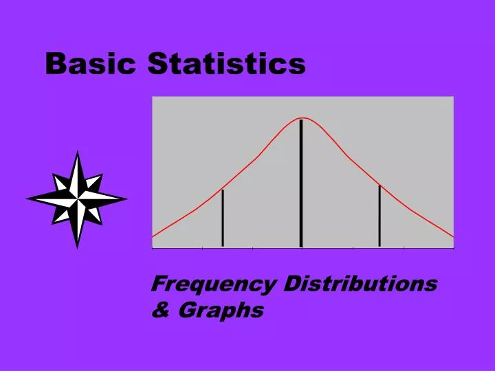
Basic Statistics. Frequency Distributions & Graphs. Structure of Research (The Scientific Method). Reviewing Information. Identify the Problem. A Systematic Approach. Collecting Data. Drawing Conclusions. Analyzing Data. STRUCTURE OF STATISTICS. TABULAR. DESCRIPTIVE. GRAPHICAL.

E N D
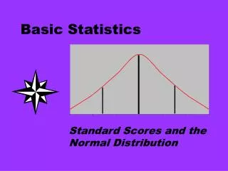
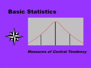
Basic Statistics Frequency Distributions & Graphs
Structure of Research(The Scientific Method) Reviewing Information Identify the Problem A Systematic Approach Collecting Data Drawing Conclusions Analyzing Data
STRUCTURE OF STATISTICS TABULAR DESCRIPTIVE GRAPHICAL NUMERICAL STATISTICS CONFIDENCEINTERVALS INFERENTIAL TESTS OF HYPOTHESIS
STRUCTURE OF STATISTICS Now, we will look at the tabular and graphical approaches. TABULAR DESCRIPTIVE GRAPHICAL NUMERICAL STATISTICS CONFIDENCEINTERVALS INFERENTIAL TESTS OF HYPOTHESIS
Step 1 QUESTIONNAIRE A Self-Concept Scale Scale: 1=Strongly Disagree 4=Neither Agree nor Disagree 7=Strongly Agree • ITEMS: • I usually achieve what I want when I work hard for it. • Once I make a plan, I am almost certain to make it work.... • 10. Almost anything is possible for me if I really want it.
Step 2 Scores of 100 college students on the self-concept questionnaire.
Step 3 A possible first step in organizing data for interpretation is to arrange the scores by size, usually from highest to lowest.
RELATIVE FREQUENCY DISTRIBUTION • The relative frequency of a class is obtained by dividing the class frequency by the total frequency.
Grouped Frequency Distribution Use to present the data as a graph or as table
Grouping and Loss of Information tradeoff More usable/comprehensible information Precise Information Ease of communication Accuracy
GRAPHIC PRESENTATION OF A FREQUENCY DISTRIBUTION • Histogram vs. Bar Graph • Polygons (Line Graphs) • Frequency/Relative Freq • Cumulative Distributions • Percentiles • Stem-and-Leaf Displays
HISTOGRAM The Histogram is a series of column, each having as its base one class interval as its height the number of cases, or frequency, in that class. FOR WATER USAGE (1,000 GALLONS)
Percent Frequency 25% ordinate 20% 15% 10% 5 % score abscissa Histogram is a graphing technique that is appropriate for quantitative data. To avoid having the figure appear too flat or too steep, it is usually well to arrange the scales so that the height of the histogram is 2/3 to 3/4 of its width.
Percent 25% 20% 15% 10% 5 % North West South male female When one is comparing two distributions that are based on unequal numbers of observations, percentages are preferable.
FREQUENCY POLYGON In the polygon a point is located above the midpoint of each class interval to represent the frequency in that class. These points are then joined by straight lines. 15 10 5 0 10 15 20 25 30 35 5 40 The lowest class interval midpoints have zero frequencies. Frequency polygons are closed at both ends.
Describing Distributions normal Positively skewed Negatively skewed Y Y Y X X X Rectangular Bimodal The Y-axis represents frequency, and the X-axis represents the numerical value of the observations Y Y X X
THE BAR GRAPH A Bar graph is used to present the frequencies of the categories of qualitative variable. A conventional bar graph looks exactly like a histogram except for the wider spaces between the bars. A bar chart can be used to depict any of the levels of measurement (nominal, ordinal, interval, or ratio).
Construct a bar chart for the number of persons with AIDS per 100,000 population for selected metropolitan areas of July 1990. Source: Dept. of Health & Human Services.
BAR CHART FOR THE AIDS DATA ATLANTA AUSTIN DALLAS HOUSTON NY, NY. SAN. FRAN. WASH., D.C. W. P. BEACH
Cumulative Percentage Curve Frequency and percentage polygons can be readily converted into cumulative percentage curve. The cumulative percentage or Ogive Curve is the most common type of cumulative distribution. Cumulative percent IQ score
Step 1: Percent (110--119) = 363/2200= 0.165 Step 2: 0.165x100 = 16.50% Step 3: 73.77% + 16.50%=90.27%
Y Cumulative percentage P45=100 IQ score X Percentile and percentile score Percentiles are points in a distribution at or below which a given percent of the cases lie. P45 corresponds to an IQ 100 score of approximately 100; therefore 55 % of the IQ scores exceed 100.
THE LINE GRAPH • A line graph is used to show a picture of the relationship between two variables. • A point on a line graph represents the value on the Y variable that goes with the corresponding value on the X variable.
Stem-and-Leaf Plots • When summarizing the data by a group frequency distribution, some information is lost since we would only have the classes and the frequency counts for the classes. We will not know what are the actual values in the classes. • A stem-and-leafdisplay offsets this loss of information. • The stem is/are the leading digit(s). • The leaf is the trailing digit (units digit). • The stem is placed to the left of a vertical line and the leaf to the right.
The Dean of the College of Education reports the following number of students in the 15 sections of basic statistics offered this semester. Construct a stem-and-leaf chart for the data. • 27, 36, 29, 21, 24, 26, 32, 30, 36, 30, 28, 23, 17, 41, 19. Another advantage of a stem-and-leaf display is that it is easily reproduced with a line printer. STEM LEAF 1 2 3 4 7 9 1 3 4 6 7 8 9 0 0 2 6 6 1
PIE CHART • A pie chart is especially useful in displaying a relative frequency (percentage) distribution. • A circle is divided proportionally to the relative frequency (percentage) and portions of the circle are allocated for the the different groups.
EXAMPLE A sample of 200 college students were asked to indicate their favorite soft drink. The results of the survey are given on the next slide. Draw pie chart for this information.
PIE CHART FOR THE TASTE TEST Coca-Cola Others Pepsi Seven-Up Dr. Pepper