Download

1 / 43
430 likes | 546 Views
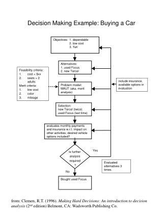
1. UPP 502 Planning Skills Fall 2007, Tuesday, October 2. An Exercise in ArcGIS 9.2: Making a Map for a Community Analysis Example. First Step (with flash drive): Set Up Your Workspace. 2.

E N D
1 UPP 502 Planning Skills Fall 2007, Tuesday, October 2 • An Exercise in ArcGIS 9.2: • Making a Map for a Community • Analysis Example
First Step (with flash drive): Set Up Your Workspace 2 “Workspace” is the area where you work and store input data, files you create while you work, notes you take to document your efforts, and map documents you produce From Blackboard, COPY the compressed file Exercise502.zip to your “origdata” folder E: or F: or whatever If you do not have a flash drive, you will have to work on the desktop….copy Exercise502.zip to the Desktop; make a new folder on the Desktop and call it “data”….. “open” the zip file, select all files and move them to the data folder….this unzips them GIS As shown, the workspace for this exercise is the GIS directory and its sub-directories data “Open” the zip file, select all files and move them to the data folder…this unzips them origdata
3 ….begin by starting up ArcMap (finding it on SEL computers could be tricky --- click on start > all programs > class applications > UPP > ArcMap); in the dialogue box that appears, choose to start with a new empty map. Click “OK.” You should get the screen similar to what appears on the next page !!
4 Main Menu Standard Toolbar Tools Toolbar (this is docked here but it could "float" or be docked horizontally above….your choice) This area is called the “Table of Contents” This is the Data Frame View Draw Toolbar
5 ….to start map-making, you need to retrieve two layers and a data table. In the exercise, “click” will mean “left-click.” When “right-click” is needed, the directions will say so. Click on the “add data” icon. This is the plus sign inside a yellow diamond on the standard toolbar
6 …the “add data” window will appear. It may look like a listing of drive directories and not much more. If your drive is there, navigate to your workspace’s data sub-directory and select lusummary.dbf, majorroad.shp, and oplanduse2001sum.shp Select by clicking on one of them and then cntl-click on the other two. Then click the “add” button. Skip to page 8. If your drive is not there, you will need to “connect to folder.” See page 7.
7 The “connect to folder” window should appear. Navigate to the folder, or to Desktop if you are not using your flash drive, where you have copied your UPP502 GIS data and click “OK.” This will not get the data but it will bring back the “add data” window which (once you navigate to your folder) should look like the window below. Note in the windows that several files have a .shp extension. These are shapefiles. Two files have .dbf extensions. These are data tables. Now click on lusummary.dbf and then cntl-click on majorroad.shp and oplanduse2001sum.shp. Click the “Add” button.
8 You should get a window that looks like this. If the lusummary file is not visible in the table of contents click on the “source” tab below and it should appear
9 If you don’t like the symbols/colors for roads and land use, left-click on the symbol or patch in the table of contents. This will bring up one of the windows below and you can change color, symbol, line width. For Lines For Polygons
10 Right clicking on the name of the layer will bring up a context menu associated with that layer
11 A Layer’s Context Menu -- Very Important Context menu is a gateway, important to effective use of ArcGIS: “Open Attribute Table” – allows you to see attribute table “behind” the layer “Joins and Relates” – for joining or relating records in a data table to features on your map “Label Features” – one way to label points, lines, and polygons “Properties” – opens up the Layer Properties window In this exercise you will use layer properties tolabel the major roads and to establish categories and colors for land uses.
12 Get the Context Menu for the majorroad layer (right click on name of layer); choose “Open Attributes Table.” This is ALWAYS a good thing to do when you first bring a layer or data table into ArcMap. Scroll around in it to see number of records and what is in the fields. You will want to label the roads so look for a field with names of streets. How many records are there?__________ What is the name of the field containing street names?___________ Close the Table (click the button with the “X” in the upper right corner)
13 To label the major roads, get the layer properties window for majorroad (right click on name of layer > in context menu, left click on properties). Select the “Labels” tab Click the empty box next to “Label features in this layer.” Set the field to be used for the labels = FENAME Set the characteristics of the labels (try Verdana, 7, dark blue) Click “OK.”
14 …and the result should look similar to this Next step is to “symbolize” on the land use layer… …i.e., show each of the major land uses with a different color
15 Open the attributes table "behind" oplanduse2001sum (right click on layer name and select "open attribute table"). There are 17 unique records but you want them displayed with more general categories. Keeping this table open, open the table “behind” lusummary (the context menu will look different, choose "open"). Drag the tables so you can see both. “LUSUMDE” is the field containing the more general categories…note that “EDUCATION” and “GOVT” are both “Institutional.” Make a note that "First_Land" is a common field to both tables. Close both tables.
16 Join the Tables: From context menu for the land use layer, select "Joins and Relates" and then "Join"
17 …the Join Data Window will appear. In box 1, you indicate the name of the common field from oplanduse2001sum (FIRST_LAND). In box 2, you indicate the name of the data table that will be joined: lusummary. In box 3, you indicate the name of the common field from lusummary (FIRST_LAND). Click "OK." A window will appear asking if you want to create an index. Click on “No.” Open the attribute table "behind" oplanduse2001sum and see what has happened. See that the field names include a prefix identifying the parent table.
18 Open the layer properties window associated with oplanduse2001sum and select the Symbology tab. In the "Show" box, select Categories > Unique Values. In the "Value Field," select lusummary.LUSUMDE. Click the "Add All Values" button and uncheck "<all other values>" Select colors for each land use type by clicking on each color patch. This will bring up the Symbol Selector (shown below) and select colors. Select the following colors: red for commercial, brown for industrial, violet for institutional, orange for multi-family residential, green for open space, pale yellow for single family residential, gray for transportation/utility and “no fill” for vacant. Click “OK.”
19 Your result should look similar to this. Now, you want to prepare the final map by adding map elements such as titles, north arrows, scale bars, legend. Click this button to change to Layout View
20 Virtual Page In Layout View, your map now appears on a virtual page. If Oak Park needs to be resized within the frame, change the values in the scale window to those shown above. "Grab" the corners of the box with the dashed outline and drag them closer to the edge of the virtual page. Use the Pan Tool to drag the map over to the right side of the page
21 Data frame You want the data frame on your map to be invisible. Right click on the data frame
22 …the context menu for the data frame appears, click on “Properties” In the Properties window select the Frame tab and choose “No Color” for your border color Click “OK.”
23 Now you want to add map elements. Pull down the Insert menu to see that this is where you find important elements to insert such as Title, Legend, North Arrow, and Scale Bar. Go ahead and insert a north arrow and scale bar, moving each to a pleasing location. As you insert the north arrow and scale bar, note the various choices in the associated windows. Poke around to see what is there!
24 Next you want to insert a title for your map. A map title at a minimum must state where, when and what. In the exercise, you are mapping Oak Park land uses in 2001. Pull down the Insert menu again and select “Title.” A box will appear centered near the top of your map. Type in your map title and hit the “Enter” key. The title will re-center and appear within a light blue outline. Double click on the title to get a Properties window. Here you can set the characteristics, number of lines and right/left/center orientation of multiple-lined titles. When you are satisfied with the characteristics of your title, click “OK” and then move the title to a pleasing location on your virtual page.
25 Next, insert a legend from the Insert menu. When you insert a legend, a wizard appears. The first two screens are shown below. The first one allows you to determine which layers of the map need a legend. The second allows you to give the legend a title (or delete the title). You can click “Next” for these two screens. Keep clicking the "Next" button until the legend is inserted on your layout. It will appear in the middle of the page. You will need to select it and drag it to a location you desire.
26 Your result might look like this. Study this for a moment. What extremely important map element is missing? Hint: You would insert this from the Insert menu selection “Text” Note that the legend looks just like it does in the Table of Contents. You probably should clean that up……..
27 Using the Select Features Tool right click in the legend. A new context menu will appear. Choose "Convert to Graphics." While this now disconnects the legend from the map it is based upon (meaning that if you change the map, the legend, as shown in the layout, will no longer change), it does allow you to edit the legend. Once you have converted to graphics, reopen the context menu by once again right clicking in the legend…..the "Ungroup" option will become available. Click on that and see what happens. Now you can separately edit all the little pieces of the legend until you are satisfied. Before you edit, you should zoom in on the virtual page. This is accomplished using a tool on the layout toolbar shown below. Zoom in on virtual page Move virtual page on the layout frame Return to full extent of virtual page
28 Skip to page 30, if you are working on Desktop in SEL lab Before you go on, export the map in pdf format. While still in the Layout View, click File Menu Choose “Export Map” Select “Save As Type” and choose “.PDF” Give it a fun file name and make sure it is going to your workspace Click “Save” You will be able to view the map in Adobe Acrobat or Adobe Reader
29 Skip to page 30, if you are working on Desktop in SEL lab Before you go on to the second part of the exercise, you should save your "map document." Pull down the File menu. Select “Document Properties" …then click on the “Data Source Options" button …and choose “Store relative path names“ Click “OK,” “OK” Return to the File menu and save the map document with a catchy name like OakParkLandUse (with no spaces). Navigate to the workspace you made at the beginning of the exercise and click “Save.” ArcGIS will save it with the extension .mxd.
30 Close your first ArcMap session and start a new one. Retrieve the data file opblockdata.dbf and the two layers flwtour83.shp and conflateblocks.shp Your result should look something like this…remember you can change the colors of the polygons and the points.
31 Note: the points are buildings designed by Frank Lloyd Wright. The polygons are census blocks The Village is going to sponsor a Frank Lloyd Wright walking tour. They expect that up to 1000 people might attend. Your job is to contact all the households within a block of these buildings to warn them of the coming crowd. In this exercise you will learn how to determine the number of households to contact.
32 As ALWAYS, open the attribute tables to explore what is there: Note that "STFID" appears to be a field common to these two tables How many records are in each table? opblockdata__________ conflateblocks_________ flwtour83___________
33 Start a Join from conflateblocks
34 Join the layer conflateblocks with the data table opblockdata with the boxes in the Join Data window filled in as shown. Click “OK.” When you are asked to create an index, choose “yes.”
35 Buffer the Frank Lloyd Wright buildings by 660 feet (about the length of a city block) Open up the Toolbox and choose Analysis Tools > Proximity and then double left click on Buffer
…the buffer window will appear. 36 Fill in the "input features" with flwtour83. Choose a name for the “Output Feature Class” paying attention to the destination folder. Set distance to 660 feet. Make sure you select "All" for Dissolve Type Click “OK”
37 A new layer is created (here, it is called flwtour83_Buffer) Next you will select blocks that intersect the buffer layer
38 Go to the Selection Menu and choose "Select by Location"… …the Select by Location window appears You will be selecting features from conflateblocks that intersect flwtour83_Buffer. If your window looks like the window to the right, go ahead and click on "Apply“ and “Close”
39 …the blocks that satisfy this query are selected and are highlighted by a cyan outline which will wash out in black and white.
40 Open the Attribute Table "behind" conflateblocks. Selected # of blocks? ___________ Right click on the field name "opblockdata.TOTHH" A new context menu appears. Click on "Statistics" The Selection Statistics Window shows that there are 4,433 households in the selected blocks. Close the Statistics Window and the Attributes table.
41 Just for fun!! Clear your previously selected blocks: pull down the Selection Menu; click on Clear Selected Features. Uncheck flwtour83_Buffer to "turn it off"
42 We want to find all the blocks with TOTPOP greater than 200. Go to selection menu and choose "Select by Attribute" ….the select by attribute window appears. Make sure the layer is conflateblocks and the method is "Create a new selection." To build an expression for your query, double click on opblockdata.TOTPOP in the list. Single click on the greater than sign (>) and type in 200. Click OK
43 The blocks where TOTPOP exceeds 200 will be outlined in cyan. Record the number of such blocks by looking in the attribute table "behind" conflateblocks: _________ That's All !!!