Download
1 / 22
220 likes | 292 Views
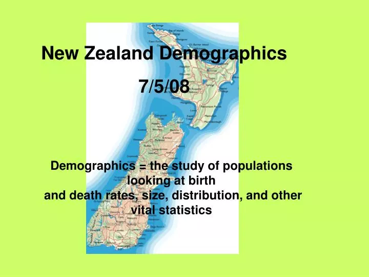
New Zealand Demographics 7/5/08. Demographics = the study of populations looking at birth and death rates, size, distribution, and other vital statistics. Choropleth Maps. A Choropleth Map is a cross between ……a graph: This shows how much of something there is. …And a Map:

E N D
New Zealand Demographics 7/5/08 Demographics = the study of populations looking at birth and death rates, size, distribution, and other vital statistics
Choropleth Maps • A Choropleth Map is a cross between ……a graph: • This shows how much of something there is
…And a Map: • This show where something is
So…A Choropleth Map shows how much of something there is in a given place = its distibution or density • This is often population or rainfall or sunshine hours etc • Eg:
How to read choropleth maps • Look at page 29 in textbook • The key gives the pattern that represents a certain percentage range eg. =<5% (in the left hand map) • What statements can you make about population distribution of NZ Maori or Polynesians from these maps?
Exercise • Divide the population total from the table into 5 or 6 evenly spaced number groups • Decide on a key for the groups • Using the table, fill in the regions on the map to show population distribution/density • Stick into books under heading + notes
A Choropleth key is usually made of different shades of the same colour, from light to dark. • What else might be shown on a map like this? • Why is it better than a map and graph side by side?
Population Pyramids • Show the population of a country divided into age and sex • By looking at a population pyramid you can tell things such as how many females aged 20-24 there are in a country or how many males aged 5-9 • They can also tell you about birth and death rates
This pyramid shows an increasing birth rate in the Philippines
Not all population pyramids take the shape of an actual pyramid • Germany has a decreasing birth rate after a baby-boom 35-60 years ago
Puerto Rico’s population is quite steady across the age and sex groups
Exercise: • Stick the hand out into your books under the heading and notes • Answer the questions on the four pyramids shown • Remember to always read the titles and the two axes; the numbers aren’t always the same eg. Thousands/ Millions
NZ Geography… Find in atlas and label on blank map: Cape Reinga, Farewell Spit, Waikato River, Chatham Islands, Cape Foulwind, Bay of Plenty, Mount Egmont, Bluff, Matamata, Lake Pukaki, Marlborough Sounds, Waimakariri River, Half-moon Bay, Coromandel Peninsula, Cook Strait, Hawkes Bay, Lake Rotorua, Mount Ruapehu, Waiouru, Springs Junction, Haast Pass, Fiordland, Lake Aviemore, Tasman Sea, Foveaux Strait, Canterbury Bight, Three Kings Islands, Pacific Ocean
Précis Map • Using the topographical map of the Abel Tasman National Park, create a précis map on the blank handout- to be glued into books. • It must follow mapping conventions (include a title and a scale). • Show on your précis map and key: Exotic forest, indigenous forest, residential areas (the dark bits) and Marahau River.
Reading the Weather… Reading the Weather… Reading weather maps helps us to understand what is being said by the weatherman on the news and in the newspaper. It makes anyone able to make an educated guess on what the weather will be like the next day- not even the weatherman is always right though!
Weather Symbols 1025 A numbered line is an Isobar- tells what the air pressure level is. L A capital L represents a Low – a region of low air pressure. H A capital H represents a High- a region of high air pressure. - - - A dashed line represents a Trough- usually means storms or rain
More symbols… A line with half moons on it represents a warm front. A line with triangles on it represents a cold front. A line with both on opposite sides means the front isn’t moving.
Lucky Last… • A Front with triangles and half moons on the same side means that there is little or no change in the temperature. • A Front with a dashed line means the front is weak.
Climate Graphs L/O: Interpret and Draw Climate Graphs (Temperature & Rainfall)
Comparing Climates • Looking at the Christchurch climate graph that you have just made, and the Auckland climate graph, make three statements comparing the two graphs e.g.: • On where is wetter/drier • On where is warmer/colder • On where you would like to live (for climate) • On the Summer/Winter differences • On comparative monthly differences