Download
1 / 9
100 likes | 112 Views
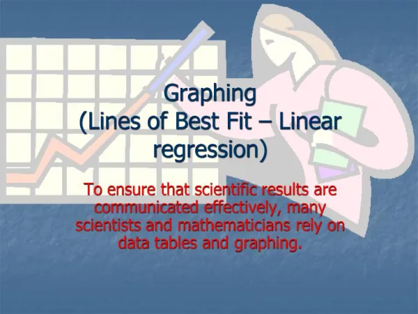
Lines of best fit. Interpreting scatter plots. This scatter plot shows the relationship between average hours of math study per week and average math test score. What can we add to this graph to help us to more easily see the general trend of the data?. Lines of best fit.

E N D
Interpreting scatter plots This scatter plot shows the relationship between average hours of math study per week and average math test score. What can we add to this graph to help us to more easily see the general trend of the data?
Lines of best fit A line of best fit (or a trend line) is drawn on a scatter plot to show the linear trend in a set of data. It is drawn so that there are roughly an equal number of points above and below the line. weak positive correlation strong negative correlation weak negative correlation strong positive correlation The stronger the correlation, the closer the points are to the line.
Lines of best fit When drawing a line of best fit, remember: • The line does not have to pass through the origin. • For a more accurate line of best fit, find the mean of each variable. This forms a coordinate pair, which can be plotted. The line of best fit should pass through this mean point. • The equation of the line of best fit can be found using the slope and y-intercept. • The line of best fit can be used to estimate one variableusing another, within the range of data used. This is called interpolation.
Height and weight of twelve grade 10 boys 130 120 weight (lbs) 110 100 0 0 150 155 160 165 170 175 180 185 height (cm) Finding the mean point This table shows heights and weights of some grade 10 boys. × × Find the mean height and mean weight: × × × × × ● × × × × 167 117 × Plot the mean point: (167, 117)
Height and weight of twelve grade 10 boys 130 120 weight (lbs) 110 100 0 0 150 155 160 165 170 175 180 185 height (cm) Drawing the line of best fit × mean point: height 167cm, weight 117lbs × × × × × × ● × × × Discuss how the line of best fit should be drawn. × × The line of best fit should pass through the mean point and the points should be distributed evenly either side of the line.
Height and weight of twelve grade 10 boys 130 120 weight (lbs) 110 100 0 0 150 155 160 165 170 175 180 185 height (cm) Using the line of best fit Use the line of best fit to estimate the weight of a 163cm tall grade 10 boy. × × × × × × × × × × y = 0.8x – 16.6 × × y = 0.8x – 16.6 = 0.8(163) – 16.6 = 130.4 – 16.6 = 113.8lbs Could we use this graph to predict the height of a grade 10 boy weighing 176lbs?
Extrapolation Using lines of best fit to predict values outside the range of data is called extrapolation. Extrapolation should be used with caution; only predict values when you expect the trend of the data to continue. We found that the grade 10 boys tended to weigh more the taller they were. However, think about the limits of the variables. Using our line of best fit, a 176lb boy would be around 241cm tall. That’s over 7ft10in! In this case, it is unrealistic to assume that the trend will continue much further.
Outliers This scatter plot shows the height and weight of a sample of grade 10 girls. One point on the scatter plot does not fit in with the rest. 130 × 125 120 × × 115 ● × × How will this affect the line of best fit? How do you think we should deal with it? 110 × Weight (lbs) 105 × 100 × 95 90 × This point is an outlier.When drawing a line of best fit on the scatter plot, this outlier should be ignored. 85 140 150 160 170 180 Height (cm)