Download

1 / 27
270 likes | 383 Views
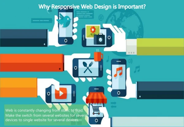
Heuristics of Responsive Web Design Aronya Waller & Nate Mudd IDIA 612. Responsive Web Design is the approach that suggests that design and development should respond to the user’s behavior and environment based on screen size, platform, and orientation. Heuristics of Responsive Web Design.

E N D
Heuristics of Responsive Web Design Aronya Waller & Nate Mudd IDIA 612
Responsive Web Design is the approach that suggests that design and development should respond to the user’s behavior and environment based on screen size, platform, and orientation.
Source: http://sender11.typepad.com/sender11/2008/04/mobile-screen-s.html/
Heuristics of Responsive Web Design Flexible Everything Design for Mobile First Design for Progressive Enhancement &/or Graceful Degradation Optimize Content Rather Than Support
Flexible Everything • Fluid or Liquid Layouts • Proportionally Scaled Images • Media Queries
Flexible Everything – Flexible Layout • Use percents and ems • Don’t use finite values like pixels • How do you convert? It’s easy: • .figure {width: 20.833%; /* 200px / 960px */ } • .headerText {font-size: 0.75em; /* 12px / 16px */ }
Flexible Everything -Proportionally Scaled Images • Hiding and Revealing Portions of Images • Deliver different images depending on device • Foreground Images That Scale With the Layout
Flexible Everything -Proportionally Scaled Images Source:http://www.alistapart.com/d/responsive-web-design/ex/ex-site-flexible.html
Flexible Everything –Media Queries • They’ve been around since CSS 2.1 • You’ve already used them • <link rel="stylesheet" type="text/css" href=“screen.css" media="screen" /> • <link rel="stylesheet" type="text/css" href="print.css" media="print" /> • When CSS3 came out the W3C extended media queries
Flexible Everything –Media Queries • @media screen and (max-width: 420px) { • .figure{ • margin-right: 3.317535545023696682%; width: 48.341232227488151658%; • }
Design for Mobile First • Multiple screen sizes & densities • Performance optimization • Device capabilities
Design for Mobile First •Consider Screen Size • Know your users • Focus on core actions • Use scalable design
Design for Mobile First Netbooks: 9" diagonal display, screen resolution of 1024 x 600 pixels, pixel density approximately 133 ppi iPhone: 3.6" diagonal display, screen resolution of 320 x 480 pixels, pixel density of 160 ppi Nokia E60: 2.2" diagonal display, screen resolution of 416 x352 pixels, pixel density of over 240 ppi Source: http://mobiforge.com/designing/story/effective-design-multiple-screen-sizes
Design for Mobile First • Focus on core actions • Know your users • Use scalable design
Design for Mobile First Source: http://mobiforge.com/designing/story/effective-design-multiple-screen-sizes
Design for Progressive Enhancement Progressive enhancement is an approach to web development that aims to deliver the best possible experience to the widest possible audience
Design for Progressive Enhancement & Graceful Degradation • basic content should be accessible to all browsers • basic functionality should be accessible to all browsers • sparse, semantic markup contains all content • enhanced layout is provided by externally linked CSS • enhanced behavior is provided by unobtrusive, externally linked JavaScript • end user browser preferences are respected
Design for Progressive Enhancement & Graceful Degradation Source: http://bradfrostweb.com/blog/web/mobile-first-responsive-web-design/
Optimize Content Rather Than Support • Structure Content First • Optimize for Context • Responsive Images Test Page http://filamentgroup.com/examples/responsive-images/ • Sencha.io Srchttp://www.sencha.com/products/io/ • Support vs. Optimize
Examples of Responsive Designs Good Responsive Experience http://unstoppablerobotninja.com/ Good Responsive Experience http://yiibu.com/ Bad Responsive Experience http://ubalt.edu/
Examples of Responsive Designs Good Responsive Experience Source: http://colly.com/
Examples of Responsive Designs Good Responsive Experience Source: http://clearairchallenge.com/
Examples of Responsive Designs Good Responsive Experience Source: http://calebacuity.us/
Exercise • Go to the following websites: • ubalt.edu • medicare.gov • att.com • Determine three core tasks a user would want to achieve when visiting the website from their mobile device • Resize your browser to 320 x 480 (approximate) • How could the layout be optimized for this screen size?
References BRYANRIEGER. (2009, January). Effective design for multiple screen sizes. [Blog post]. Retrieved from http://mobiforge.com/designing/story/effective-design-multiple-screen-sizes CalebAcuity Americas. (2011). Why us? [Website]. Retrieved from http://calebacuity.us/ Clean Air Works. (n.d.) Clean air commute challenge. [Website]. Retrieved from http://clearairchallenge.com/ Collison, S. (2011). The celebrated miscellany of Mr. Simon Collison. [Website]. Retrieved from http://colly.com/ Frost, B. (2011, June 19). Mobile-first responsive web design. [Blog post]. Retrieved from http://bradfrostweb.com/blog/web/mobile-first-responsive-web-design/ Hjerde, M. (2008, April 15). Mobile screen size trends. [Blog post]. Retrieved from http://sender11.typepad.com/sender11/2008/04/mobile-screen-s.html Keith, J. (2011, March 27). Context. [Blog post]. Retrieved from http://adactio.com/journal/4443/ Knight, K. (2011, January 12). Responsive Web Design: What It Is and How To Use It. [Blog post]. Retrieved from http://coding.smashingmagazine.com/2011/01/12/guidelines-for-responsive-web-design/ Olsson, T. (2007, February 6). Graceful degradation & progressive enhancement. [Blog post]. Retrieved from http://accessites.org/site/2007/02/graceful-degradation-progressive-enhancement/ Sencha Inc. (2011). Sencha.io. [Computer software]. Retrieved from http://www.sencha.com/products/io/ Wroblewski, L. (2010, November 1). Mobile first. [Blog post]. Retrieved from http://www.lukew.com/presos/preso.asp?26


![Progressive Enhancement & Mobile [Funka 2012]](https://cdn4.slideserve.com/7565260/progressive-enhancement-mobile-dt.jpg)