Download

1 / 2
30 likes | 205 Views
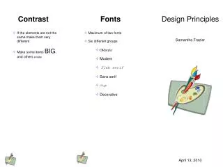
Font Families. Proximity. Design Principles. Suzy Que Cake Decorator 123 Baking Lane Hershey, IL 12345 (123)456-7890. There are two main font families: Serif: A style of font that has tails Example: Garamond Sans Serif: A style of font that does not have tails Example : Raavi

E N D
FontFamilies Proximity DesignPrinciples Suzy Que Cake Decorator 123 Baking Lane Hershey, IL 12345 (123)456-7890 • There are two main font families: • Serif: A style of font that has tails • Example: Garamond • Sans Serif: A style of font that does not have tails • Example: Raavi • There are also fun fonts that can be used: • Fun: A style of font that is just plain fun to use. • Example: Curlz MT • Only two fonts can be used when making a document. One should be Serif while the other is San Serif. The title of your document may be a different font than the text inside your document. • Helps you to organize ideas. • You should always group related items together. • Don’t be afraid of white space. Use the space to visually separate unrelated items instead of cluttering it with unnecessary objects or text. Jill Basler February 20, 2014
Contrast Repetition Alignment • Helps you create visual interest. • Two elements of contrast must be drastically different to be effective. • Contrast can be accomplished though: • Shape • Size • Line thickness • Color • S p a c e • Type • Helps you unify your document. • You want to repeat some aspect throughout the document, but don’t overuse it. • You can use lines, text, size, colors, shapes, art, or spatial relationship. • Helps you organize and unify your document. • As a general rule you should not have more than one type of text alignment • Alignments can help create different types of looks. Some can convey, formal, fun, serious or sophisticated works. • There are four types of alignment: Use dark text on light backgrounds Left – is most common Right – is used to make an impact or vice versa. Make big items big, while keeping little items little. Center – is formally used for titles Block – is often used in newspaper articles. But can sometimes create awkwardly spaced out text.