Download
1 / 15
150 likes | 156 Views
Designing effective posters. Dr. Berenice Golding School of Human and Health Sciences University of Huddersfield. Aims and objectives. To provide a brief overview of why posters are an effective method of communication To provide some tips and advice for how to start to construct posters.

E N D
Designing effective posters Dr. Berenice Golding School of Human and Health Sciences University of Huddersfield Revised March 2012
Aims and objectives Revised March 2012 To provide a brief overview of why posters are an effective method of communication To provide some tips and advice for how to start to construct posters. Give some practical tips and examples of how to go about developing an effective poster.
Purpose of posters Revised March 2012 • Academic posters are becoming a common approach to communicating and presenting research. Traditionally this has been the pursuit of scientific disciplines however, posters are increasingly being used in other disciplines (Anon, n. d); • Posters act as a medium to advertise your work; • They enable you to summarise your work – and to get your main points across to as many people as possible; • Act as a conversation starter - they engage people in discussion about your work.
Getting your message across Revised March 2012 Increasingly posters are used being used to disseminate research. More and more conference organisers offer the option of submitting a poster rather than giving an oral presentation. Posters unlike oral presentations need to speak for themselves – an audience should be able to work out your key messages without you stood there presenting them. However, be prepared to discuss your poster particularly if you have entered it into a competition. This can be a daunting prospect but it is good practice in terms of speaking about your research to different audiences.
Thinking about your poster Revised March 2012 • Key questions need to be answered before you get to the design stage. • These are: • Who is your audience? • Professionals, academics, the general public – the language used and messages given out need to meet the needs of your audience • What is your hook? • Catchy titles provide the feature that may draw your audience in to peruse your poster. Is the message clearly stated and will it capture the attention of your audience? • What is the purpose of your poster? • Consider what messages you wish to communicate and the audience receiving the messages. Remember you need to present a coherent snapshot of your research • What are the guidelines for your poster? • Refer to your brief • What is your message? • Effective posters deliver clear messages, content is highly visual
Planning your poster Revised March 2012 • An effective poster should be: • Legible from a distance of about six feet away, • Use a title that captures the attention of your audience, • Your title should be readable from about 15 - 20 feet away. • Use the right language for the right audience, • Avoid clipart wherever possible – due to pixel quality the resolutions may not suit your poster, images may blur. Consider sourcing photos from somewhere like ‘istock’ photos, • Have enough ‘white’ space – this aids readability, • Expect to work for a period of about five weeks on your poster!! This will be intermittently, so don’t panic but give yourself plenty of time to proof and revise accordingly.
Things to think about Revised March 2012 • People read posters from left to right and top to bottom – consider your layout – portrait/landscape. Be guided by your conference brief. • Using too much jargon may confuse your audience, unless they are specialists in your field and already know the jargon. • What message will readers take home with them? – what will they remember about your work? • Colour schemes – think about the tones and hues, avoid large swathes of garish colours. • Word count – a typical poster will have between 300 – 500 words, audience dependent (Anon, n. d).
Cont’d... Revised March 2012 • Font – Avoid using more than two different fonts. Choose a font such as Arial. • Use a good balance of text, pictures, charts and graphics. The text should support your images and vice versa. • The size of your poster and the orientation you will use. • Line spacing and text justification – left justification maybe easier to read. • Getting it printed – matt/glossy to laminate or not to laminate – a matt finish reduces glare. Laminated posters travel better so this might be worth considering – refer to conference brief. • At the printers -When arranging to get your poster printed it might be useful to find out if they print use RGB (red green and black) or CMYK (cyan magenta (purplish pink) yellow black – four colour printing) as this can affect your final print version of your poster. e.g. purple may appear as more of a pink hue than true purple. • Most PCs are set to RGB as default – custom colours.
Design tips Revised March 2012 • Plan your poster – preparation is key. • Consider using a sheet of flipchart paper during preliminary planning. • Do not clutter the poster. • Be creative and proofread. • Think outside of the box – what images best capture the messages you are attempting to give out?. • Use arrows, number, boxes, headings to guide readers through your poster. • Do not forget to include you title, names, supervisor details (if relevant), University and any funding logo (where necessary/relevant) any other affiliations and possibly your email address. Ideally, you want people to be able to contact you about your research.
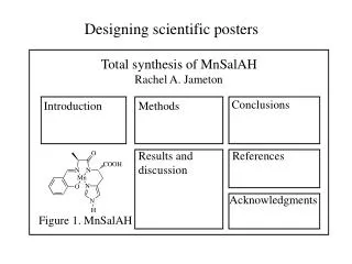
Cont’d... Revised March 2012 What to include? Think about - 'Introduction', 'Methods', 'Results' and 'Conclusions‘, ‘References’. Be guided by your conference brief. Use indents, justification and a variety of formatting to highlight your main points e.g. bold titles Identify the most innovative, exciting and relevant aspects of your work to present in your poster.
The practicalities Revised March 2012 • From paper to computer. • Posters can be designed in Word or Publisher – my preference is PowerPoint. • Tips when working with PowerPoint. • Changing the size of your paper: • In office 2007 (if you are using Office 2010 there may be some slight variations) – select Design then Page Setup, select the drop down box slides sized for and scroll down to select Custom. This option allows you to specify the size of your poster • For A1 - 594 mm x 840 mm or 59.4cm x 84.0cm • For A0 – 841 mm x 1189mm or 84.1 x 118.9cm. • Viewing your poster - remember to select the fit to window option in the view menu. The gridline option in the view menu may help you to plan your poster. • Managing the space – ensure the poster is balanced. Consider asking colleagues to comment on your drafts. • Printing drafts of your poster.
Title Presenter details and affiliations Introduction Results Image Method Conclusion Image/table/graphic Image References Revised March 2012
Useful websites Revised March 2012 British Science Association http://www.kumc.edu/SAH/OTEd/jradel/Poster_Presentations/PstrStart.html http://www.stars.rdg.ac.uk/poster.html http://lorien.ncl.ac.uk/ming/Dept/Tips/present/posters.htm http://www.vitae.ac.uk/researchers/1638/Posters.html
References Revised March 2012 Anon (n. d) ‘Posters’ [online] Available at: http://www.vitae.ac.uk/researchers/1638/Posters.html [Accessed 05 March 2012]
An example Please note my brief included no presenter details etc. these were displayed separately. The poster was matched to the presentation brief: emphasis on social and ethical issues of research area and communication to the general public. Revised March 2012