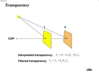
Download
1 / 16
160 likes | 168 Views
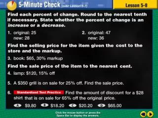
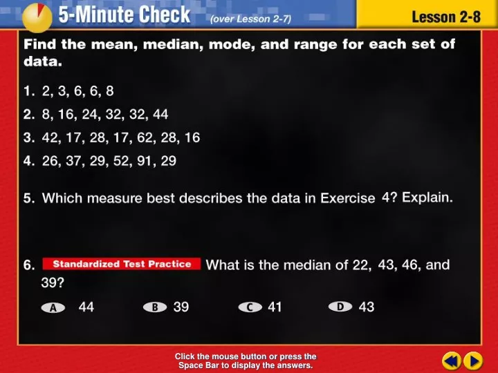
Transparency 8. Click the mouse button or press the Space Bar to display the answers. Splash Screen. Example 8-3c. Objective. Recognize when statistics and graphs are misleading. Example 8-3c. Vocabulary. No new vocabulary. Lesson 8 Contents. Example 1 Drawing Conclusions from Graphs

E N D
Transparency 8 Click the mouse button or press the Space Bar to display the answers.
Example 8-3c Objective Recognize when statistics and graphs are misleading
Example 8-3c Vocabulary No new vocabulary
Lesson 8 Contents Example 1Drawing Conclusions from Graphs Example 2Changing the Interval of Graphs
Graph A Graph B Example 8-1a GEOGRAPHY Refer to the graphs below. Which graph suggests that the nation of Bahrain is about twice as large as the nation of Andorra? Explain. 1/2
Graph A Graph B Example 8-1a Answer: In Graph A, Bahrain appears to be about twice as big as Andorra. Because the scale on the vertical axis is different 1/2
Example 8-1c Refer to the graphs below. Which graph suggests that boys spend twice as much money each month on sporting equipment as girls? Explain. 1/2
Example 8-1d Answer: In Graph B, the bar for boys’ spending indicates that boys spend about twice as much as girls spend. The vertical scale is not consistent 1/2
Graph A Graph B Example 8-2a ECONOMICS The graphs show U.S. exports to Ireland. Which shows that exports increased more rapidly? Explain. Compare the steepness of the slope 2/2
Graph A Graph B Example 8-2a ECONOMICS The graphs show U.S. exports to Ireland. Which shows that exports increased more rapidly? Explain. Answer: Slope A is steeper than Slope B so increased more rapidly because the scale is by 1’s on Graph A is smaller than Graph B 2/2
Example 8-2c SALES The graphs show the total sales of a retail shop over a period of years. Which graph makes it appear that the sales have increased more rapidly? Explain. Answer: The slope on Graph B is steeper because it uses smaller intervals 2/2
End of Lesson 8 Assignment
Example 8-3a BUSINESS A business says that its average employee makes $71,000 a year. Look at the list and explain how using this average to attract employees is misleading. mean: $71,000 median: $30,000 mode: none 3/3
Example 8-3b Answer: The average used by the business was the mean. While the mean salary is $71,000 a year, the median salary is $30,000. So, the median is a better reflection of a typical salary, especially at the entry level. 3/3
Example 8-3c * HOUSING PRICES A real estate agent says that the average home price in a particular community is $171,400. Look at the list and explain how using this average makes this community look more attractive to home buyers. House Prices$175,000, $195,000, $230,000, $205,000, $52,000 Answer: The average used was the mean. While the mean house price is $171,400, the median house price is $195,000. So, the median house price is a better reflection of a typical house price in this community. 3/3