Download
1 / 41
410 likes | 413 Views
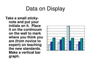
Ways to Display Data. Frequency Table. A frequency table shows how often something occurs. The frequency may be shown by tally marks or the number . Data is displayed numerically. A frequency table is best used to keep track and organize data!. A frequency table contains 3 columns.

E N D
A frequency table shows how often something occurs. The frequency may be shown by tallymarks or the number. Data is displayed numerically.
A frequency table is best used to keep track and organize data!
A frequency table contains 3 columns. # of Cats in Homes
Class Exercise What type of soda is your favorite?
Choose one of the following…. • Coke • Mountain Dew • Dr. Pepper • Sprite • Diet Coke
Now, complete the table. Compare your frequency table with your neighbor’s. Are the same? Any differences?
Stem-and-Leaf Plot
A stem-and-leaf plot displays and organizes numerical data by separating the digits of each number into a stem and a leaf. • The number of students enrolled in a dance class in the past 12 years: 81, 84, 85, 86, 93, 94, 97, 100, 102, 103, 110, and 111.
Stem & Leaf Example Make a stem-and-leaf plot of the exam scores shown below. The first one is done for you. 69, 71, 75, 79, 80, 83, 84, 88, 92, 95, 97, 99
A single bar graph uses the same color or shade of bar to compare amounts, such as number of students per class. STUDENTS PER CLASS 30 15 Number of Students 0 6 7 8 Grade
Bar Graph Example A middle school near Athens, has a recycling drive every year. The table shows the results of last year’s drive. Complete the bar graph on your own.
20 Boys Girls 10 Number of Students 0 6 7 8 Class Number A double bar graph uses two or more colors or shades of bars and a key to compare amounts, such as the number of boys and girls in each class. STUDENTS PER CLASS
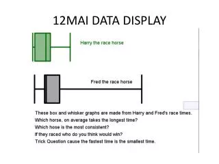
A histogram is a special kind of bar graph that shows how ranges ( or intervals) of data differ from one another. There are no spaces between the bars of a histogram.
A histogram is also used to compare data clearly and efficiently. Number of students receiving grades
This histogram compare grades on a final exam. Number of students receiving grades What are the intervals? Letter Grades: A 90-100 B 80-89 So forth
Histogram Example Minutes Spent on Homework Histogram 30-39 40-49 50-59 60-69
A pictograph has a keythat tells the value of each picture. KEY
A pictograph is similar to the bar graph and histogram because it is also used best to compare data.
A circle graph shows how a whole circle is broken into parts.
The sum of the parts (percents) in a circle graph must always equal 100%! 30% 20% 15% 5% 20% 10% 100% +
Sometimes a circle graph is referred to as a pie chart. A circle graph is used best when comparing data, especially data that involves percentages.
Circle graph Example 1) Find the total. 2) Write a fraction and change each fraction to a percent. 3) Create a key and graph the percentages. 27 15 = 56% 7 = 26% 1 = 4% 4 = 14% 27 27 27 27
A line plot uses a horizontal number line and individual data points (usually Xs) to show how the data is grouped.
Line plots are a quick way to determine the mode because it is the number on the scale with the most Xs.
Number of Pets in each Household Outliers, or data items that are much larger or smaller than the rest of the items are easy to spot as well.
Average Daily Temperature for January 1-7 in Degrees Fahrenheit A single line graph uses one line to show how something changes over time.
A multiple line graph compares two or more groups of data during the same time period. Average Studying Time Each group of data will have its own line. 3hrs 6th 2hrs 7th 1hrs 0 1990 1995 2000
A line graph shows trends, or how things change over time. By looking at the line(s) on a line graph, you can tell whether something is increasing, decreasing or staying the same.
A steady trend may be used to help predict what will likely happen in the future.