Download
1 / 11
120 likes | 332 Views
codes and conventions of a double page spread

E N D
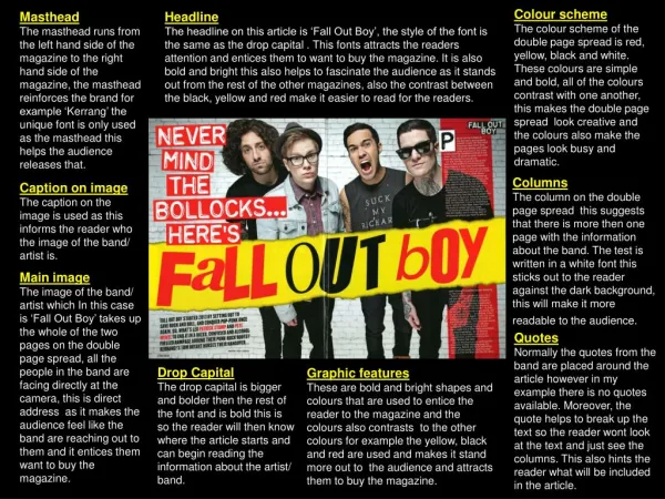
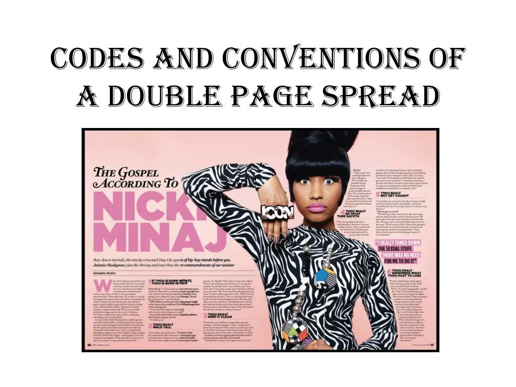
Main Image The main image takes up most of the double page and uses direct address to attract the readers attention. The image also often gives a good representation of the artists personality.
Drop Quote A drop quote is a quote take from the article. Often it will be bold and stand out to the reader to grab their attention to give them an insight in what the article will be about. The quote can sometimes be found on the main image or in the middle of the text.
Drop Cap The drop cap is the first letter at the start of the text and is bigger and bolder than the rest of the text.
By-lines The by-line is the part of the magazine that tells us the name of the interviewer/ writer of the article and also the name of the photographer.
Headline The headline is across the top of the article and is usually only a few words long to draw the audience in. The font is usually different to the rest of the text in the article.
Mise-en-scene The mise-en-scene is used to represent the artists personality to give the reader an insight into what they're really like.
Stand first The stand first is used to introduce the audience to the article and is usually place under the headline but above the text. The artist/band name may be mentioned here and will be put in either a different colour or will be bold.
Colour scheme The colour scheme is also very useful as it makes the article look appealing to the eye and can also help in representing the genre of the magazine. For example this article is bright and colourful as the magazine is for the pop genre. The colour is another factor which helps in showing the artists personality but it also ties in with the colours that Nicki is wearing in the main image.
Page Numbers and Date The page number is placed at the bottom of the page and is usually in size font 12. the page number is important as the reader can look at the contents and find the page they want quickly using the page number. The date is usually placed next to the page number to further reinforce the issue date of the magazine.
Text The text used for the magazine is usually the same style used throughout the text. However the text will be different if the article was for a interview as the questions would be in bold and the answers would be in a smaller or maybe even different styled font. The text is usually in size 11 font.